10.1
10.2
10.3
10.4
10.5
100
What is a stem and leaf plot?
A stem-and-leaf plot uses the digits of data values to organize a data set. Each data value is broken into a stem (digit or digits on the left) and a leaf (digit or digits on the right)
100
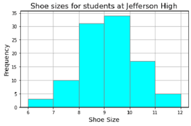
What is a histogram?
A histogram is a bar graph that shows the frequencies of data values in intervals of the same size
100
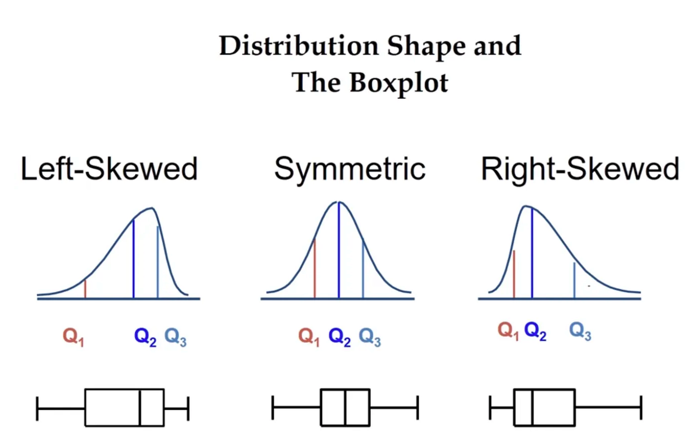
What are the 3 types of shapes of distribution?
Left Skewed
Right Skewed
Symmetric
100
When the data distribution is symmetric, use ________ for measure of center and use _________ for measure of variation...
Mean for measure of center
M.A.D. (Mean Absolute Deviation) for measure of variation
100
What is a box and whisker plot?
A box-and-whisker plot represents a data set along a number line by using the least value, the greatest value, and the quartiles of the data. A box-and-whisker plot shows the variability of a data set.
200
How is each data value broken up into for a stem and leaf plot?
Each data value is broken into a stem (digit or digits on the left) and a leaf (digit or digits on the right).
200
Draw an example of a histogram...
200
Draw an example of each of the 3 different types of shapes of distribution...
200
When the data distribution is skewed, use ________ for measure of center and use _________ for measure of variation...
Median for measure of center
IQR (Interquartile Range) for measure of variation
200
List all 5 numbers of the "five number summary"...
Q1
Q2 (Median)
Q3
Lowest Value
Highest/greatest Value
300
The stem-and-leaf plot shows student quiz scores. How many students scored less than 8 points?
Stem Leaf
6 6
7 0 5 7 8
8 1 1 3 4 4 6 8 8 9
9 0 2 9
10 0
Key: 9 | 2 = 9.2 points
5 people scored less than 8 points on the quiz
300
Display the data in a histogram...
Snow Days used per School
Snow Days Frequency
0–1 9
2–3 6
4–5 2
6–7 1

300
Describe the shape of this distribution...
Skewed Left
300
What are the most appropriate measures to describe the center and the variation for the following set of data?
Candy Bars Eaten Frequency
0–1 3
2–3 13
4–5 21
6–7 11
8–9 2
Because the data distribution is symmetric, Mean for Measure of center and M.A.D. for measure of center
300
Make a box-and-whisker plot for the ages (in years) of the spider monkeys at a zoo.
15, 20, 14, 38, 30, 36, 30, 30, 27, 26, 33, 35
14 23 30 34 38
|---------|=========|=========|-----------|
L.V. Q1 Med Q3 H.V.
400
Make a stem and leaf plot of the following data...
Books Read
26 15 20 9
31 25 29 32
17 26 19 40
Stem Leaf
0 9
1 5 7 9
2 0 5 6 6 9
3 1 2
4 0
Key: 2 | 0 = 20 books read
400
The histogram shows the numbers of magazines read last month by the students in a class.

a. Which interval contains the fewest data values?
b. How many students are in the class?
a. 0-2
b. 26 students in the class
400
The frequency table shows the number of apples retrieved during apple picking. Display the data in a histogram. Describe the shape of the distribution.
Apples 10–19 20–29 30–39 40–49 50–59 60–69
Frequency 3 15 36 38 14 3
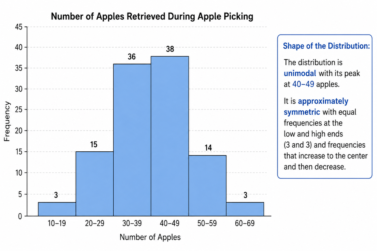
Symmetric
400
The following data shows the numbers of words that several students can form in 1 minute using the letters P, S, E, D, A...Choose the most appropriate measures to describe the center and the variation...
Number of Words: 1–3 4–6 7–9 10–12 13–15
Frequency: 7 9 5 3 1
Center: Median
Variation: IQR
400
Make a box-and-whisker plot for the data. Identify the shape of the distribution.
Ticket prices (dollars): 39, 42, 40, 47, 38, 39, 44, 55, 44, 58, 45
38 39 44 47 58
|-----|=========|=========|----------------|
L.V. Q1 Med Q3 G.V.
Right Skewed
500
Create a stem and leaf plot using the following data...
Minutes waiting on line at chick fil a
16, 19, 20, 22, 26, 27, 29, 31, 31, 36, 38, 40
Stem Leaf
1 6 9
2 0 2 6 7 9
3 1 1 6 8
4 0
Key: 3 | 1= 31 Minutes
500
The frequency table shows the ages of people watching a comedy in a theater. Display the data in a histogram. Then describe the shape of the distribution.
Ages Frequency
10–13 1
14–17 3
18–21 7
22–25 12
26–29 20
30–33 18
34–37 3
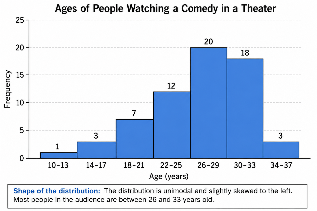
skewed left
500
Make a histogram of the data starting with the interval 0–14 and Describe the shape of the distribution.
Donations (dollars)
20 15 40 70 20 5 25 50 47 20 62 55 40
10 50 18 20 100 40 80 60 20 80 3 30 50
25 30 10 33 20 50 7 35 40 25 70

Skewed Right
500
The frequency table shows the numbers of eggs laid by several octopi. Choose the most appropriate measures to describe the center and the variation...
Eggs (thousands) Frequency
1–20 2
21–40 8
41–60 14
61–80 9
81–100 3
Center: Mean
Variation: M.A.D.
500
Make a box-and-whisker plot for the data. Identify the shape of the distribution....
Number of sit-ups: 20, 20, 23, 25, 25, 26, 27, 29, 30, 30, 32, 34, 37, 38
20 25 28 32 38
|---------|=========|=========|-----------|
L.V. Q1 Med Q3 G.V.
Roughly Symmetric