Relationships
Breakpoints
Inspector
What and When
100
An approach to web design where the website’s design adapts to the viewport using fluid sizing and breakpoints.
What is responsive?
100
Points of screen resolution where you choose to make significant changes in the design or layout when fluid definitions are just not enough.
A starting point, an endpoint and the range between them.
What defines a breakpoint?
100
Fixed Sizing Unit
What is px?
100
One-dimensional flexible CSS layout model which offers space distribution between items and powerful alignment capabilities.
What is the Layouter or Flexbox?
200
The component on a website that represents the Structure and Content of the site.
What is HTML?
200

You would add one of these from this menu.
What is a custom breakpoint?
200
fr, auto, percentage units.
What are fluid sizing units in the editor?
200
Two dimensional CSS layout that allows structuring content in columns and rows — which you can resize and set exactly the way you want.
What is the Grid?
300
A list of Style Rules that define the Design and Layout of each element of the DOM.
What is CSS?
300
Desktop, tablet, & mobile.
What are the 3 default breakpoints in Editor X?
300
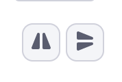
This icon can change the orientation of the element with 2 preset options, either vertical or horizontal.
What is the FLIP option in the inspector?
300
A repeating layout, best used for multiple items with connectivity to a collection, if needed.
What is a repeater?
400
This makes the page interactive.
When an event (load, click, drag, scroll..etc) happens, and the DOM is manipulated.
What is Javascript?
400
Go to the Layers panel and click the eye icon.

How do you show elements in other Breakpoints?
400
Displays a visual relationship between elements and the parent where you can define margins.
What is docking in the editor?
400
An accelerated design tool used to expedite design production. My parent is the PAGE.
What are designed Sections?
500
The representation of the relationship between components - Parent, Child & Siblings.
What is the DOM(document object model)?
500
HTML, the data and content.
What can't change when editing breakpoints?
500
You can scale images proportionally when this option is selected.
What is the fluid option in the inspector?
500
Sometimes I'm turned into a grid, while other times, I'm just holding many things inside.
What is a container?