What is a line of best fit and what is it used for?
A line of best fit is a straight line that depicts the trend of a given scattered plot. It is used to represent the relationship between two variables.
What is the mean and how is it calculated?
The mean is a measure of central tendency that is calculated by summing up all the values in a dataset and dividing by the total number of values.
How is the strength of a relationship measured in statistics?
The strength of a relationship is often measured using correlation coefficients.
What are the two main measures of variability discussed in class?
IQR and MAD or MSD
How do you find an outlier using the 1.5 rule?
In the 1.5 method, a data point is considered an outlier if it falls below Q1 - 1.5 * IQR or above Q3 + 1.5 * IQR.
Identify the best line of best fit. Explain why its better than the others.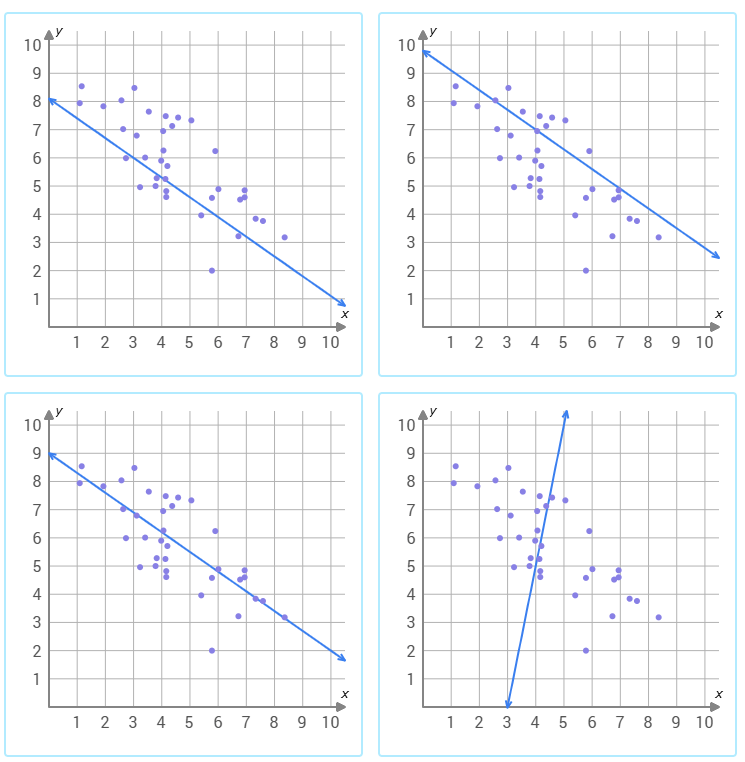
The third graph shows the line of best fit because it follows the trend of the data and it is directly in the middle of the dots.
Which student had the greater median? Explain.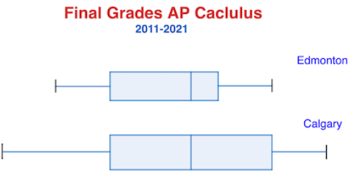
The medians are the same because the line in the middle of the box are located on top of the same number.
Match the correlation coefficients to the correct scatter plot.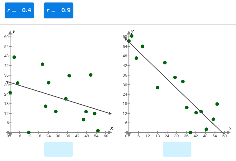
Graph on the left: r = -0.4
Graph on the right: r = -0.9
1. Put data in order from least to greatest.
2. Find the median and split the data in half.
3. Find Q1 and Q3
4. Subtract Q1 from Q3.
Which measure of center should you use to analyze the data in the histogram below and why.
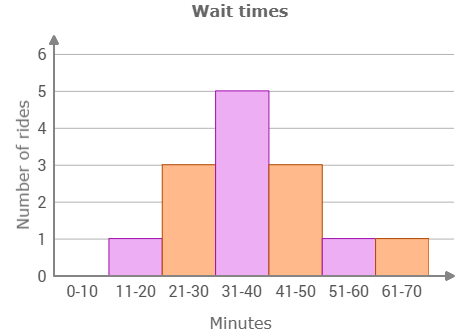
The distribution of wait times is best described as symmetrical. So, the mean is an appropriate measure of center.
Write the equation of the line of best fit. Simplified!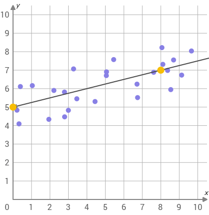
y= 1/4x + 5
When would you use the mean versus the median to describe a dataset?
The mean is typically used when the data is normally distributed or symmetric, while the median is more appropriate when the data is skewed or contains outliers.
Can a strong relationship between variables always be considered as causation? Give an example.
No, some variables have a relationship duee to random chance.
Example: Teacher's discretion
Find the mad: [19,3,6,7,1,13,13,11,9,8]
MAD: 4
How can outliers impact statistical analysis and interpretation of data?
Outliers can mess up statistical analysis by making results inaccurate, changing the average and spread of data, and affecting how variables are related.
Write the equation of the line of best fit.
y= -x + 25
Compare the medians of the grade levels.

5th- 61
6th- 60
5th grade has a higher median. Difference is 1.
A scatter plot showed that number of compliments a person received and the amount of times that person smiled in a day had a correlation coefficient of r = 0.74. Describe the relationship between the two variables. Explain how you know and what this indicates.
There is a strong positive relationship between the two variables because the abs value of the correlation coefficient is close to 1. The closer to one it is, the stronger. This means the number of compliments a person receives is a good indicator of the amount of times they smile in a day.
Compare the IQR's and Standard Dev in the grade levels.
5th: IQR-11 Stdev- 5.6
6th: IQR-9 Stdev- 4.7
5th grade is more spread out than 6th grad.e
Select the outlier in the data set.

If the outlier were removed from the data set, would the median and mean increase or decrease?
The median w/ outlier:
The median w/o outlier:
The mean w/ outlier:
The mean w/o outlier:
Dean is researching Labrador retrievers for his veterinary science class. This scatter plot shows the weights of some puppies at different ages along with the line of best fit, y = 1.8x + 1. Interpret the slope and the y intercept.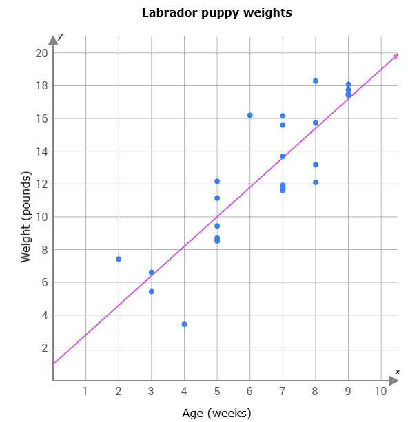
The puppies were born at 1 lb and they grow 1.8 lbs. per week.
Compare the means in the data set:
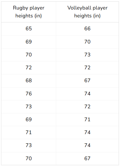
The mean for rugby players is 70.5
The mean for volleyball players is 70.9.
Volleyball players have a 0.4 increase from rugby players.
This scatter plot shows the number of weeks since a typing class started and the number of words he missed on each test. Describe the relationship between the variables.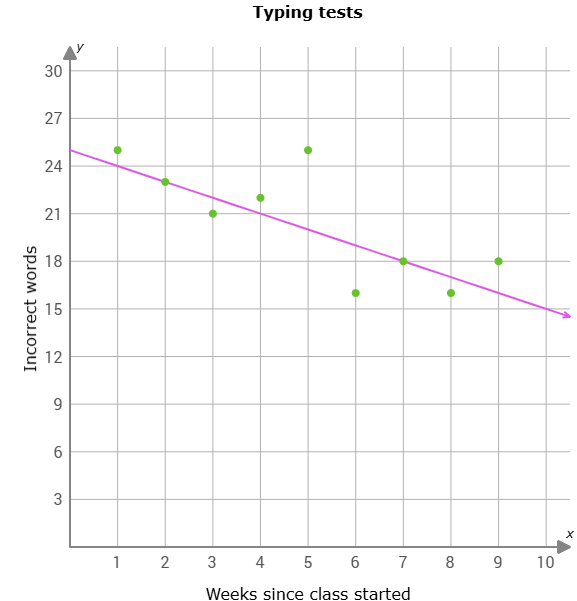
As the number of weeks since the class started increase, the number of incorrect words decrease resulting in a strong negative correlation.
How does the IQR and standard deviation measure variability in a dataset?
They both measures the average amount of deviation or dispersion from the mean in a dataset. They provide a measure of how spread out the data points are from the mean.
Describe the shape of the data. What is the appropriate measure of center and variation? Explain.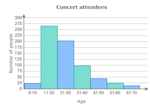
The data is skewed right. The appropriate measure of center is median because it is less influenced by outliers or extreme values present in the data. The appropriate measure of variability is IQR because of the same reason and it goes hand and hand with median.