Mean, Median, Mode and Range
Stem and Leaf Plots
How to describe a numerical, univariate graph
Histograms
Spiral Review
100
Define median in simple words.
The median is a simple measure of central tendency. To find the median, we arrange the observations in order from smallest to largest value. Then we cross out the numbers from each side until we reach the middle of the data.
100

What is the median for this set of data?
There are 10 pieces of data. If you cross out 4 from both ends, you will end up with 2 middle numbers, 89 and 90. Half way between them is the median, 89.5.
100
Define Center is simple terms.
The center discuss where the middle of the data falls. Three measures of central tendency are mean, median, & mode
100
How many students scored 90% or higher on the semester test?

10 + 12= 22 students
100

Given the following pie chart of students' response, which of the following is true?
a. Students tend to like movies made in the USA.
b. Most teachers do not like movies.
c. Students prefer action movies than other types of movies.
d. A higher percentage of students like romance movies compare to other types of movies.
d. A higher percentage of students like romance movies compare to other types of movies.
200
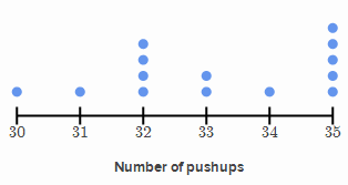
What is the mode number of pushups in this data set?
35
200

How many students were surveyed in this poll?
13
200
What shape is the graph shown below?
:max_bytes(150000):strip_icc()/benford-567b5fab5f9b586a9e918c65.jpg)
It is positively (or right) skewed.
200
How many test scores are between 65 and 70 percent on the graph above?
13
200
Which variable is most likely skewed to the right?
a. A person's wait time for a check up.
b. Color of s bicycle.
c. Ages of cats
d. Number of goals scored in a soccer game.
d. Number of goals scored in a soccer game.
300

What is the range of pets for this data set?
14 - 0 =14
The range is 14.
300
What is the range for this set of data?
66 - 1= 65
300
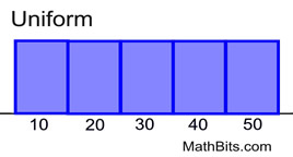
Define Uniform and what it looks like.
It refers to data in which every class has equal or approximately equal frequency.
300
How many students took the semester test?
A. 100 B. 125 C. 101 D. 102
(A) 100
300
When do we use a Time Series Plot?
When there are measurements collected over time at regular intervals.
400
The following were Evangeline's 10 test scores:
81 82 83 84 86 87 89 90 92 94
What is Evangeline's median from the test scores?
86.5
400
How many students live more than 12 miles from school?
7 Students
400

What is the shape of this distribution?
a. Symmetrical b. Bimodal c. Unimodal
d. Multi-modal
b. Bimodal
400
Title: How many minutes students spend on homework

X-axis: Number of Minutes Spent on Homework
When doing homework, which time interval contained exactly 15 students?
15 Students spent 200 to 240 minutes on homework.
400

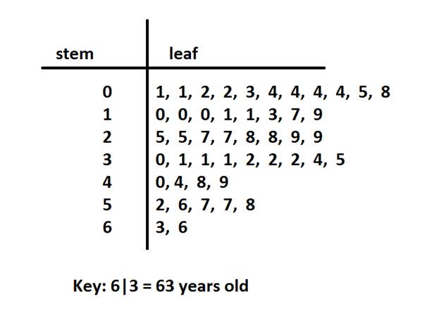
Create another stem and left plot to better see the shape of the distribution.

We use L for lower leaf values (0-4) and H for higher leaf values (5-9). Notice that now you can see the shape of this distribution.
500
What is the sum of the mean, median, and mode for the following set of data?
2 7 7 11 15
Mean: 42/5 = 8.4
Median: 7
Mode: 7
Sum= 22.4
500

What is the upper quartile for this set of data?
The upper quartile is 38.5
500
What are the main components to describe distributions?
Center, Spread, Shape and any Unusual Occurrences.
500

What are the steps to create a histogram for the data in the chart?

How to construct:
Draw a horizontal scale and mark it with the possible values for the variable
Draw a vertical scale and mark it with frequency or relative frequency
Above each possible value, draw a rectangle centered at that value with a height corresponding to its frequency or relative frequency
500
Title: Plane Flights

What percentage of the data is above the lower quartile?
A box plot is divided into 4 equal sections. Each section contains 25% of the data. Therefore 75% of the data is located above the lower quartile.