Mean, Median, Mode, Range, & Outliers
Vocabulary
Box-n-Whisker
Dotplot
Wild Card
100
Find the mean of the following set of data:
13, 23, 21, 20, 21, 24, 18
What is the mean is 20
100
This type of graph indicates each value as a dot above its location on a number line.
What is a dotplot.
100
Make a box and whisker plot for the following data:
7, 1, 0, 4, 8, 3, 10
What is you should have points at the numbers:
0 (least value)
1 (lower quartile)
4 (median)
8 (upper quartile)
10 (greatest value)
See example on board
100
Using the data: 13, 12, 14, 14, 15, 16, which data point would have the most dots?
What is 14
100
There are seven children in the Arthur family, including one set of twins. The youngest child is 6 years old, and the oldest is 16 years old. The mean of their ages is 11 years, the median is 10 years, and the mode is 15 years. What are the ages of the Arthur children? How old are the twins?
What is the children are 6, 7, 8, 10, 15, 15, and 16 years old. The twins are 15 years old.
200
What is the mode:
10, 9, 4, 4, 8, 8, 8, 4, 7, 6, 11, 14, 27
What is 4 and 8
200
This type of chart is considered to be cut in very specific ways and is also very tasty; it shows each category as a "slice of pie."
What is a pie chart.
200
Find the interquartile range for the data set:
12, 14, 11, 10, 9, 10, 9
What is the IQR = 3
- put the numbers in order from least to greatest
- find the median
- find the difference between the first quartile (9) and third quartile (12)
200
A dot plot can be described as...
What is peaks, cluster, or symmetry?
200
When an outlier is added to a data set, which of these measurements will usually change the most: the mean, median, mode, or range?
What is the range.
300
Find a possible missing value in the set of data if the range is 20.
14, 8, 17, 21, ____, 11, 3, 13
What is 1 or 23
300
This graph shows each category as a bar.
What is a bar graph.
300
A solution used to kill bacteria is tested The solution kills the following percentages of bacteria in six trials:
85, 84, 87, 86, 90, 80
Use the data to make a box-and-whisker plot.
What is your box-and-whisker plot should have the following points:
80 (least value)
84 (lower quartile)
85.5 (median)
87 (upper quartile)
90 (greatest value)
300
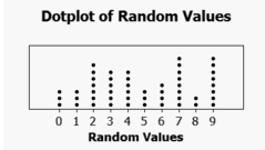 The peak of this dot plot is...
What is 7
300
Find the interquartile range for the data set. Round your answer to the nearest hundredth.
1.75, 2.5, 3.25, 4.15, 3.85
What is 1.9
400
Frank has 3 nickels, 5 dimes, and 2 quarters. Find the mean, median, mode and range of the values of Frank's coins.
What is:
mean: 11.5 cents
median: 10 cents
mode: 10 cents
range: 20 cents
400
This table shows the proportion, or percent, of individuals having each value.
What is a relative frequency table.
400
Find the interquartile range, round to the nearest tenth if necessary:
5, 2, 4, 7, 4, 4, 1
What is 3
400
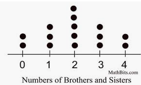 The data values are spread...
What is 0 to 4.
400
There are 5 whole numbers in a data set. The mean of the data is 10. The median and mode are both 9. The least number in the data set is 7, and the greatest is 14. What are the numbers in the data set?
What is 7, 9, 9, 11, and 14
500
What is the definition of the term mode?
What is the value or values that occur the most often in a set of data.
500
This table shows the number of individuals having each value.
What is a frequency table.
500
The amount of rainfall (in inches) for each of the first 5 months of the year is 1, 3, 8, 4, and 4. What is the mean absolute deviation for the number of inches of rain for the first 5 months of the year?
What is 1.6
500
Define the term frequency.
What is the number of times a value in data occurs.
500
You surveyed 25 of your classmates on their favorite ice cream and found that 20% of them liked chocolate the best. How many students voted for chocolate ice cream?
What is 5 students.