That one one
Posters of Color
Tem Plates
Text Me
Double Text Me
100
True or False: We should always avoid using hella colors in our designs
False! It's up to you, PERIOD POOH
100
When all the parts of your design - text, graphics, color - come together well, it has good
Composition
100
Script fonts are the ones that look like
Handwriting!
100
Important information (a company name, headline, 50% off sale offer) will usually be
Larger, in bold, or different in some way
200
True or False: We need to limit ourselves to a max of three colors in our designs
False! Once again, it's up to you, but limiting the # of colors can help your design look less "busy"/overwhelming
200
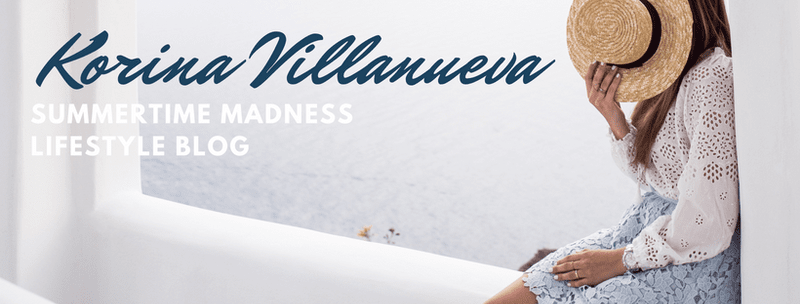
This is an example of what kinda style? 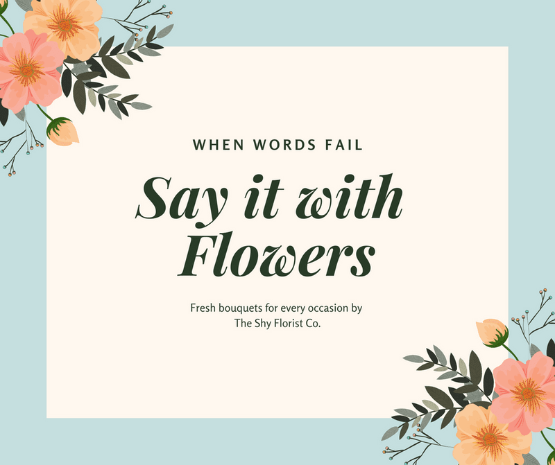
Elegant! (10 bonus points for each element of elegant styles you can name)
200
This design uses _______ to make sure their text is readable
Shape!
200
As a general rule, we wanna use [LESS or MORE] fonts
Less
300
How did Canva suggest adding color to these hot air balloons?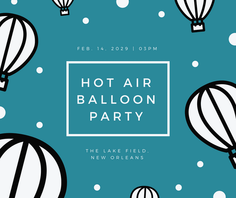
"Having a couple of colors will offer his design balance and prevent it from getting messy."
300
Was this Canva's example of minimalist, modern, or corporate design?
Minimalist
300
This designer uses the background pic's _______ to place their text
Clear Space aka that area that's kinda blank but technically not
400
This is an example of what kinda color scheme?
Monochromatic
400
Humorous styles are usually used for these kinds of designs
Events/social
400
Look what they did to these desserts to make the text pop!
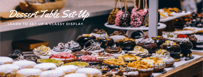
BLURRRRRRR
500
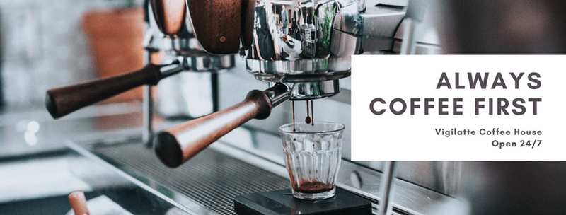
These days, it's usually safest to send someone your resume in what kind of format?
500
When a design uses colors that are close to each other on the color wheel, it uses an _________ color scheme
Analogous
500
What makes this a "modern style" design?
hand-drawn images
geometric text holders (those blue lines)
large desaturated images (black and white > hella color)
white space
500
Draw a Serif and Sans Serif "A"