Mean
Median
Mode
Tables and Plots
Graphs
Venn Diagram
100
The mean of 3, 6, 3, 4,2, and 6.
What is 4?
100
The median of 8, 42, 13, 7, 50, 91, 28.
What is 28?
100
The mode of 8, 7, 8, 9, 8, 7.
What is 8?
100
The type of chart shown here: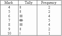
What is a frequency table?
100
The type of graph shown here:
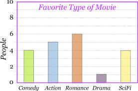
What is a bar graph?
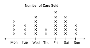
100
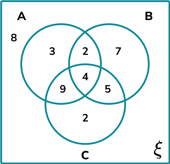
How many people only like choice A?
3
200
The mean of 12, 9, 11, 8, 9, 12, 9
What is 10?
200
The median of 6, 10, 12, 5, 7, 12, 9.
What is 9?
200
The mode of 23, 24, 27, 25, 26, 23, 21.
What is 23?
200
The type of chart shown here:
What is a stem and leaf plot?
200
The type of graph shown here:
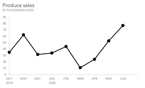
What is a line graph?
200
How many people do not like any of the 3 choices?
8
300
The mean of 23, 24, 27, 25, 26, 22, 21.
What is 24?
300
The median of 2, 4, 5, 4, 3, 4, 2, 3, 3.
What is 3?
300
The mode of 17, 7, 15, 23, 16, 7, 15, 13, 7, 20, 13, 13.
What are 7 and 13?
300
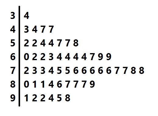
The type of chart shown here:
What is a line plot?
300
The favorite color:
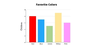
What is yellow?
300
How many people like both choice B and C
9
400
Them mean of 500, 450, 475, 450, 500.
What is 475?
400
The median of 14, 21, 24, 16, 21, 17, 22, 26, 25, 17, 19.
What is 21?
400
The mode of 11.2, 30.9, 46.5, 20, 46.5, 30.8, 11.1, 46.5, 11.2.
What is 46.5?
400
The greatest number of the plot that is under 50.
What is 47?
400
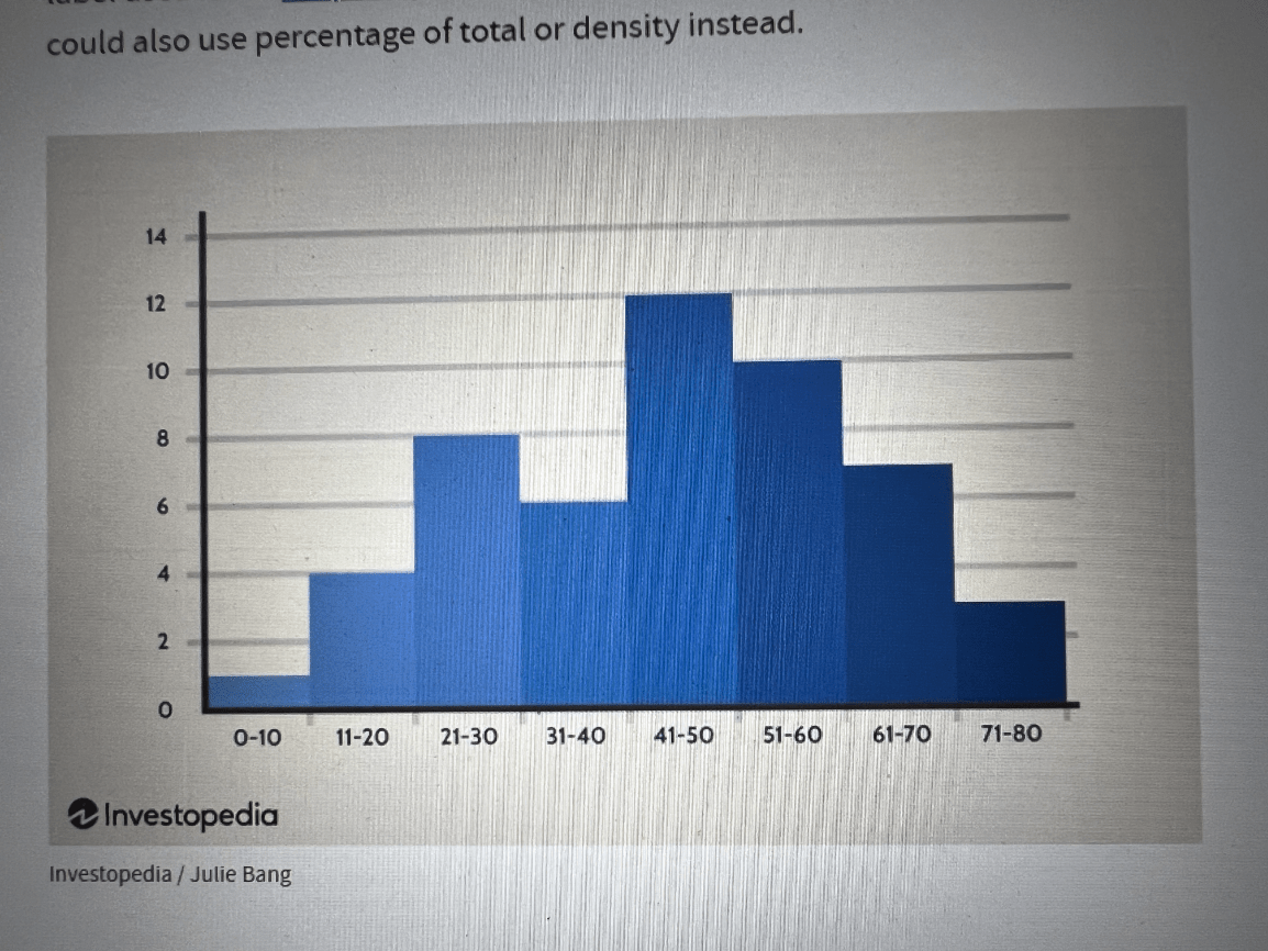
What score range has the most students?
What is 41-50?
400
How many people like choice C?
20
500
The mean of 121, 95, 115, 92, 113, 108, 91.
What is 105?
500
The median of 46.5, 42.5, 45.6, 45.2, 972, 43.9, 48.1, 53.2, 51.7.
What is 46.5?
500
The mode of 15, 12, 17, 13, 20, 19.
What is no mode?
500
The mode of the plot:
What is 76?
500

How many students scored between 71-80%
What is 3?
500
How many students were surveyed in total?
40