Dot Plots
Frequency Table
Histogram
Double line graph
Double Bar Graph
100
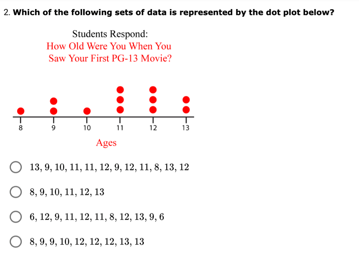
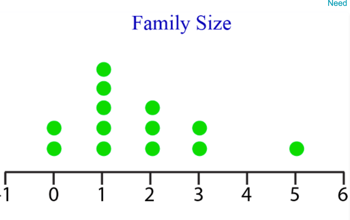 Which number has the highest frequency?
1
100
2
100
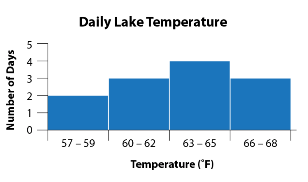 What type of graph is this?
Histogram
100
TRUE OR FALSE
Is this a double line graph?
TRUE
100
TRUE OR FALSE
This is an example of double bar graph.
false.
200
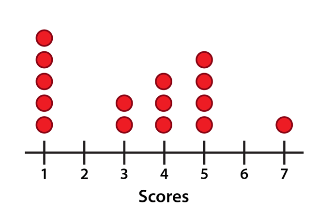 How many basketball players are included on the dot plot?
15
200
Tally marks
200
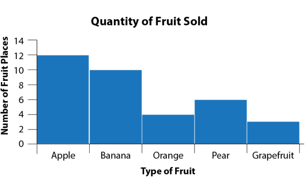 Which fruit had the highest frequency?
Apples
200
In what day(s) of the week is the difference in the sales of burgers and hot dogs the biggest?

Monday and Thusrday
200
Why is this graph misleading?
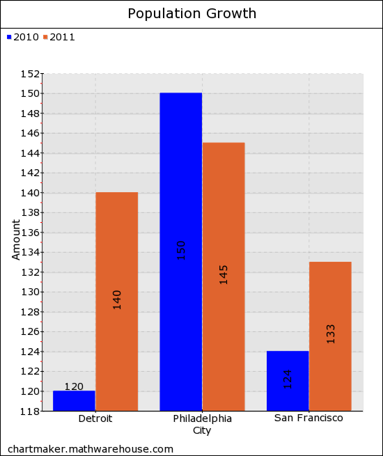
the scale they use in the y axis.
300
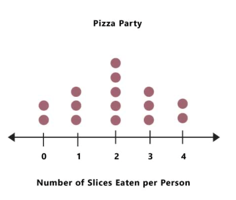 How many children ate fewer than 2 slices of pizza?
5
300
How many columns are in a frequency table, and what is in each column?
Three columns.
Column 1: Categories or numbers in data
Column 2: Tally Marks
Column 3: Frequency
300
There are no spaces between the bars of a histogram because the intervals are _____.
sporadic
continuous
missing
all the same
Continuous
300
Explain why is this graph misleading?
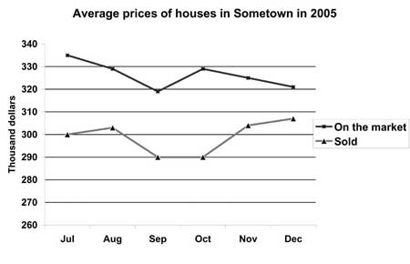
Because the sclae used in y (thousand of dollars) does not start on 0, or does not use the symbol to start in 260.
300
How many more boys than girls prefer pizza?

5
400
A dot plot is a data distribution that uses dots to show the frequency of the values that occur within a data set. Each dot on the number line represents _____.
A. an observation about the set
B. a category of the set
C. the frequency of the set
D. a value in the set
D. A value in the set
400
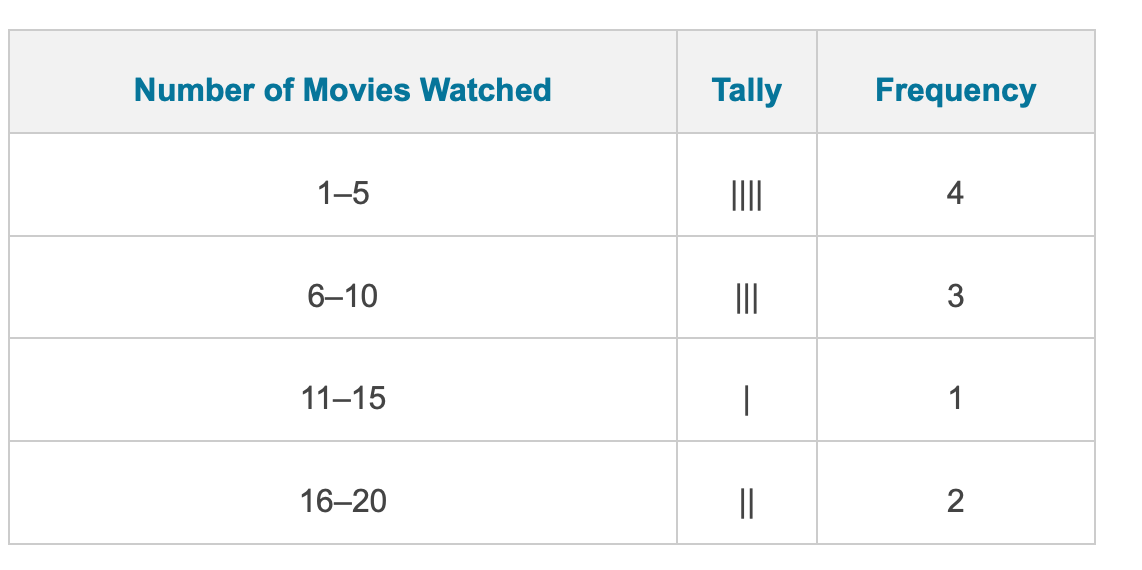 How many people watched 6-10 movies?
3
400
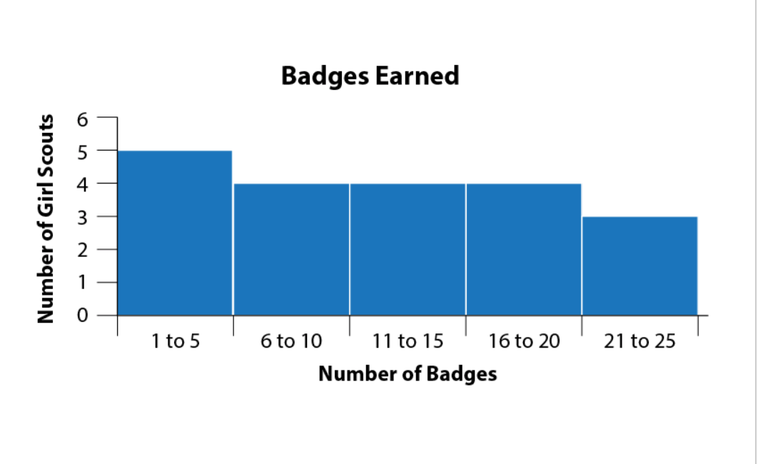 How many total badges were earned?
20
400
In a line graph what information goes always in the x axis?
time reference: years, days, months...
400
Based on this information in what season is the temperature the same?
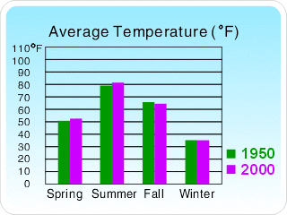
winter
500
A
500
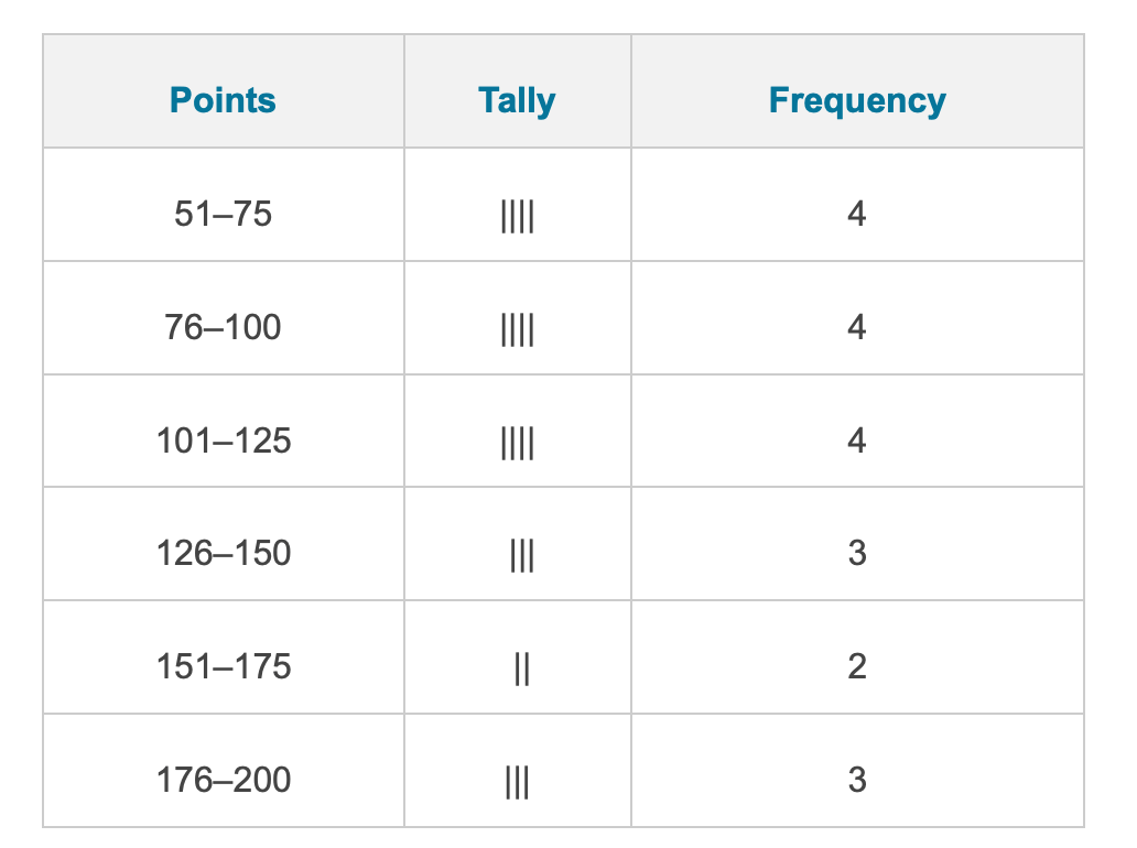 Which points had the lowest frequency?
151-175
500
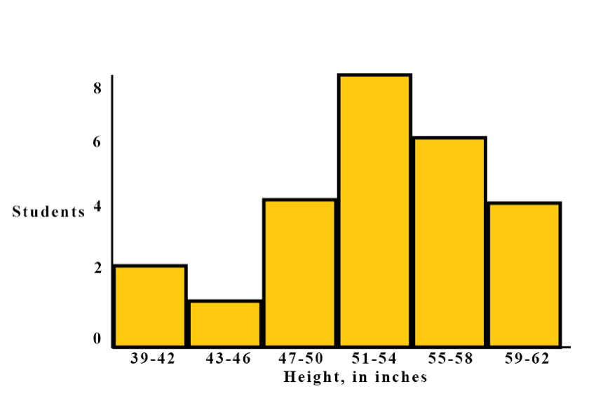 Which height range bucket had 4 students?
47-50 inches
500
TRUE OR FALSE: A line graph is the bext way to represent this information.

true
500
 TRUE OR FALSE:
The best way to represent this information is a double bar garph.
false