Vocabulary
Graphs
Which Graph is Best?
True or False
Reading Graphs
100
This type of data is composed of numbers and can be counted.
What is numerical discrete data?
100
This graph uses pictures or symbols to display data.
What is a pictograph?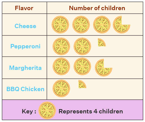
100
You want to collect data about favourite foods in our Grade 7 class and Mr. DaCosta's Grade 6/7 class. You want to compare our class to their class. The type of graph that is best to display this data is...
What is a double bar graph? Double bar graphs are best to use with categorical discrete data, and when you want to compare the results of two groups.
100
The mode is the number that occurs the most often in a data set.
What is true?
100
Consider the following data set:
36, 12, 18, 38, 5, 16, 39, 22, 21, 30, 30, 22, 27, 26, 25
The range of the data is....
What is 34?
200
This type of data is composed of labels (words) and is not counted or measured.
What is Categorial data?
200
This graph displays one variable data using bars of equal width on a grid.
What is a bar graph? 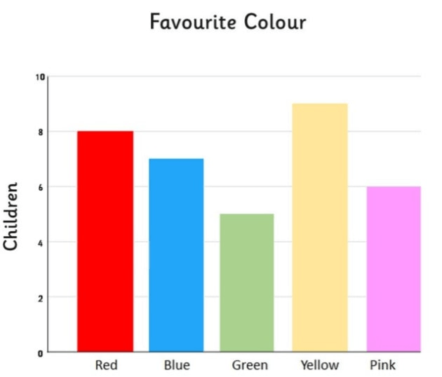
200
 Consider this data set. The type of graph that is most appropriate to display this data is...
What is a bar graph? Bar graphs are best for categorical or numerical discrete data.
200
Primary data is data that you research on a website, or find in a book.
What is false?
200
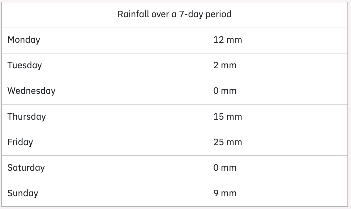
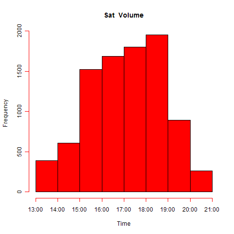
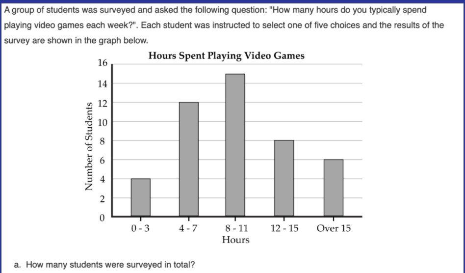 How many students were surveyed?
What is 45?
300
This type of data is made up of numbers and can be measured and broken into parts of a whole number.
What is Numerical continuous data?
300
This graph displays one variable data by showing a whole, divided into sections. Percentages are associated with this type of graph.
What is a circle graph (or pie chart)?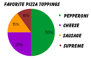
300
 Consider this data set. The type of graph that is most suitable to present this data is...
What is a line graph? This graph is best suited to show changes over time.
300
Data that you have collected from Statistics Canada is called secondary data.
What is true?
300
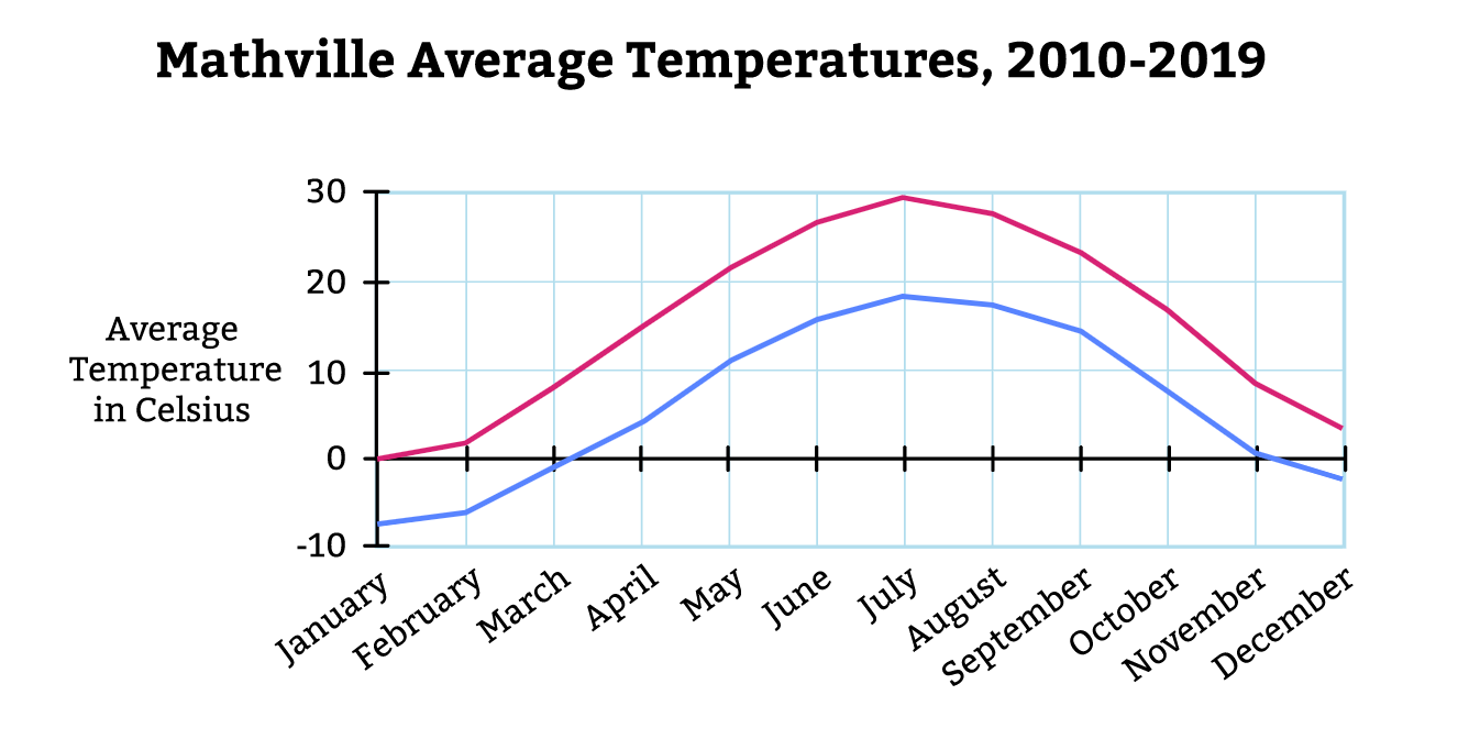 During these months, the average low temperatures below 10º Celsius.
What is January, February, March, November and December?
400
Examine the Circle Graph. The type of data shown is called...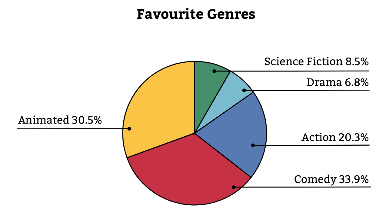
What is categorical nominal data?
400
This graph also uses bars to display one variable data, but only when the data is continuous.
 What is a histogram?
400
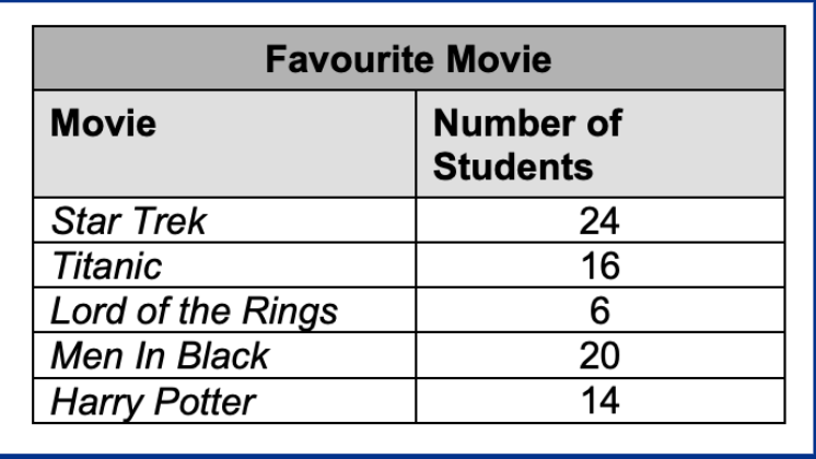
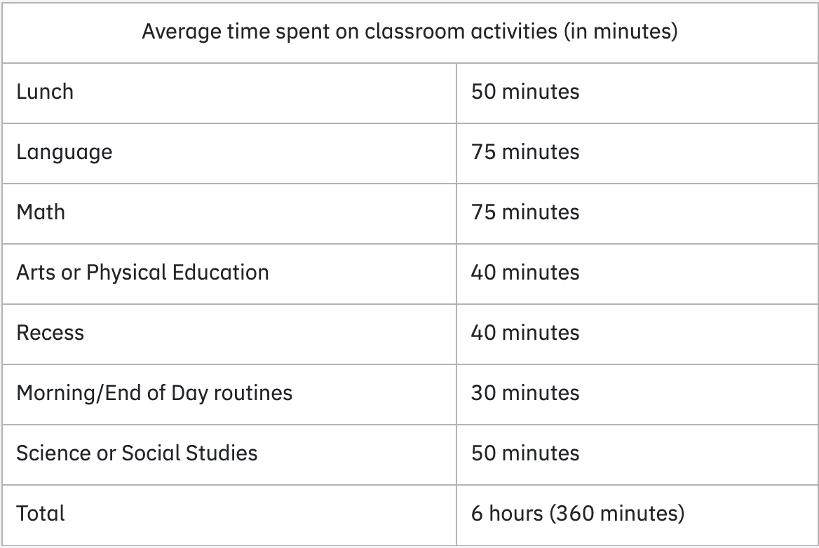 Consider this data set. The type of graph most appropriate to display this data is...
What is a circle graph? This graph is most suitable to show one variable data and show the whole (the school day) and it's parts (time spent on each activity)
400
One variable data is best shown in a line graph or scatter plot.
What is false? Scatter plots and line graphs are used for two variable data, to show a relationship.
400
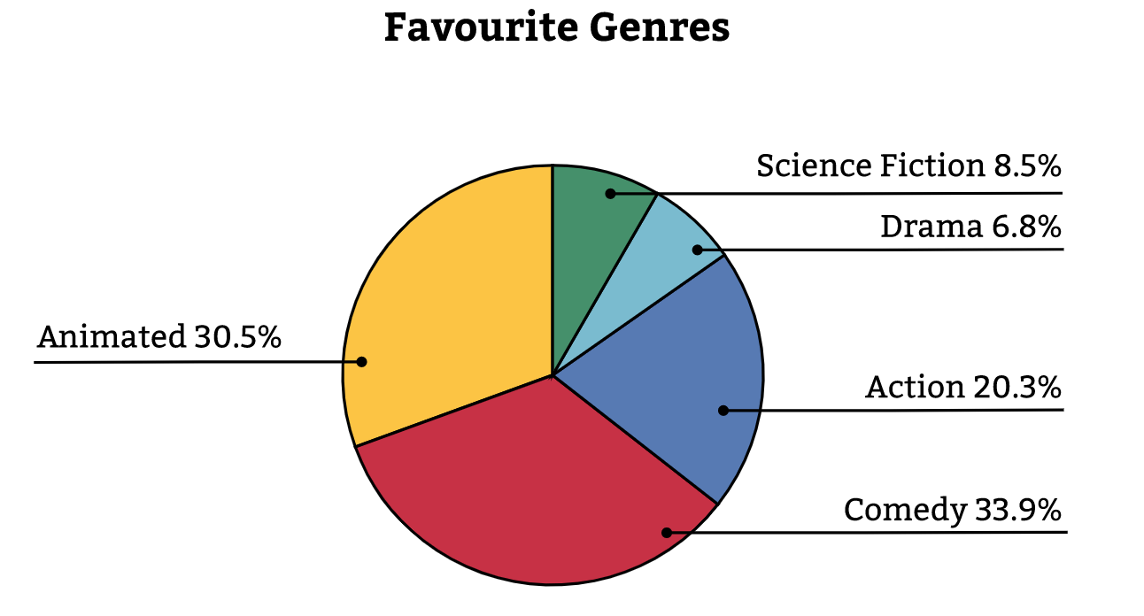 These two genres make up about half of the students who voted.
What is action and animated?
500
A survey asks you to identify which level of education you have achieved. This type of data is called...
What is categorical, ordinal data?
500
This graph is used to represent two-variable data as points on a graph. They are helpful in displaying a relationship that may exist between the two variables.
What is a scatterplot?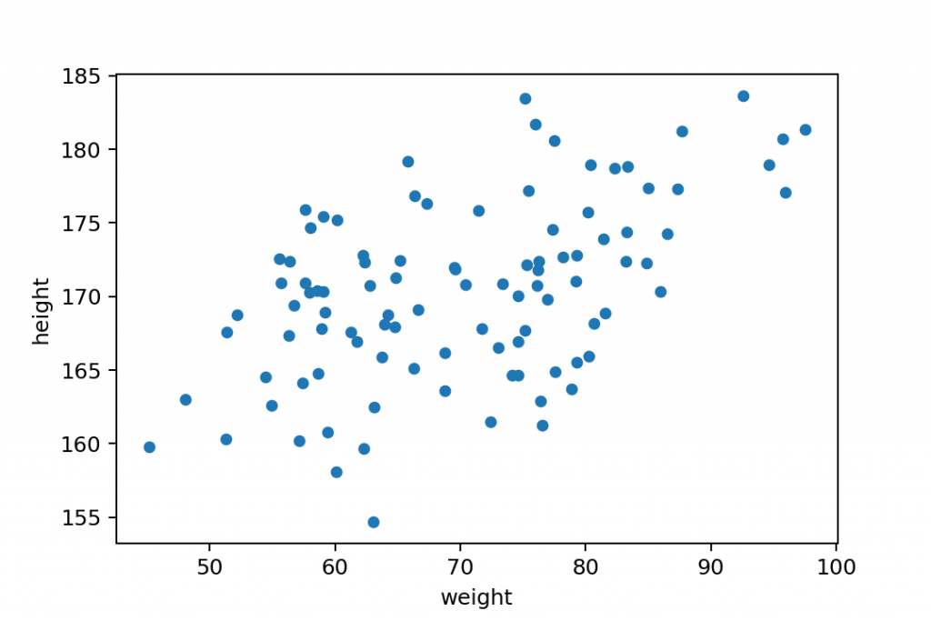
500
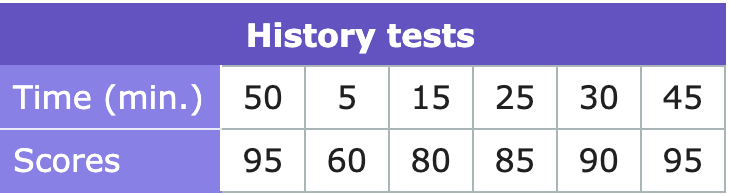 Consider this data set. Darren records the amount of time he spends studying and the scores of his history tests. The graph most appropriate to display this data is...
What is a scatter plot? Scatter plots are best for two variable data and to explore if a relationship exists between two variables.
500
This graph displays two variable data.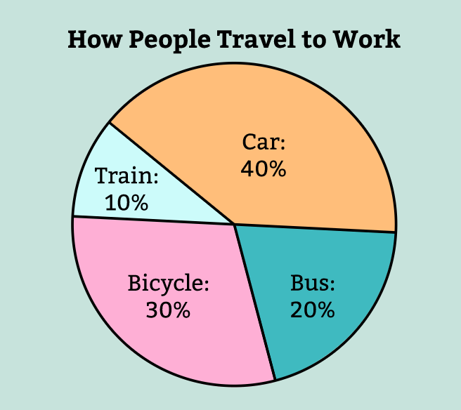
What is false? Circle graphs display one variable data. In this case, categorical data about how people travel to work.
500
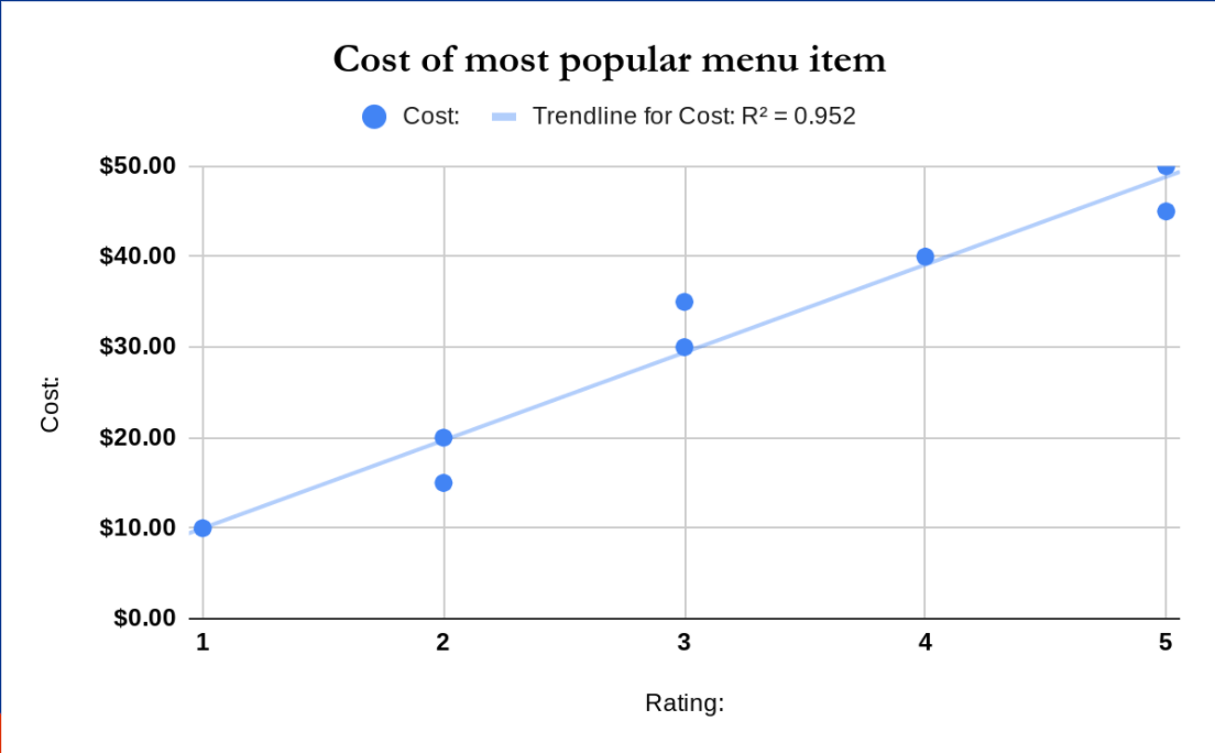 The independent and dependent variables shown on this graph.
What is rating (independent) and cost of menu item (dependant)?