What is the range of this data set?
45 - 32 - 21 - 11 - 54
54 - 11 = 43
What is the main difference between these two graphs, and how does it impact the data?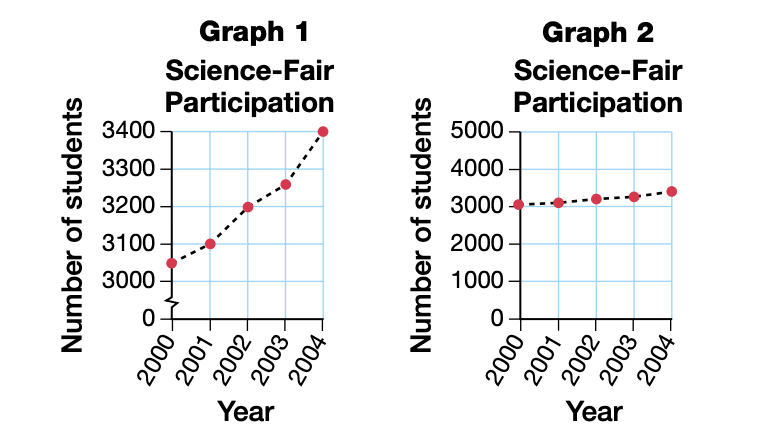
The scale on the y-axis of Graph #1 is smaller, which allows the data to be represented more accurately on Graph #1. The line is ascending more drastically on Graph #1 than on Graph #2.
How many glasses of milk did Tommy drink on Weeks 2 + 3?
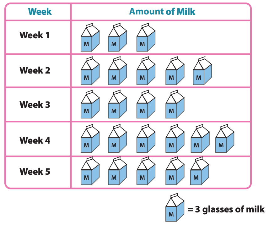
27 glasses of milk
What are three things you'd fix about this graph?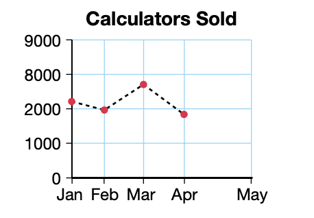
The scale should be consistent along the y-axis, the months should be spaced consistently along the x-axis, and there should be titles along the x-axis and y-axis.
What is the mean of this data set?
50 - 50 - 50 - 50 - 50 - 40 - 25
315 divided by 7 = 45
Determine the amount of water that will be wasted on Day 5 + 6.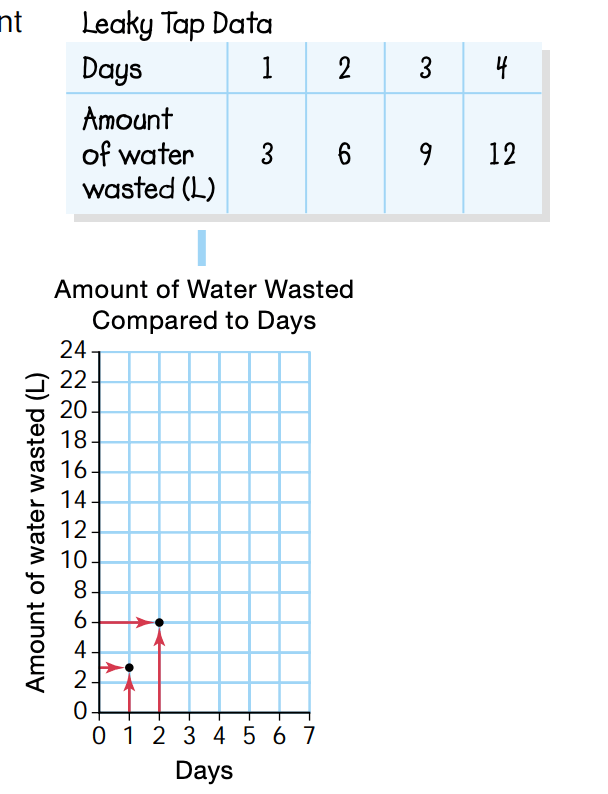
Day 5 = 15
Day 6 = 18
What is the most appropriate scale for this graph?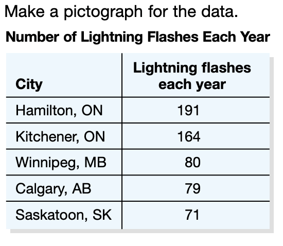
Increase by 20's.
Which took longer - filling, or emptying? Explain.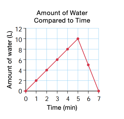
Filling took 5 minutes, while emptying took 2 minutes.
What is the median of this data set?
45 - 93 - 32 - 20 - 19 - 18 - 46 - 70
32 + 45 = 77
77/2 = 38.5
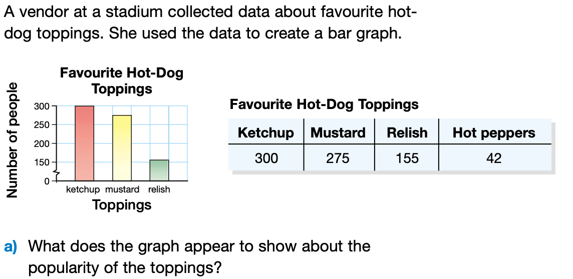
Answers may vary.
How many miles were driven each week?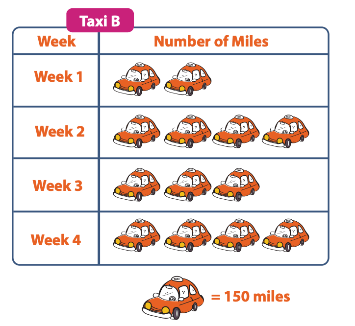
Week 1 = 300
Week 2 = 600
Week 3 = 450
Week 4 = 600
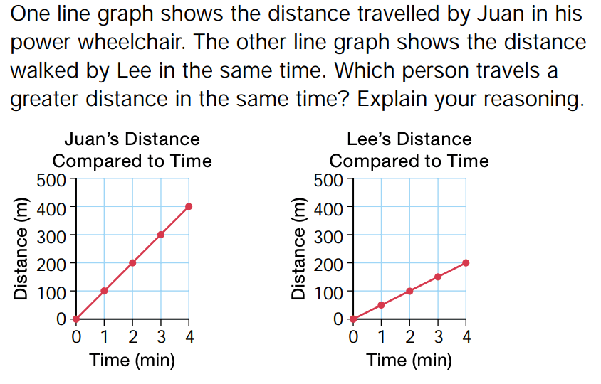
Juan travels a greater distance in the same amount of time.
What is the mode of this data set?
45 - 32 - 15 - 32 - 90 - 45 - 76 - 32
32
Which graph might the organizers of the Science Fair choose to show potential sponsors? Why?
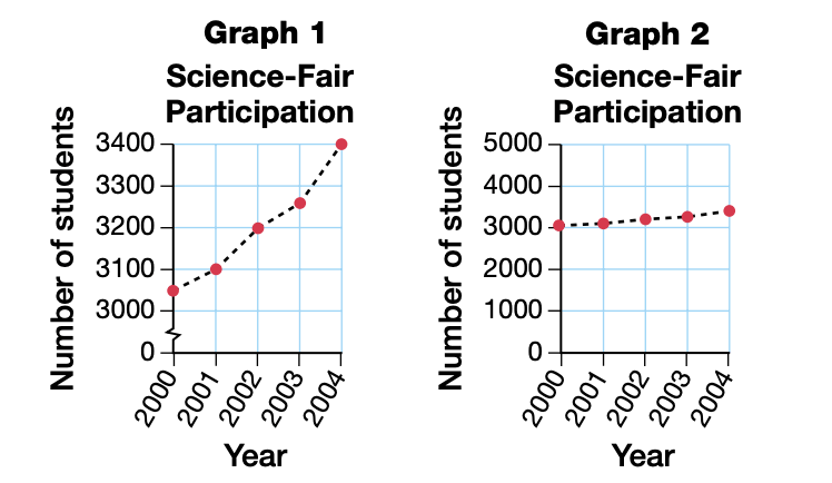
Graph #1 - shows a more drastic increase which will make the sponsors think that the attendance has increased drastically throughout the years.
How many carrots were eaten in total?
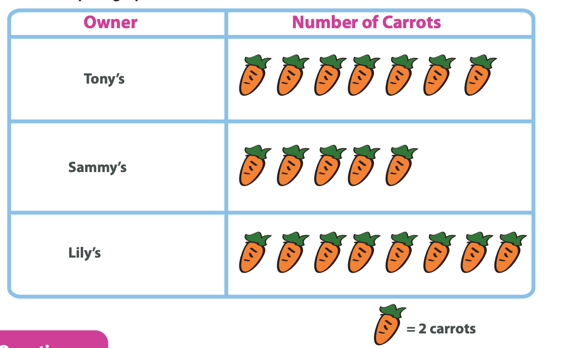
40
Which part of the line graph shows the container being filled? Explain.
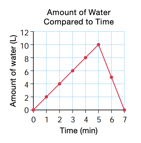
Answers may vary.
What is the mean of this data set?
56 - 32 - 15 - 14 - 14 - 34 - 23
188/7 = 26.8
Describe the data on this graph.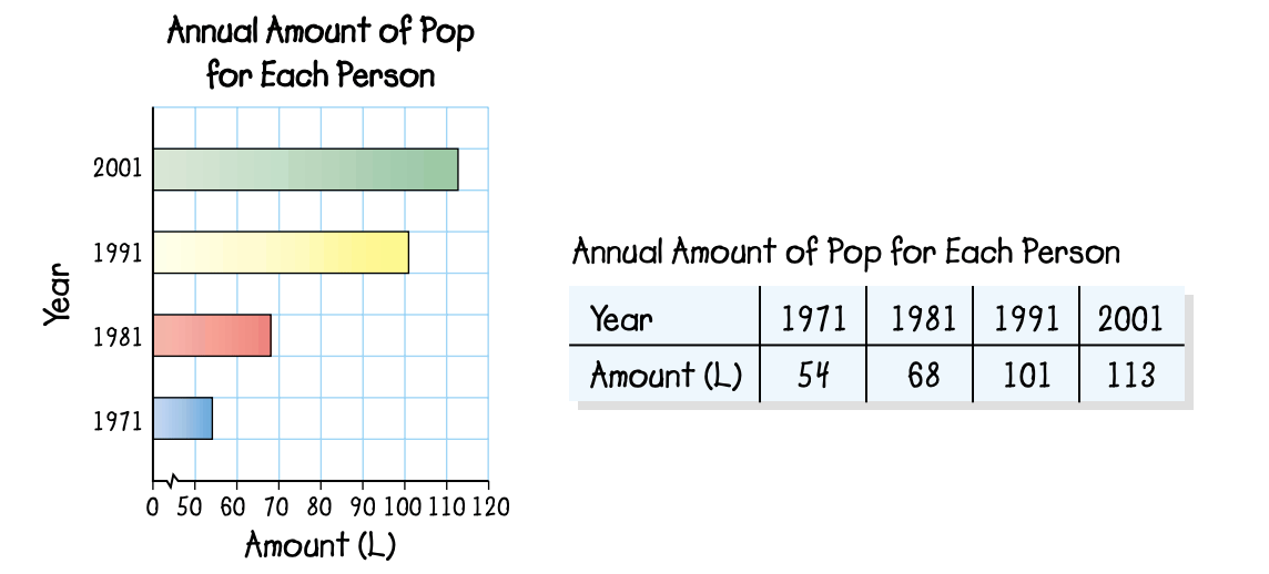
Answers may vary
What is the range of this data?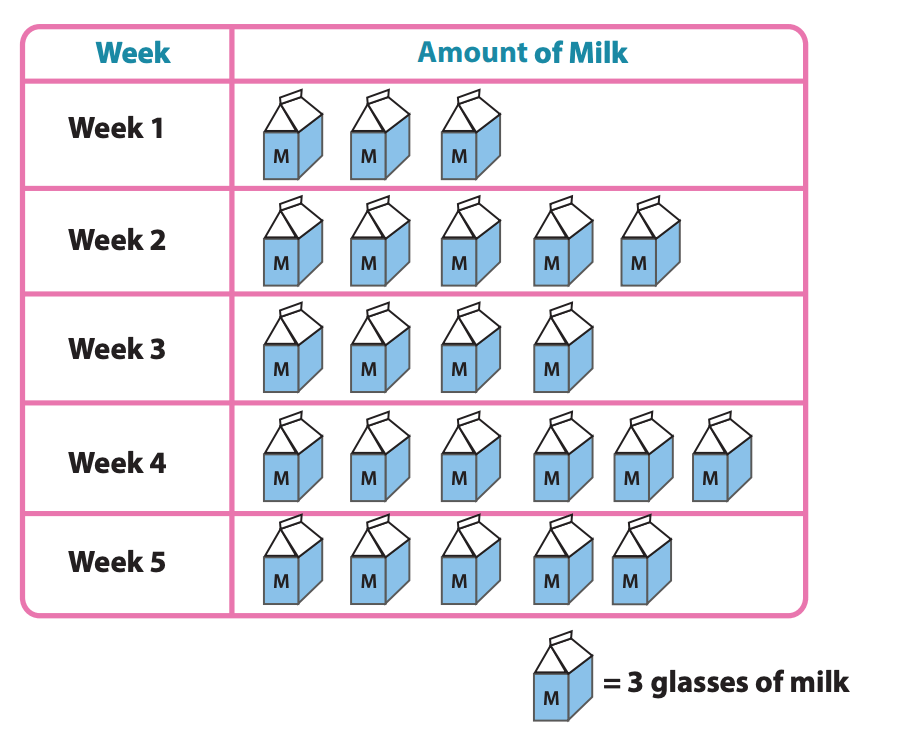
18 - 9 = 9
What are three things that are wrong with this pictograph, and how would you fix them?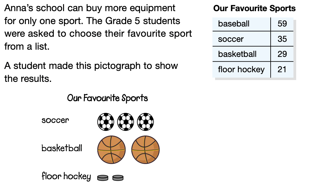
All images should be the same, they should all be the same size in order to show that they all represent the same scale, and baseball should be added to the chart.