Decide if each of the following are either categorical or quantitative variables.
• manufacturer
• cost
• screen size
• type
• performance score
• manufacturer (categorical)
• cost (in dollars, quantitative)
• screen size (in inches, quantitative)
• type (categorical)
• performance score (quantitative).
What do you look for when looking for the shape of a distribution?
To describe the shape of a distribution, look for, single vs. multiple modes, symmetry vs. skewness, and outliers/gaps.
What are the benefits of using a histogram?
A histogram uses adjacent bars to show the distribution of a quantitative variable. Each bar represents the frequency (or relative frequency) of values falling in each bin.
What is one thing beyond SOCS that must be done when comparing two sets of data.
One thing many students forget to do is to answer the question if there is one, such as, what conclusion can be drawn from this comparison.
what does it mean for a graph to be normal?
When it has a bell shape, or normal distribution, and the mean, median, and mode are all the same
What does it mean for a variable to be independent?
Variables are said to be independent if the conditional distribution of one variable is the same for each category of the other. We’ll show how to check for independence in a later chapter.
How does an outlier affect the variance of a set of data?
The spread(range) and mean is effected, while the median and IQR is less likely to be changed.
What does SOCS stand for
Shape, Odd, Center, and Spread
What must be done when comparing distributions?
When comparing the distributions of several groups using histograms or stem-and-leaf displays, consider their:
-Shape
-Odd
-Center
-Spread
Also known as SOCS in class, but must compare between both distributions.
Interpret z-score.
How many standard deviations below/above the mean a piece of data is in a set of data
What is the difference between a population and sample?
A population are all the cases we wish to know about, while a sample are the cases we actually examine in seeking to understand the much larger population.
What must be included in a 5-number summary?
The 5-number summary of a distribution reports the minimum value, Q1, the median, Q3, and the maximum value.
When do you know when to use median or mean as a center
This is usually decided upon based on context of the data and which one a person believes fits the data set better. Just make sure you can give a reason, such as more number so mean is better representing the data.
What all is involved with comparing boxplots
-Compare the shapes. Do the boxes look symmetric or skewed? Are there differences between groups?
-Compare the medians. Which group has the higher center? Is there any pattern to the medians? u
-Compare the IQRs. Which group is more spread out? Is there any pattern to how the IQRs change?
-Using the IQRs as a background measure of variation, do the medians seem to be different, or do they just vary much as you’d expect from the overall variation?
-Check for possible outliers. Identify them if you can
What is the empirical rule?
In a Normal model, about 68% of values fall within 1 standard deviation of the mean, about 95% fall within 2 standard deviations of the mean, and about 99.7% fall within 3 standard deviations of the mean.
Why does relative frequency not prove anything?
Although frequency can be useful to measure the difference in proportions, it is simply a proportion, not an number that can be used as evidence in many cases.
The first 6 prices of items at a store is 39.99, 4.99, 9.99, 17.99, 24.99, and 14.99. Is the $39.99 item an outlier?
Yes.
24.99(Q3)-12.49(Q1)=12.5(IQR)(1.5)=18.75
Median=14.99
14.99+18.75=33.74<39.99
How do you figure if data is an outlier?
Find the IQR, multiply it by 1.5. With that number add it to Q3 and substrate it from the Q1, any number in that spread is not an outlier.
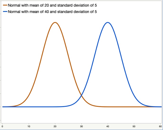
Compare these Distributions

The shape is approximately normal in both.
The are no apparent outliers in both
The center is different as the yellow graph has a mean of 20, while the blue has 40.
Since they are both approximately normal, the have similar IQR's.
A normal distribution with a mean of $300 and a SD of $34, what percentage of items will be less than $250
normalcdf(-1000,250,300,34)= 7.07%
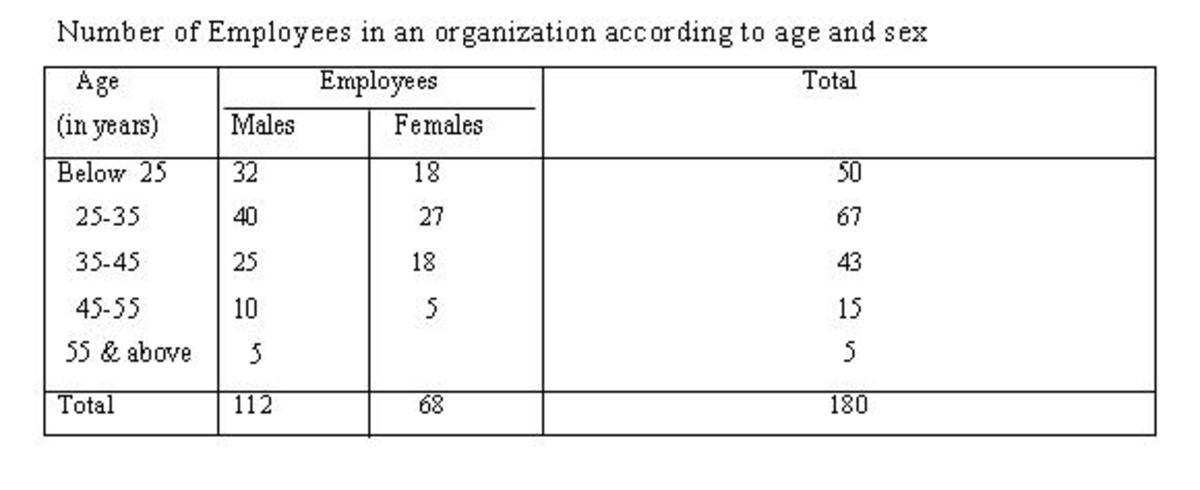
If the employee is a male, what is the relatitive frequency that they are ages 25-35
40/112=.357
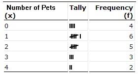
Make a 5 number summary for the following

min=0
Q1=1
mean=1.65 and Median=1.5
Q3=2.5
max=4
Describe the Distribution:
Shape - Skewed Right
Odd - Potential outlier at 700
Center - Around 200
Spread - Ranges between 0-700 seconds
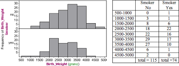
Compare the graphs of the Yes and No smoking for birth weight. What conclusion can be drawn from this.

Yes is slightly skewed right, while no is slightly skewed left. There are no outliers in either graph. The median appears to be higher in the no graph in comparison to the yes graph. No graph IQR seems to be slightly higher and the max is great than the yes graph, while the yes graph also has a lower minimum than the no graph. According to the graphs, babies that are born from people that don't smoke tend to weigh more at birth compared to people that do smoke.
If z=-2.57, s=5.5, and the mean is 65. What is the value of this piece of data
50.865