The elements used on one side of a design that is similar to those on the other side
symetrical balance
 The repeating of an object or symbol all over the piece of art
Pattern
 light reflected off an object
Color
 Service quality that can be seen and felt, they don't always feel the way they look.
Texture
The only true colors (red,yellow,and blue)
Primary colors
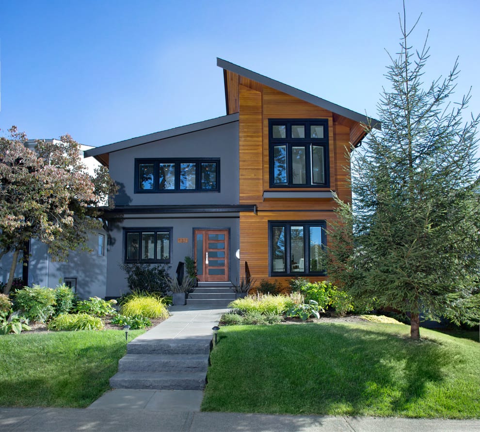 the sides are different but still look balanced
asymmetrical balance
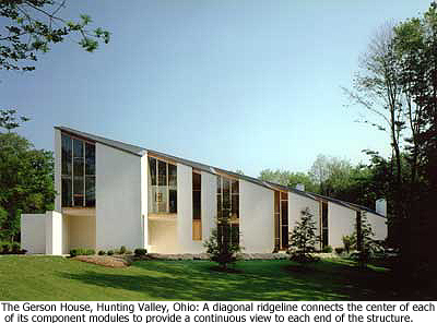 The feeling of unity (sizes,amounts, and numbers ) relate well with each other.
Proportion
 Three dimensional shapes expressing length width and depth,(example:cylinder)
Forms
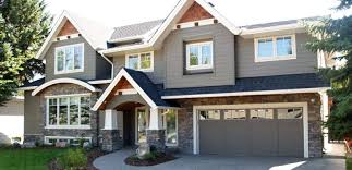 The name of a color (example : maroon)
Hue
When two primary colors are mixed together(green,orange,purple)
Secondary
the elements are arranged around the center point
radial balance
 Works with pattern to make the piece of art feel active( creates unity with in the art).
Repetition
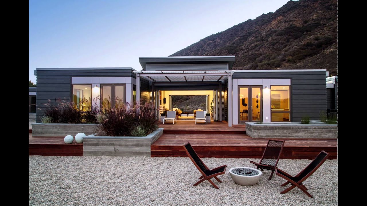 A mark with greater length than width. ( thin or thick,curved or straight, horizontal, vertical , diagonal).
Line
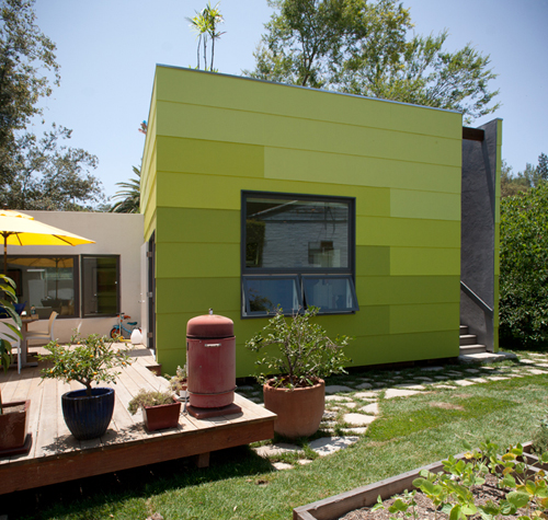

how light or dark something is
Value
When a primary color and a secondary color are mixed together (blue;green, blue;purple, yellow;green)
Intermediate
 part of the design that catches the viewer's eye ; usually the artist would make one area stand out by using contrast.
Emphasis
 When one or more elements are used to create a feeling of organized movement.(variety is essential)
Rhythm
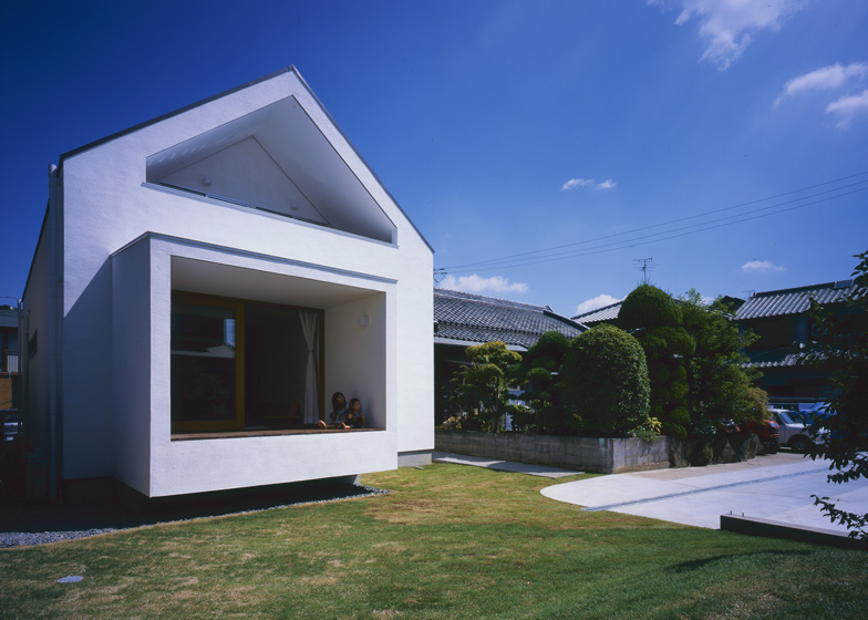 A closed line and can be geometric and free-form( are flat that express length and width).
Shapes
how bright or dull something is
Intensity
Colors that are located across the color wheel, they do not share a common color(red&green)
Complementary
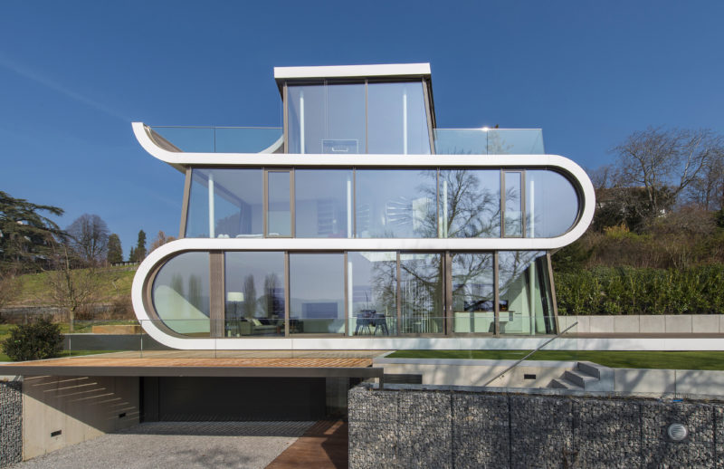 The path that viewers eye takes through the work of art
Movement
 The feeling of harmony with all the parts of the work of art, creates a sense of completeness.
Unity
 The area between and around objects ,( can refer to the feeling of depth).
Space
 1. distribution of visual weight of objects,color,texture,and space
Balance