Random
Bar Graphs
Parts of a graph
2 & 5 facts
Pictographs
100

Which was the least favourite sport?
Ice Hockey
100
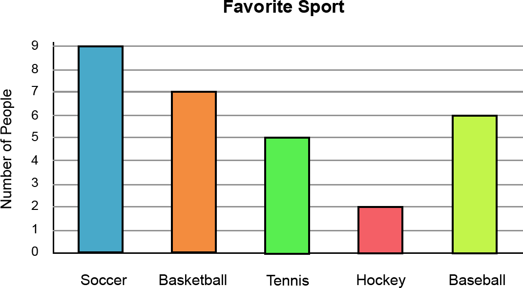
How many students like baseball the best?
6 people
100
What do we call the name of the graph that tells what the graph is about?
Title
100
2 x 5 =
10
100
looking at the pictograph on the whiteboard, which fruit received the least amount of votes?
Apple
200
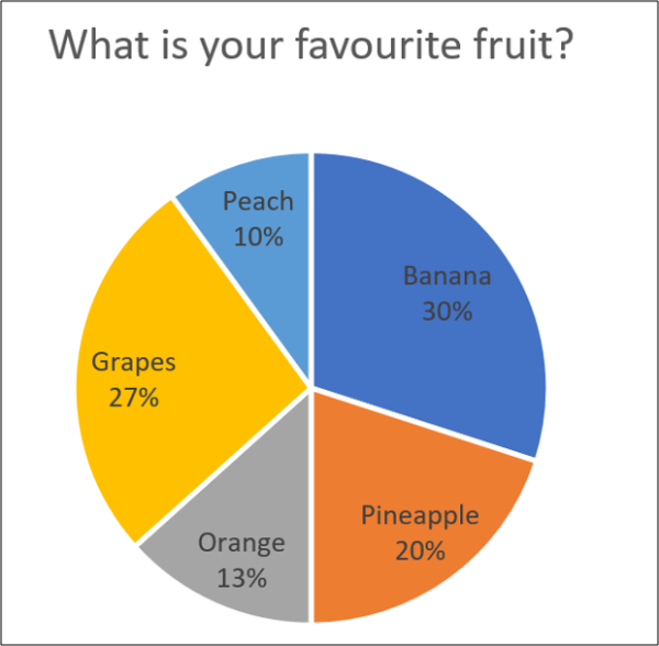
What percentage of people liked grapes and bananas?
57%
200
How many total people completed the survey?
29 people
200
Which part of the graph goes across the bottom and shows the categories or labels?
X-axis
200
4 x 5 =
20
200
looking at the pictograph on the whiteboard, which fruit received 4 votes?
Apple
300
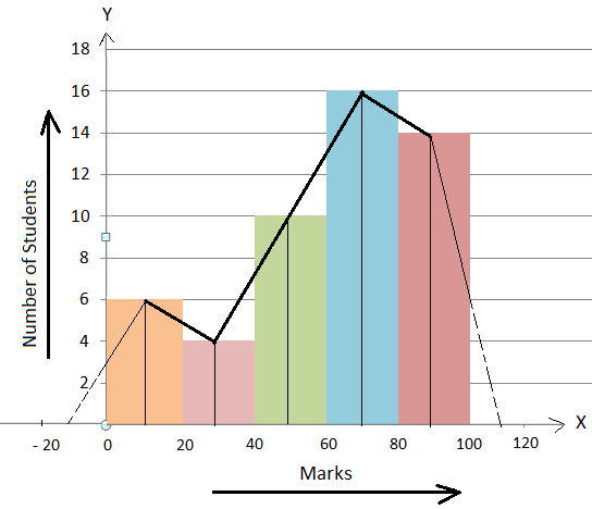
How many students scored 40 marks or below?
10 students
300
How many more students like Soccer than Basketball?
9 - 7 = 2 students
300
Which part of the graph goes up and down and shows the numbers or amounts?
Y-axis
300
2 x 9 =
18
300
looking at the pictograph on the whiteboard, How many more votes did mangos receive then apples?
16
400
382 + 213 =
595
400
What is the most favorite sport?
SOCCER
400
What do we call the numbers on a graph that tell us how much each step is worth?
scale
400
5 x 7 =
35
400
looking at the pictograph on the whiteboard, how many votes did bananas and strawberry's receive altogether?
28
500
643 - 336 =
310
500
How many people picked a favourite sport that is played on a court?
12 people
Basketball and Tennis are played on courts, the others are played on fields or pitches
500
What do we call the information shown on a graph using bars or pictures?
Data
500
5 x 9 =
45
500
looking at the pictograph on the whiteboard, how many people voted altogether?
52