Reading Line Plots
Reading Data Sets
Whole Number Line Plots
Histogram
Box Plots
100
Use the following line plot to answer the question:
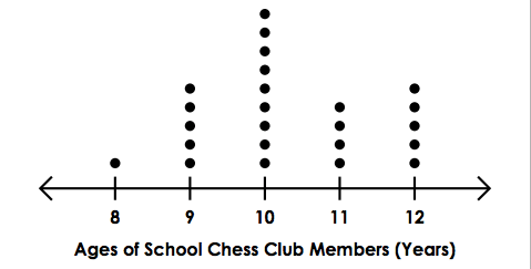
What is the most common age?
10 years old
100
What is an Outlier?
A piece of data that is separate from the rest of the data.
100
Use the following line plot to answer the question:
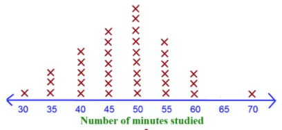
What was the LEAST common number of minutes studied?
30 and 70 minutes.
100
What is one difference between bar graphs and histograms?
Bar graphs have spaces between the bars, Histograms do not. Histograms have intervals. Bar Graphs tell you about certain categories.
100
What is the median?
15
200
Use the following line plot to answer the question:

What is the Age of the youngest Chess Club Member?
8 years old
200
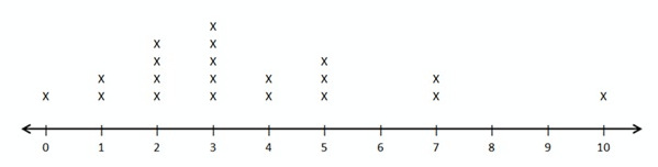
Look at the following data set:
8, 6, 5, 5, 3, 4, 3, 6, 7, 5, 6, 7, 8
On a number line, how many X's would be placed above the number 5?
3 X's
200
Use the following line plot to answer the question:
What is the most common age?
10
200
For a histogram, the frequency is always on which axis?
y-axis
200
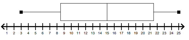
What are the lowest and highest number?
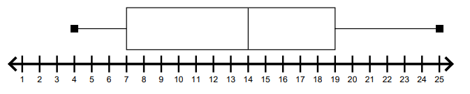
Lowest-4
Highest-25
300
Use the following line plot to answer the question:
What is the age of the oldest Chess Club Member?
12 years old
300
Look at the following data set:
8, 6, 5, 5, 3, 4, 3, 6, 7, 5, 6, 7, 8
Which number is the LEAST common?
4
300
Use the following line plot to answer the question:
 Is there an outlier in this lineplot? If so, what is the outlier?
Yes, 10
300
What goes on the x-axis for a histogram?
The intervals
300
Find the Interquartile Range
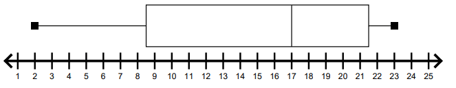
13
400
Use the following line plot to answer the question:
How many Chess Club Members are younger than 11 years old?
15 Chess Club Members
400
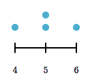
Make a line plot using the following data set:
5, 4, 5, 6
400
Use the following line plot to answer the question:
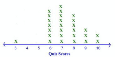
How many people scored higher than 7 on the quiz?
11
400
These are important to histograms. They go from one number to another. They must be equal. They cannot overlap. Each number can only belong inside one. What are they?
Intervals
500
Use the following line plot to answer the question:
How many total members are in the Chess Club?
24 Members
500
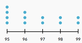
Make a line plot using the following data set:
99, 97, 95, 96, 95, 95, 96, 95, 99, 98, 98, 97, 96
500
Use the following line plot to answer the question:
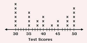
What is the difference between the highest and the lowest test scores?
50 - 30 = 20
500
This is the histogram that is labeled correctly. Be ready to defend your decision.
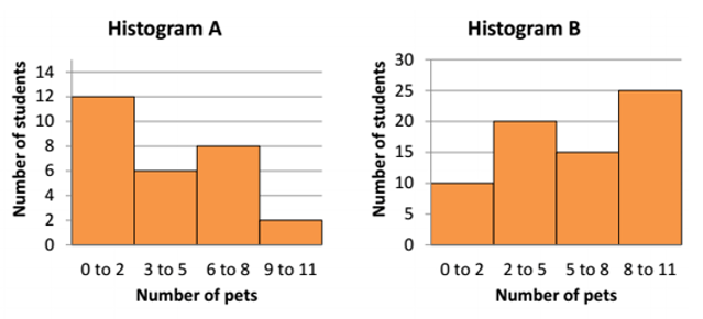
Histogram A