Slope
Y-intercept
Scatter Plots
Scatter Plots Cont.
Data Display
100
This is the slope of the line that passes through the points (-2, 5) and (1, 14)?
What is 3?
100
This is the y-intercept of the line y=3x-2.
What is -2?
100
This is the correlation of a scatter plot that is graphing time spend studying vs. time spent playing video games.
What is negative?
100
This scatter plot has a stronger correlation.
What is the second scatter plot?
100
The data display that compares categorical data
What is a bar graph
200
This is the slope of the line that passes through the points (3, -5) and (6, -4).
What is
1/3?
200
This is the y-intercept of the line y=5+7x.
What is 5?
200
This is the correlation of a scatter plot that is graphing height vs. IQ.
What is No Correlation?
200
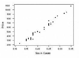
The line of best fit for this scatter plot has this y-intercept.

What is around 250?
200
The data display that shows changes over time
What is a line graph
300
This is the slope of the line y=3x-4?
What is 3?
300
This is the y-intercept of the line
y=-2/3x+1
What is 1
300
This is the correlation of a scatter plot that is graphing distance of road trip vs. amount of money spent on snacks at gas stations.
What is positive?
300
This is the equation for the line of best fit below.
y=2x
300
The data display that represents data as part of a whole
What is a circle graph
400
This is the slope of the line
y-3=1/4(x-2).
What is
1/4?
400
This is the y-intercept of the line x=-5
What is TRICK QUESTION! It is a vertical line
400
This is the visual tool that is used to make predictions with scatter plots.
What is the trend line, or line of best fit?
400
This is the expected sales if the temperature is 20 degrees Celsius. 
What is 450?
400
The data display that organizes data into quartiles
What is a box and whisker plot
500
This is the slope of a vertical line.
What is undefined?
500
This is the y-intercept of the line that passes through the points (-2, 7) and (3, 22).
What is 13?
500
When you are writing an equation for the line of best fit, how do you determine the y-intercept?
What is look at where the line cross the y-axis?
500
This is the time I should spend studying if I would like to get a 90% on the final. 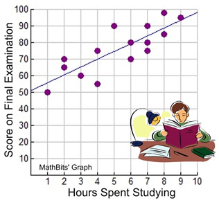
What is 8.5 hours?
500
The data display that compares frequencies of data in equal intervals
What is a histogram