Types of Graphs
Exploring Types of Data
Correlations and Outliers
Measuring Central Tendencies
Infographics/Misleading Graphs
100
This specific type of graph
What is a Double Bar Graph?
100
What is qualitative and quantitative data?
Qualitative Data refers to data that represents a quality (favourite colour, favourite movie, etc.)
Quantitative Data refers to fixed attributes that can be represented by a number (height, weight, etc.)
100
What kind of correlation is there?

There is No Correlation/ No Relationship
100
What is the mode
The number in a data set that appears the most
100
What is an infographic?
Infographics are a visual representation of data. They incorporate charts, graphs, symbols, images, and text to communicate information clearly
200
A Class tracked the daily temperature for two weeks. Which graph would be best, and why?
A line graph, to show change over time.
200
What is the difference between discrete and continuous data?
Discrete refers to whole numbers, while continuous can be represented by decimals or fractions.
200
What kind of coorelation is herre>
Strong Positive Correlation/Relationship
200
How do you find the median if there are two numbers in the middle?
Add them and divide them by two.
200
Name a reason a graph might be misleading
Intentionally Misleading graphs are used to skew data so as to convince someone of something
Unintentionally misleading graphs are human error
300
What are the limitations of using a pictograph (must have at least three)
Hard to compare
Image may not represent exact quantities
Not suitable for large data
Not suitable for complex data
300
On a volleyball team, the number of points is compared to the number of hours they practice.
Is this one-variable or two-variable data?
This is two-variable data as it is comparing two different things.
300
Which measure of central tendency is often changed drastically by adding an outlier?
The mean (average is changes when adding an outlier.
300
Find the median of these numbers
12, 13, 15, 17, 19, 22, 24, 25
18
300
Name three types of graphs that might be on an infographic?
Bar Graph
Scatter Plot
Line Graph
Pie Graph
Pictograph
400
What are the components of a bar graph?
- Title
- Labels on X and Y axis
- A good scale/consistent scale
- Accurate Bars
- Colours are ideal
400
The number of students celebrating Christmas over the last ten years.
Is this one variable or two variable?
This is two-variable data as it shows the comparison of two different variables.
400
What kind of relationship is this photo?

This photo has weak negative correlation
400
What central tendency is best used to describe the average?
How do you find it?
The Mean
Add up all the numbers and divide by how many there are?
400
If Company A wants to create a misleading bar graph to make Company B's sales look bad, how might they do it?
They might omit data
They might manipulate the scale
They might make the bar sizes inconsistent
500
Bartholomew conducted a class survey to determine which sports students liked to play. He tried to put it into a line graph but found it didn't work well. Why?
Line graphs are not suitable for qualitative data
500
A researcher conducts a fitness survey and records their weight and height.
Is this discrete or continuous, one variable or two variables, and is this quantitative or qualitative data?
This is an example of continuous, two-variable, and quantitative?
500
If there is positive correlation, what changes when the x-axis increases
The Y-axis also increases
500
What is frequency?
The number of times something happens
500
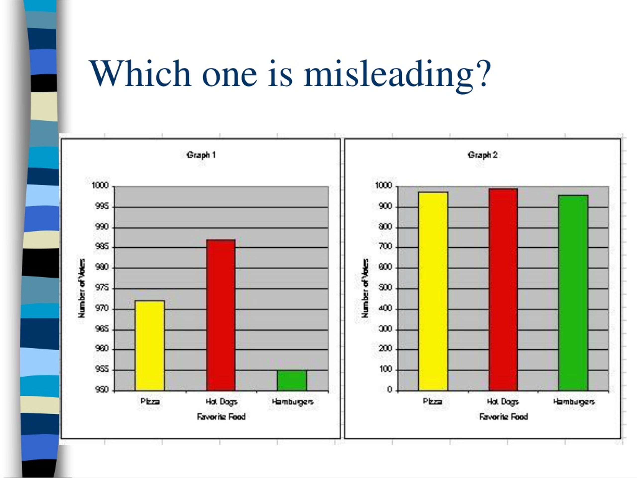
Graph 1 is misleading