Enter Category Name
Enter Category Name
Enter Category Name
Enter Category Name
Enter Category Name
100
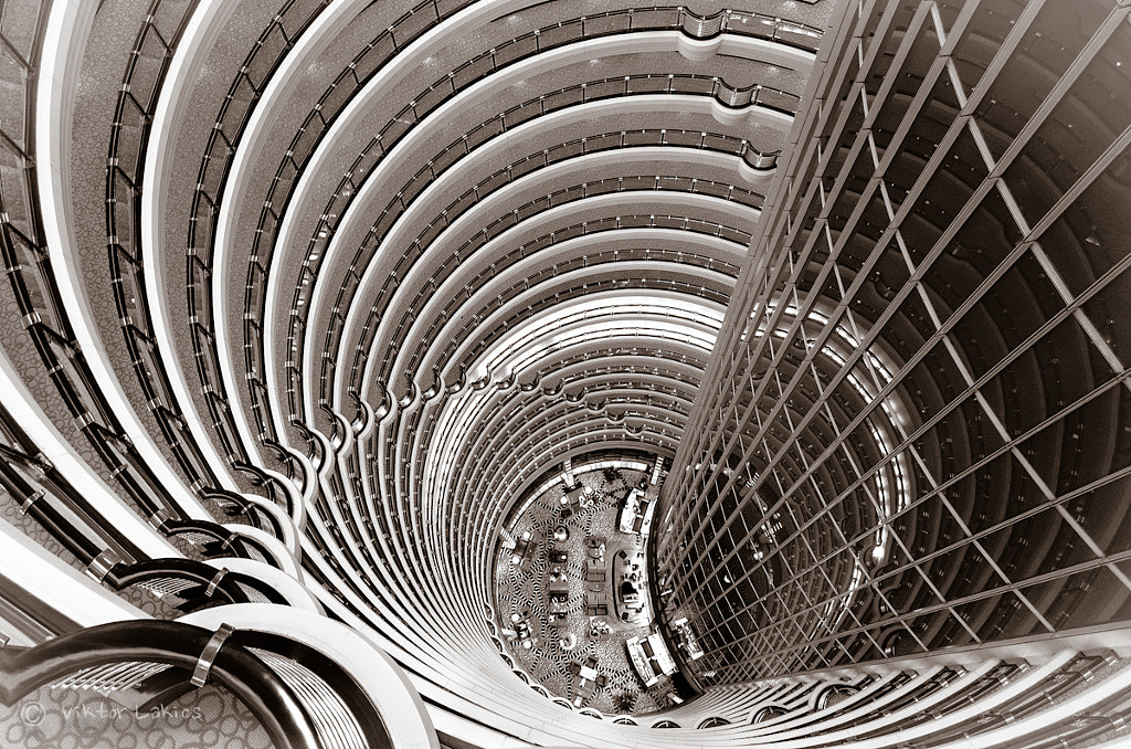
when the elements used on one side of the design are similar to those on the other side
symmetrical balance
100
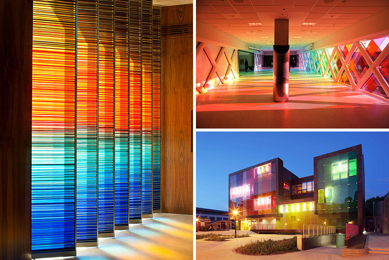
the repeating of an object or symbol all over a work of art

pattern
100
the light reflected off of objects
color
100
an objects surface quality that can be seen and felt (i.e.: smooth, rough, hard, sharp, etc.)

texture
100
purple, green, and orange; the colors made when mixing two primary colors
200
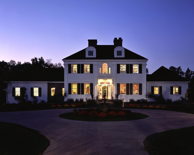
when the sides of a building are different but still look balanced

asymmetrical balance
200
the size of objects in relation to other objects
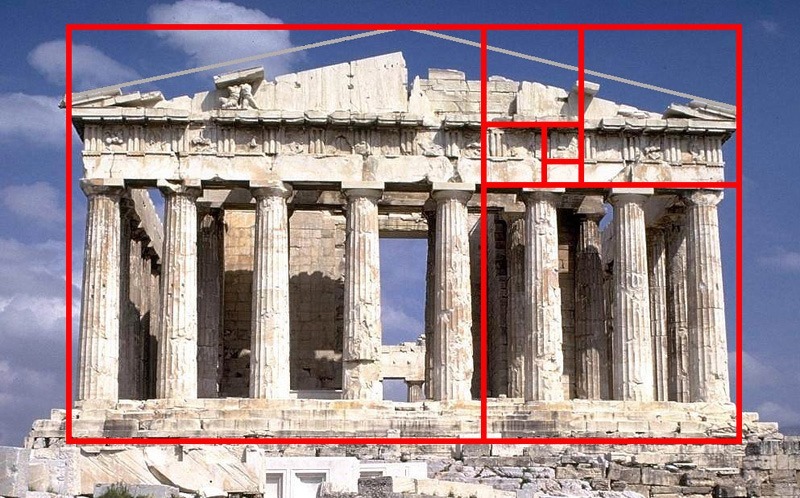
proportion
200
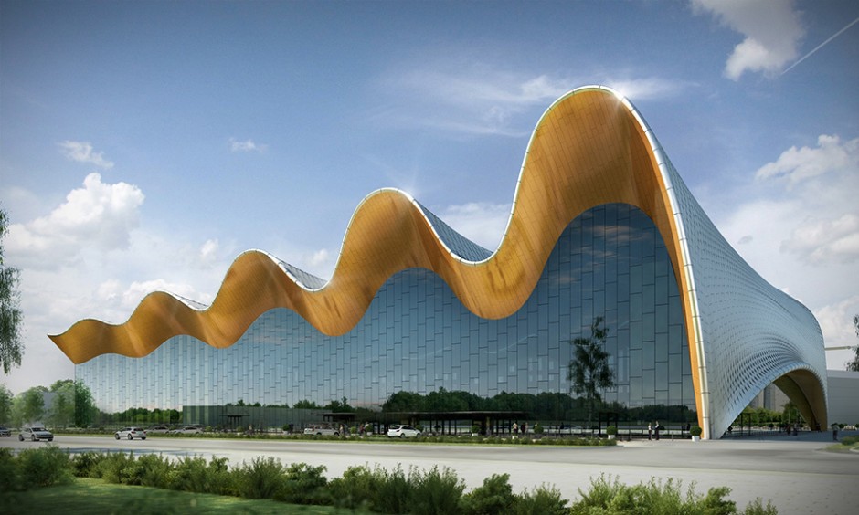
three-dimensional shapes that express length, width, and depth

form
200
the name of a color (blue, green, red, orange, etc)

hue
200
colors made when mixing a primary and secondary color that are next to each-other on the color wheel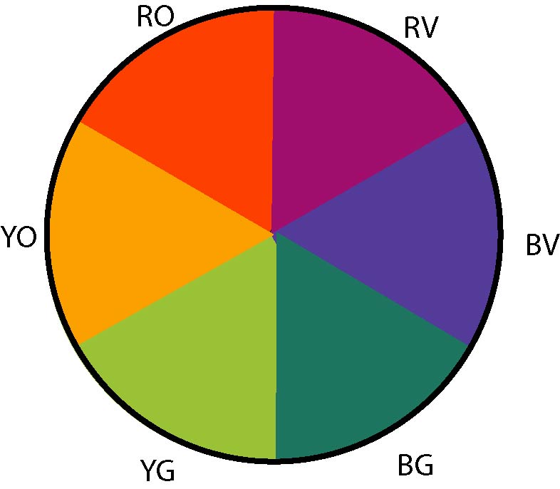
intermediate colors / tertiary colors
300
when an element is arranged around a central point

radial balance
300
the repeating of design elements in a work of art; makes the art seem active

repetition
300
a mark with a greater length than width
line
300
how light or dark a color is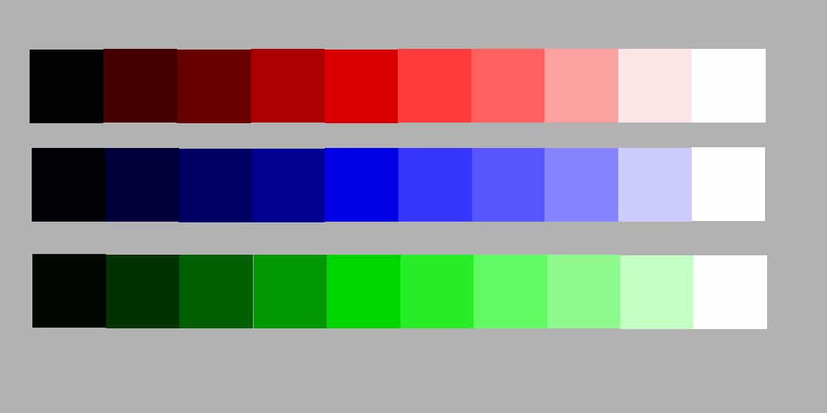
value
300
two colors that are on opposite sides of the color wheel
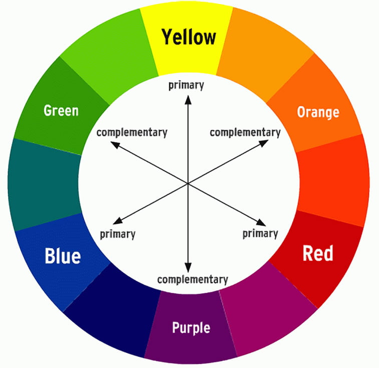
complementary colors
400
part of a design that catches the viewers attention/stands out

emphasis
400
this is when one or more elements of design are used repeatedly to create a feeling of organized movement
rhythm
400
a closed line; can be geometric or organic

shape
400
how bright or dull a color is
intensity
500
the path that the viewer’s eye takes through a work of art, usually towards focal areas
movement
500
the feeling of harmony in all parts of a work of art; gives a sense of completeness

unity
500
area between or around objects
space
500
red, yellow, and blue; the only true colors
primary colors