Definition (A)
Intro to scatter plots (B)
Trend lines (C)
Regression equations (D)
100
Points on a graph; displays two variables for a set of data

scatter plot
100
Tim wants to predict how much energy he will use to heat his home based on how cold it is outside. The table below shows the mean amount of gas per day that Tim used each month and the average temperature that month for one heating season. All of the scatter plots below display the data correctly, but which one of them displays best?

D) Graph D
100
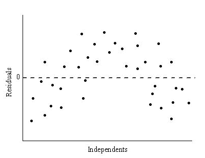
~Residual Plots~
The graph displays a residual plot that was made after doing a least squares regression on a set of bivariate numerical data(x, y)
What can you conclude from this graph?

The least squares regression equation overestimate y more often that it underestimates y
100
Consider removing the outlier (99, 35) and calculating a new least squares regression lines.
What effects would removing the outlier have?

The slope of the least square regression would decrease
200
A linear through a model of a scale or data points

linear regression
200
Samantha wants to predict how many people use the internet each day based on their age

B) By age 30-35 internet use is high
200
Catelyn's math test included a survey questions asking how many hours students pend on their phones. The scatter plot below shows the relationship between how many hours students spend on their phones an playing outside.
Which of linear equations best describes the give chart?

y= 20x+20
200
Ned distributed to his fellow students asking them how many hours they spent playing sports in the past week. He also asked them to rate their mood on a scale from 0-10. (hours labeled on the bottom)
Estimate the mood rating for a student that spend 2.5 hours given the equation is y= -1.5x + 5

8.75
300
The slope that represents the changes in y as x changes

regression line
300
What's the best description of the relationship in the scatter plot below

C) Nonlinear association
300
The scatterplot show the relationship between hours and test scores. Which equation best describes the graph best.

y= 5x+ 5
300
The equation that best describes this is...

y= 5/22x + 40
solution: (0,40) (22,45)
45-40/22-0 = 5/22
y= 5/22x + 40
400
How close the data are to the fitted regression line, it indicates that whether the variability response data around its mean
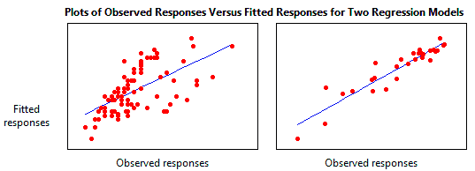
R squared
400
Match the correlation coefficients with scatter plot below
r= 0.65, r= 0.84, r= -0.02, r= -0.72

Scatter plot A= -0.72
Scatter plot B= 0.84
Scatter plot C= -0.02
Scatter plot D= 0.65
400
What is the best description of the relationship of this graph

negative linear association
400
What effects of removing the outlier (10, -18) have?

Y-intercept of least squares regression line would increase
500
Points that are randomly dispersed around the horizontal axis; shows the relationship between a given independent variable and the response variable
residual plots
500
The percentage of adults who sleep recorded every few years since 1980 suggest a positive linear association with not outliers. On average the percentage up by 0.5 each year. Which of the following plots suits the description.

graph 2
500
This graph displays a residual plot that was constructed after running a least square on regression from on a set of bivariate numerical.
Which can you conclude from this graph?

There does not appear to be a linear relationship between x and y
500
What is the squared error of (x2, y2) on the graph

y2- (mx2 + b)