Graphs
Definition
100
Describe whether this graph is categorical or quantitative? why?
The graph is quantitative because it expresses variables of numerical/quantitative data
100
What is quantitative variable? what graphs represent quantitative data
A quantitative variable is a numerical expression of a value within graphs, Some examples of quantitative graphs are histogram,linegraph,time series,scatterplot and box plot.
200
what is it called when a graph is being drastically moving upward or downward for a certain amount of time. In which type of graphs is this possible in?
This is called a trend which is found in line graph, scatter plot, and a time serious graph.
200
What is a categorical variable? what graphs represent categorical data?
A categorical variable is a value that is taken upon a title or category. Some examples of categorical graphs are pie chart, bar chart/graph, pictogram.
300
A histogram of exam scores has a long tail stretching to the right. What type of skewness does this distribution have? is it positive or negative?
It is a right skewed which means it is positive
300
What is an outlier? how can an outlier affect the data within a graph?
An outlier is a certain value that differs from all the other values in the graph, it can affect the data by manipulating the mean causing a skewness and it can also increase or decrease the standard deviation which causes variability to change within the data set.
400
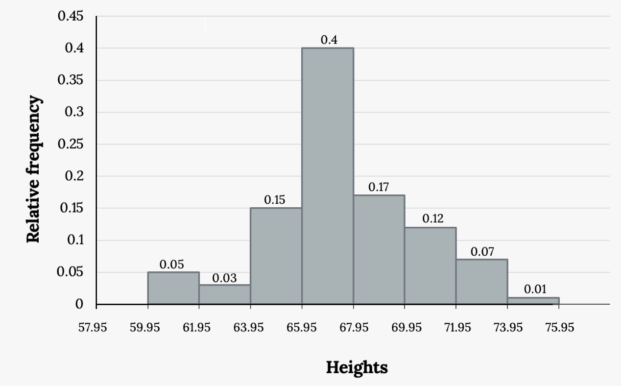
what is the variability, shape and outlier in the graph represented?
It is a low variability graph, with a bell shaped curve and the outlier is on the 100th value
400
what is skewness in a dataset or graph and how can you determine wether the skew is positive, negative or symmetrical
A skewness is how close the data is spread out in relation to the mean. If the tail of a graph is extending to the right it is positive, but if it is extending to the left it is negative, if there is no skewness and it looks like a bell shape, it is symetrical
500
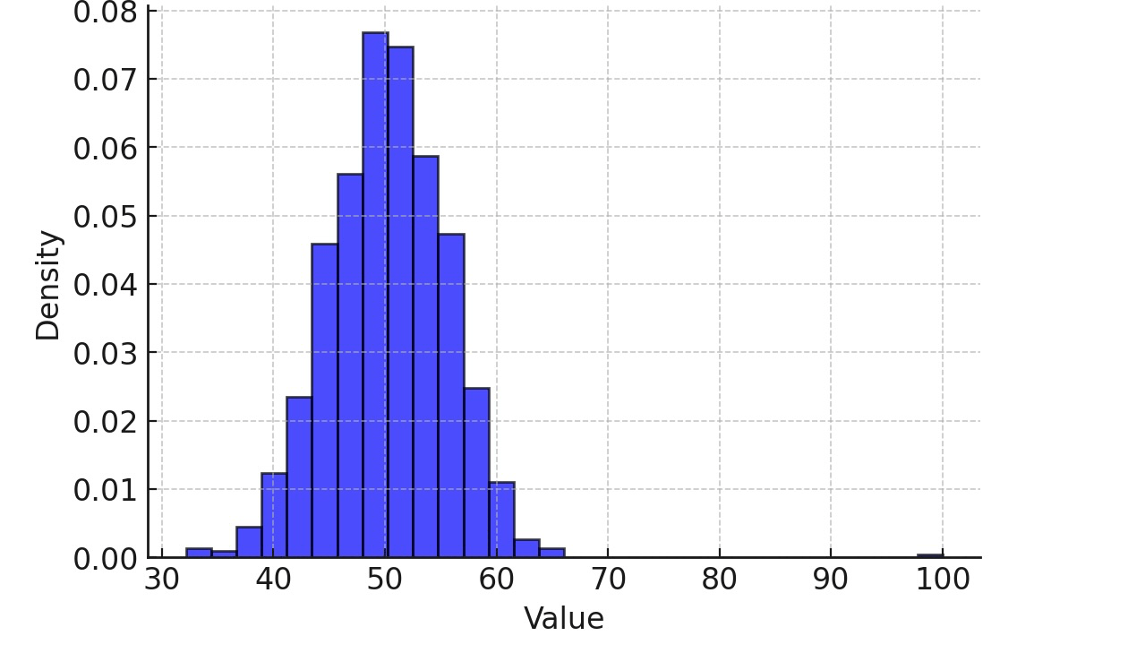
The total return on a stock is the change in its market price plus any dividend payments made. Total return is usually expressed as a percentage of the beginning price. The total returns for all 1528 common stocks listed on the New York Stock Exchange in one year.
Which graph would you consider using a stem plot or a histogram? explain
A histogram because the dataset is to large to fit into a stem plot.
500
in a data set if the mean is greater than the median what does this mean? if the median is greater than the mean what does this mean? if all median mean and mode are equal what does this mean
if the mean is greater than then the median it is a right skewed data, if the median is greater than the mean it is left skewed. if it is all equal it is symmetrical