Vocabulary
Making a Scatter plot
Describing Associations
Finding y
Calculator Skills
100
A graph with points to show the relationship between two sets of data
Scatter plot
100
This trendline fits the overall pattern of this scatter plot. True or False
True
100
Describe this association.
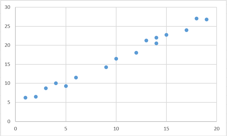
Strong, Positive, Linear
100
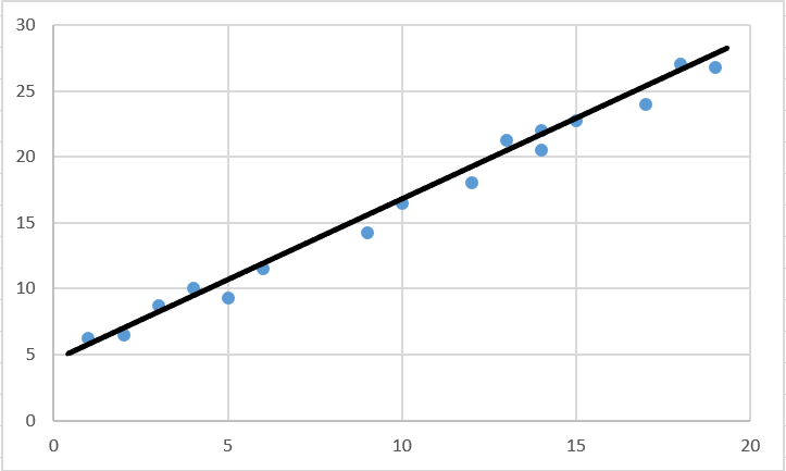
Using the scatterplot below, come up with a reasonable estimate for y when x = 5
About 20 or 21.
100
5+5
10
200
A group of points that occur together.
outlier
200
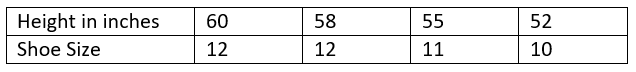
What is the Y intercept on this scatterplot:
10
200
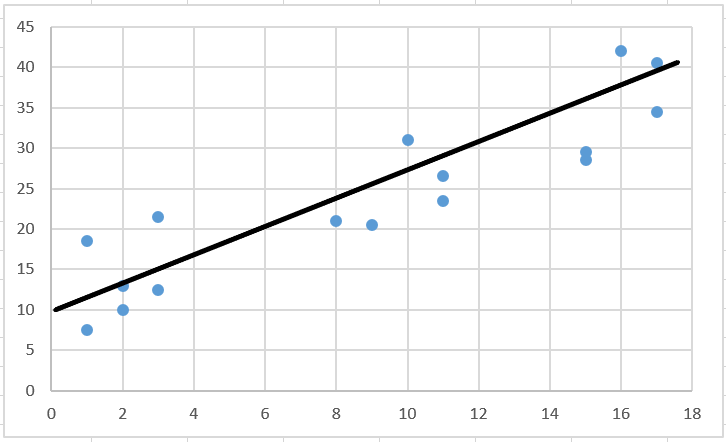
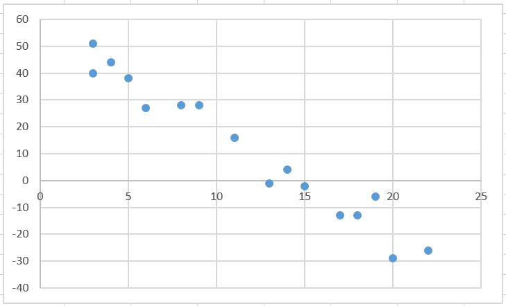
Describe this association
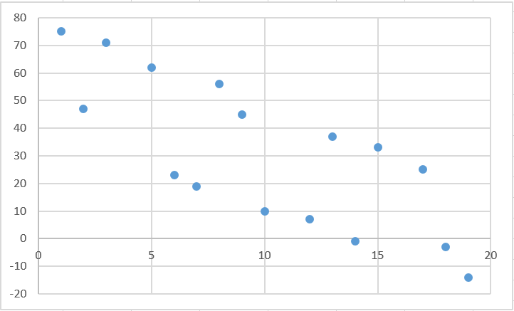
Weak, Negative, Linear
200
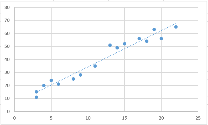
Using the scatterplot below, come up with a reasonable estimate for x when y = 60
Around 19 or 20.
200
(80 / 2)+ 2
42
300
A data point that is very different from the rest of the data
outlier
300
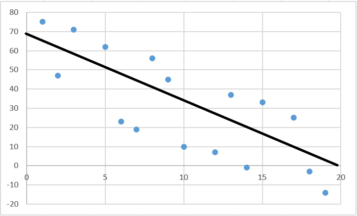
Draw a trendline on this scatterplot:

300
Describe the association:
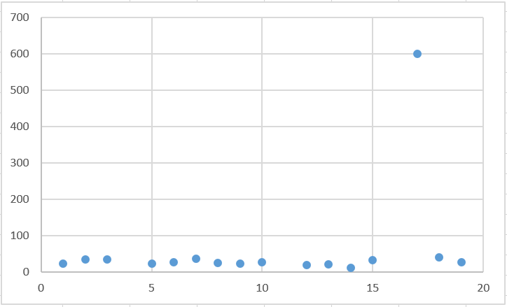
No association, with an outlier
300
Using the scatterplot below, come up with a reasonable estimate for y when x = 13
Somewhere from 40-45
300
54 + 47 - 3
98
400
A line on a scatter plot that helps show the correlation between data sets more clearly
Normally goes through at least 2 points
line of best fit
400
What is missing from the following scatterplot?

A title, labels on the axes, units
400
Describe the association
Moderate, Negative, Linear
400
Using the scatterplot below, come up with a reasonable estimate for y when x = 10
Around 20.
400
((16 x 2) / 4) + 3
11
500
Area on the graph that contains no data.
a gap
500
Would this be a positive association or negative
500
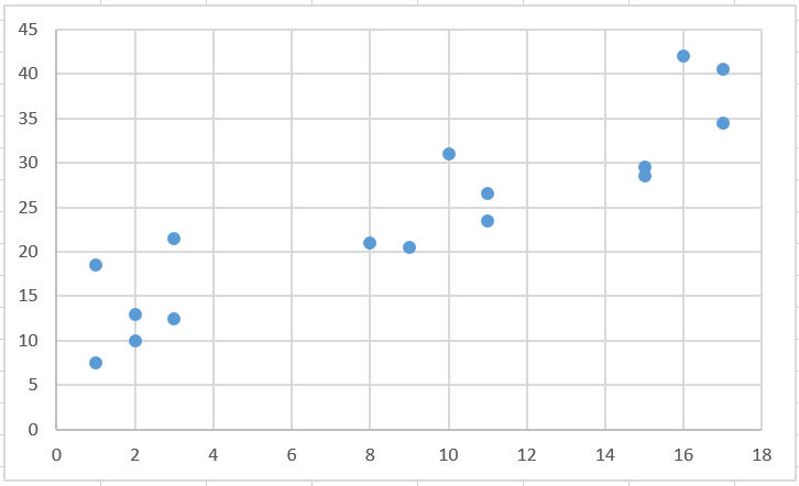
Describe the association
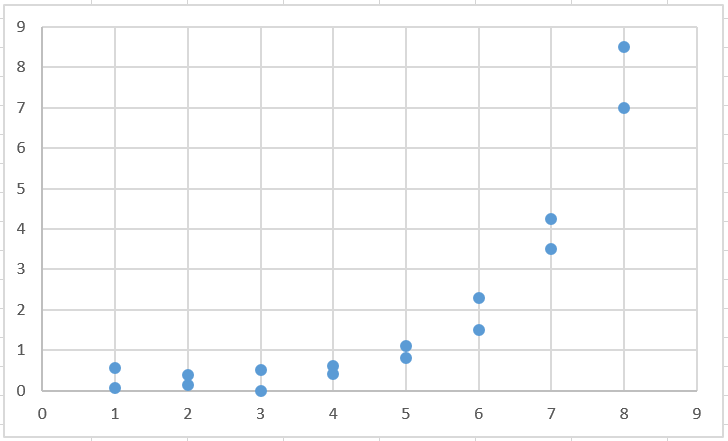
Strong, Positive, Nonlinear
500
Using the scatterplot below, come up with a reasonable estimate for x when y = 10
Around 12.
500
(10 + 9 x 4 - 13) / 3
11