Vocabulary
Review
Describing Associations
Finding y
Calculator Skills
100
A graph with points to show the relationship between two sets of data
Scatter plot
100
The horizontal axis on a coordinate plane
The X axis
100
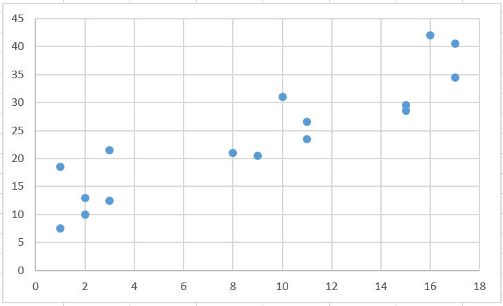
Describe this association.
Strong, Positive, Linear
100
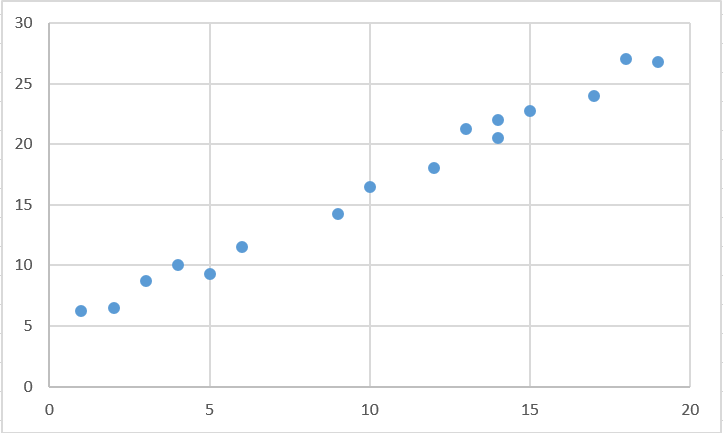
Using the scatterplot below, come up with a reasonable estimate for y when x = 5
About 20 or 21.
100
5+5
10
200
a set of closely grouped data
Cluster
200
How slope is measured
Rise/Run
change in y/change in x
y-y/x-x
200
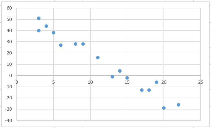
Describe this association
Weak, Negative, Linear
200
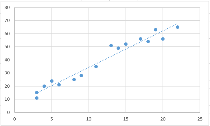
Using the scatterplot below, come up with a reasonable estimate for x when y = 60
Around 19 or 20.
200
(80 / 2)+ 2
42
300
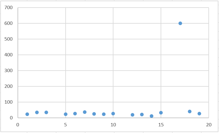
A data point that is very different from the rest of the data
outlier
300
Point A on a triangle is at (2, 3) and translated using the rule (x + 3, y - 2). The new Point A is located
(5, 1)
300
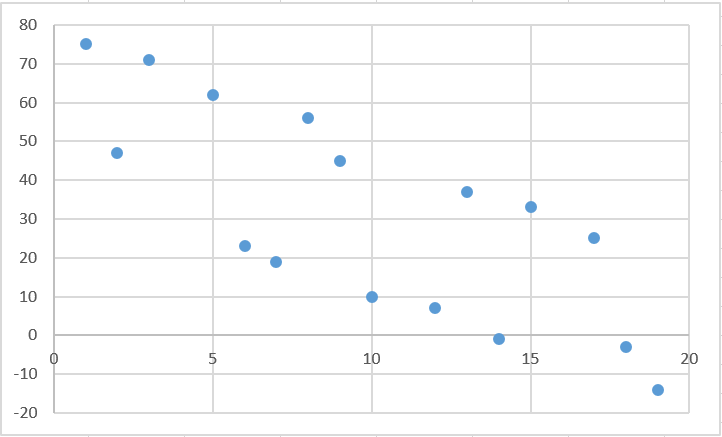
Describe the association:
No association, with an outlier
300
Using the scatterplot below, come up with a reasonable estimate for y when x = 13
Somewhere from 40-45
300
54 + 47 - 3
98
400
A line on a scatter plot that helps show the association between data sets more clearly
Trend line
400
Is this a linear function?
4x = 3(y-1)
Yes
400
Describe the association
Moderate, Negative, Linear
400
Using the scatterplot below, come up with a reasonable estimate for y when x = 10
Around 20.
400
((16 x 2) / 4) + 3
11
500
Data values that lie roughly along a line
Linear association
500
Three methods to solving systems of equations
Elimination, Substitution, Graphing
500
Describe the association
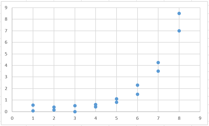
Strong, Positive, Nonlinear
500
Using the scatterplot below, come up with a reasonable estimate for x when y = 10
Around 12.
500
(10 + 9 x 4 - 13) / 3
11