Vocabulary
Describing Associations
Finding y
100
A graph with points to show the relationship between two sets of data
Scatter plot
100
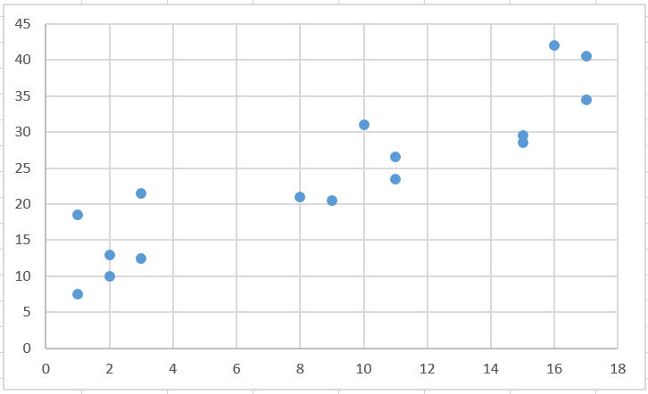
Describe this association.
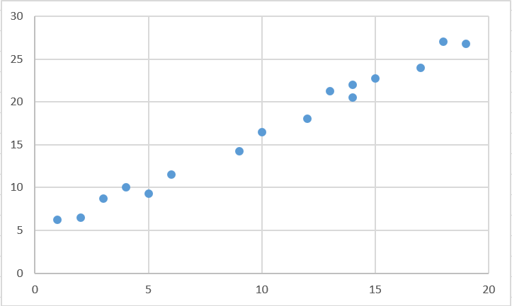
Strong, Positive, Linear
100
Using the scatterplot below, come up with a reasonable estimate for y when x = 5
About 20 or 21.
200
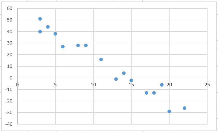
Describe this association
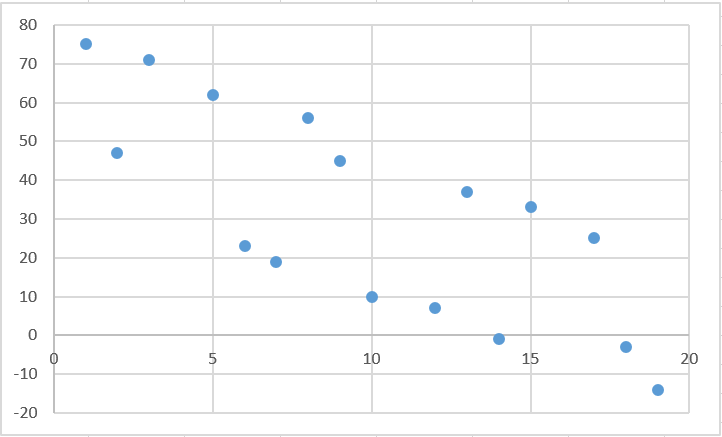
Weak, Negative, Linear
200
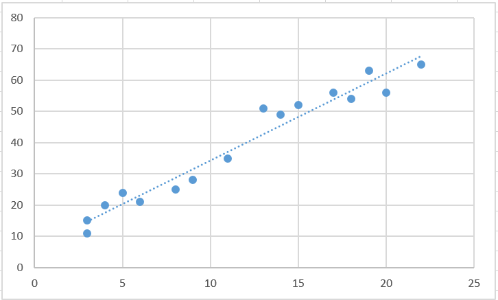
Using the scatterplot below, come up with a reasonable estimate for x when y = 60
Around 19 or 20.
300
Describe the association:
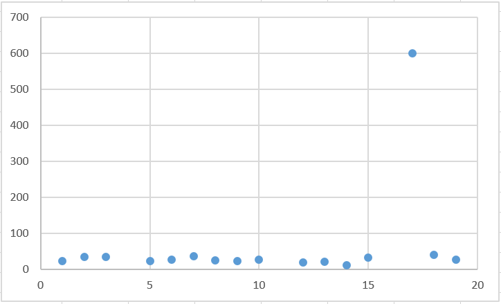
No association, with an outlier
300
Using the scatterplot below, come up with a reasonable estimate for y when x = 13
Somewhere from 40-45
400
A line on a scatter plot that helps show the correlation between data sets more clearly
Normally goes through at least 2 points
line of best fit
400
Describe the association
Moderate, Negative, Linear
400
Using the scatterplot below, come up with a reasonable estimate for y when x = 10
Around 20.
500
Describe the association
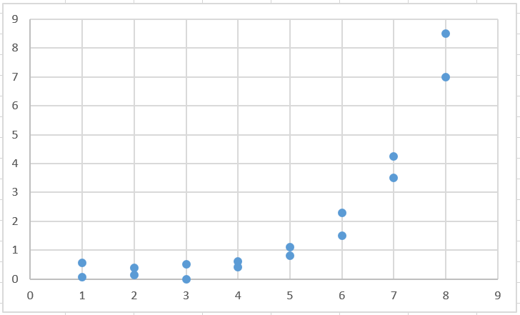
Strong, Positive, Nonlinear
500
Using the scatterplot below, come up with a reasonable estimate for x when y = 10
Around 12.