Vocabulary
Graph It
Interpret the Plot
Association/Correlation
Make a Prediction
100
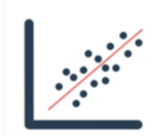
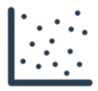
What is a scatterplot?
A graph with points plotted to show a possible relationship between two sets of data
100
What type of association is shown?
positive
100
What type of association is shown?
Negative
100
True or False: All scatterplots show either weak or strong association.
False: Many scatterplots show no association.
100
True or False: A good "line of best fit" for this data would probably pass through the point (10,0)
False
200
What do we call a point that doesn’t fit the pattern of the other data?
Outlier
200
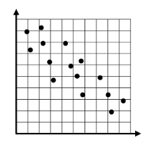
Describe the trend in a scatterplot shown.
no correlation - no association.
200
A scatterplot shows more spread out points. What does this mean about the strength of the association?
weaker
200
What type of correlation would you expect: As ice cream sales increase, so do sunburns.
Positive
200
True or False: the line drawn here is a good trend line.
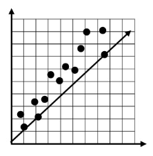
False: it is drawn below most of the data.
300
What is the line of best fit?
A straight line that best represents the data on a scatterplot
300
Given data on hours studied vs. test scores, describe how to set up your axes.
(X = hours studied, Y = test score)
300
What can you say about a scatterplot with no clear pattern or direction?
no association or correlation
300
What type of association would you expect from this scenario: The number of hours per week spent playing video games, the number of hours spent outside.
Negative association.
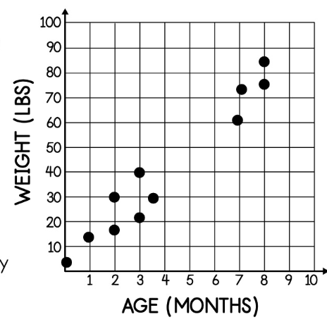
300
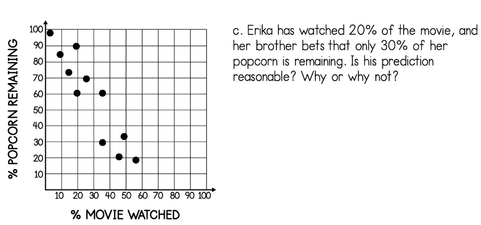
If gregor has 45% of his popcorn remaining, predict the percentage of the movie he has watched.
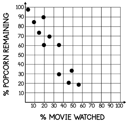
somewhere around 35% - 45% of the movie has probably been watched.
400
What does it mean if a scatterplot has a positive correlation?
(As one variable increases, the other also increases)
400
You’re given data on shoe size and height. Sketch a possible scatterplot.
(Student draws scatterplot showing a positive trend)
400
does this graph show linear association? Explain.
No, because if you cannot draw a straight line to show the overall trend of the data.
400
Strong correlation means what about the closeness of the points to a line?
(They’re close to forming a line)
400
False: from the data - a better prediction would be that about 75% of the popcorn is left.
500
Data that involves two different variables is called _____________ data.
Bivariate
500
What type of association would you expect from the following situation? The number of people at a basketball game and the noise level in the gymnasium.
positive association
500
Consider this graph, between which four year increments would you say there is a linear association in the data?
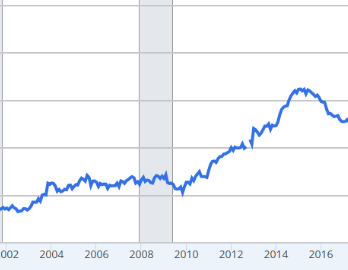
from 2010 to 2014
500
Which scatterplot shows the best example of weak, non-linear association?
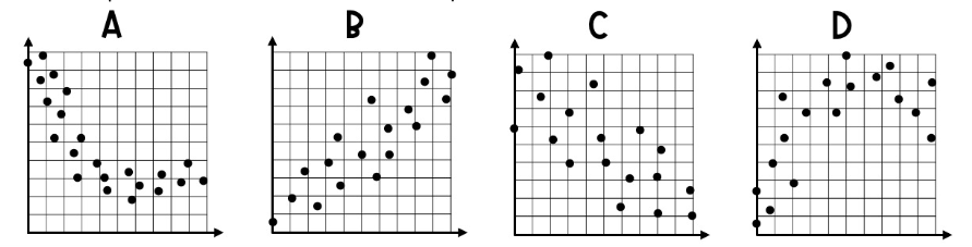
Both a and d show non-linear association, between those 2 choices - D shows a weaker association because the data points are more spread out.
500
Ally has about 90% of her popcorn remaining after 90% of the movie has been watched. Ally says she's unique because of this. Do you agree with her? Why or Why not?
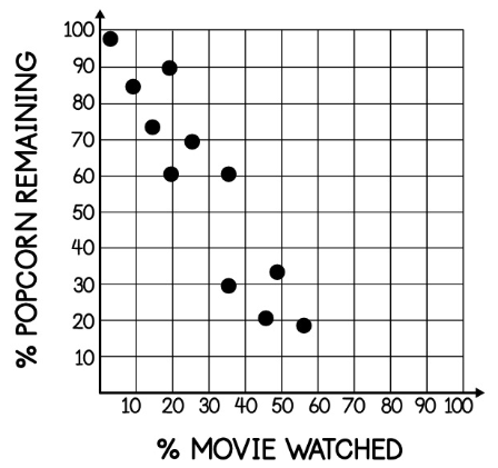
Yes, Ally would be considered an outlier in this graph because most people would have eaten all the popcorn after 90% of the movie has been watched.