Picturing Distributions with Graphs
Describing Distributions with Numbers
The Normal Distribution
Scatterplots and Correlation
Regression
Producing Data: Sampling & Experiments
100
Describe frequency vs relative frequency.
Frequency = # of times a certain value occurs in a dataset
Relative Frequency = % of times a certain value occurs in a dataset
100
This measure of center is not resistant to outliers and gets pulled in the direction of extreme values.
Mean
100
This type of curve represents a theoretical distribution, must always stay above the x-axis, and has a total area of 1 underneath it.
Density curve
100
In a study examining hours studied and exam scores, which variable is the explanatory variable and which is the response variable?
Explanatory = hours studied
Response = exam scores
100
This line represents the best linear relationship between an explanatory and response variable and is used to make predictions.
Least-Squares Regression Line
100
You want to estimate the average GPA of all university students, but you sample only from one business class because it is easy to access. What type of sampling method is this, and what is the main issue?
Convenience sample, the issue is that the sample is not representative of the entire population.
200
A dataset records students’ shoe size, state of birth, zip code, and height. Which of these are quantitative and which are categorical?
Shoe size → could be both, when quantitative variables get forced into groups, it can become categorical
State of birth → categorical
Zip code → categorical
Height → quantitative
200
A dataset is heavily right-skewed with a few very large values. Which measure of center should you use and why?
Median, because it is resistant to outliers and skewness.
200
According to the empirical rule, in a Normal distribution, about 95% of the data falls within how many standard deviations of the mean?
2 standard deviations
200
This type of graph displays the relationship between two quantitative variables, where each point represents one individual.
Scatterplot
200
A regression line predicts a value of 52, but the actual observed value is 48. What is the residual, and what does its sign mean?
residual = observed y - predicted y = 48 - 52
residual = -4
The observed value was less than predicted, and our prediction was an overestimate.
200
Name two different types of sampling error/bias and give one realistic example of each.
Undercoverage: a survey about internet usage that only samples people with landlines, excluding younger people who mostly use cellphones
Nonresponse: a mailed survey where many selected individuals choose not to respond
Response bias: people underreport how much fast food they eat
Wording effect: a question is phrased in a way that influences responses
300
This type of graph is used for quantitative data, has bars that touch, and helps show the shape, center, and spread of a distribution.
Histogram
300
Find the 5-number summary for the dataset:
3, 4, 4, 7, 7, 7, 8, 10, 12
Minimum = 3
Q1 = 4
Median = 7
Q3 = 9
Max = 12
300
A student scores 85 on an exam where the mean is 75 and the standard deviation is 5. What is their z-score, and what does it represent?
z = 2
The student scored 2 standard deviations above the mean, meaning that the student scored fairly high relative to their class.
300
A scatterplot shows that as one variable increases, the other variable also increases. What type of association is this?
Positive
300
A regression model has an R2 of 0.81. Interpret this value.
81% of the variation in the values of y (response variable) is explained by the regression line.
300
In an experiment, neither the subjects nor the researchers know who is receiving which treatment. What is this called, and why is it important?
Double-blind experiment, it is important because it helps reduce bias and placebo effects.
400
Given the stemplot below, describe the shape, center, and spread of the distribution:
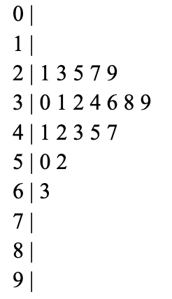
Shape → skewed right
Center → 38
Spread → 63 - 21 = 42
400
Use the 1.5xIQR rule to identify any suspected outliers in the dataset:
3, 4, 4, 7, 7, 7, 8, 10, 12, 50
[Q1-1.5IQR, Q3+1.5IQR] → [-5, 19]
400
In a Normal distribution with a mean of 50 and a standard deviation of 10, find the probability that a value falls between 45 and 60.
P(45 < x < 60) = 53.28%
400
A set of data on hours of sleep and test scores has a correlation of r = 0.6. Interpret this value in context.
There is a moderate positive linear relationship. As hours of sleep increase, test scores tend to increase.
400
Given that x̄ = 12, sx = 3, ȳ = 32, sy = 9, and r = 0.45, find the Least-Squares Regression Line.
ŷ = 1.35x + 15.8
400
An experiment tests two diets by pairing similar individuals (same age, weight, etc.) and randomly assigning one diet to each person in the pair. What type of experimental design is this?
Matched-Pairs design