Useful Knowledge
Graphical Knowledge
Agree, Disagree, Can't be Sure
Comparing Values
Similarities and Differences
100
What is the difference between a Census and Sample?
Census is everyone in the population.
Sample is a portion of the population.
100
What is wrong with this graph?

The percentages don't add to 100%
100
Agree or Disagree: Women eat more fruits and vegetables than Men

Agree
100
How many more times likely is it to rain on Thursday than on Sunday?

4 times more likely
20/5=4
100
Name one similarity or difference in this graph

Similarity: Trend is the same (Steady to sharp decline)
Difference: 2022 have about 200 to 400 more homeschooled students from 6 to 14.
200
What is this sampling method call?
Simple Random
200
What is the trend in this graph?
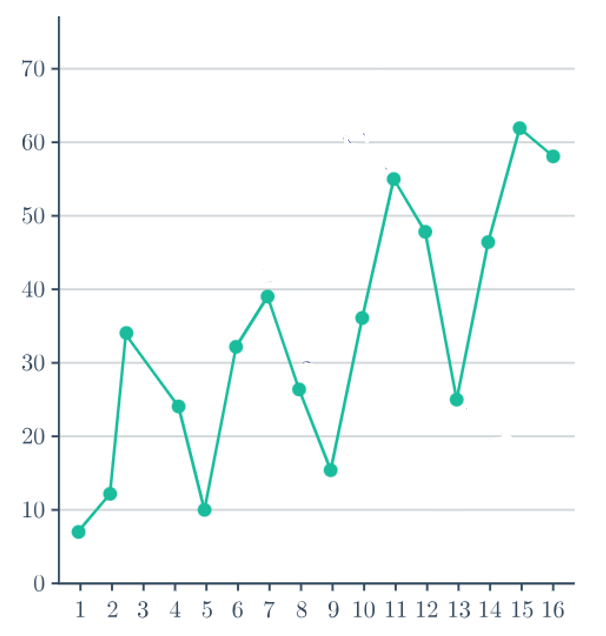
Increasing Trend
200
Is there a relationship between price and performance?
Yes: Their is a positive relationship.
No: The relationship is due to the type of washer.
200
Is a student twice as likely to get a Tertiary Level Qualification than a Postgraduate Qualification?

No. It is only 1.9 times more likely
19/10=1.9
200
What is a difference in this graph?

- Quarry increases at a faster rate from 2014 onwards.
- In 2014, Quarry has a larger increase in penguins.
300
What is the probability that a randomly selected full licenced driver has no car?
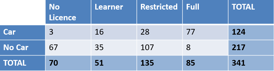
8/85=0.09 (2dp)
300
Why is this infographic misleading?

The body sizes aren't proportionate
300
Give two reasons why men are more likely to have a FULL drivers licence in NZ
1. There are more men with a licence.
2. There are less men that don't have a licence
300
How many times cheaper are Christchurch houses compared to Tauranga?

0.70 (2dp) times cheaper
751901/1074336=0.70 (2dp)
300
What is a similarity from this graph?
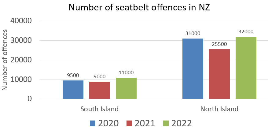
For both islands, 2021 has the lowest amount and 2022 has the highest amount.
400
What is the expected number of golds USA will win from their next 200 medals?

76 or 77
76.64 (2dp)
400
What is the pattern of this graph?

There is none
400
Give one reason why you can agree with the statement: "Vegetables are the most expensive they've ever been"
If you add a trend line, it is increasing.
400
Using the highest and lowest values. How many times more likely are you to pass your driving test?

1.69 (2dp) times more likely.
81/48=1.69 (2dp)
400
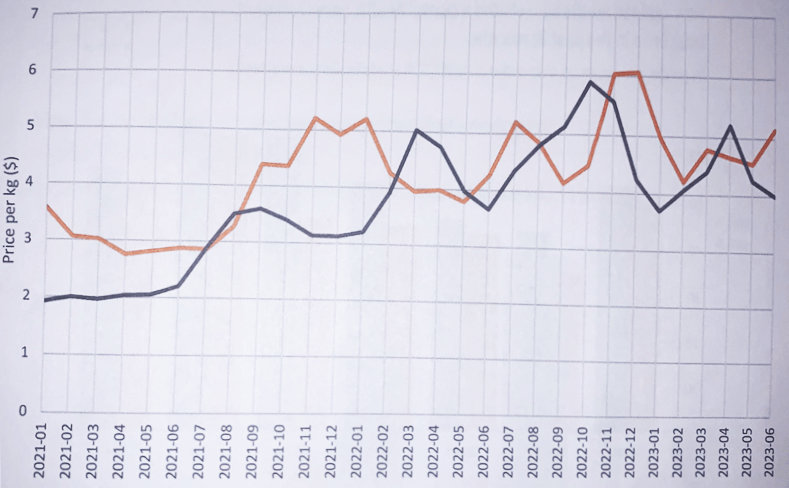
What is a similarity in this graph?
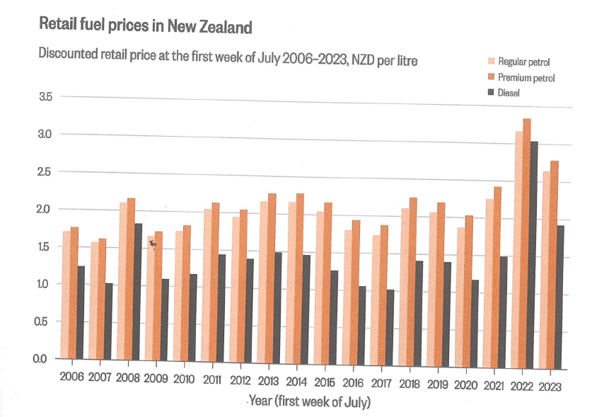
- The trend is the same
- There is a large peak in 2022
- Premium is always the most expensive and diesel is the cheapest
500
Name one disadvantage of using a Pie Graph?
- Not so useful when displaying more than 5 pieces of data.
- Not great at showing small portions of data.
- Doesn't clearly show order of numeric data.
500
What is being talked about in this page?

Variation

500
This graph shows the 13 most popular girl names of the 20th century.
Name one reason why you can't be sure Mary is the most popular name of all babies.
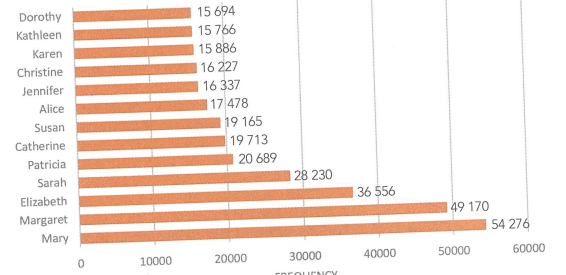
The graph doesn't include boy names.
500
How many more times are you likely to contract Cryptosporidiosis in September than the average of all the other months?

5.72 times more likely.
(626-261)/8=45.625
261/45.625=5.72 (2dp)
500
What is a similarity in these graphs?

Individually, Male and Female numbers are very similar at every age group for each graph