Measures of Center
5 Number Summaries
Graphs
Correlation vs. Causation
Linear Regression
100
Calculate the range
1, 1, 2, 2, 3, 6, 7, 7, 8
7
100
Identify the minimum of the data set
24, 16, 27, 13, 11, 24, 27
11
100
C
100
If variable A causes variable B, what is this called?
A) Correlation
B) Causation
C) Coincidence
D) Observation
B) Causation
100
Identify the type of correlation between the data
a) Positive, because as one variable increases the other variable increases
b) Negative, because as one variable increases the other variable increases
c) Positive, because as one variable increases the other variable decreases
d) Negative, because as one variable increases the other variable decreases 
a) Positive, because as one variable increases the other variable increases
200
What is the mode of the data set
13, 14, 15, 15, 15, 17, 18, 19, 20, 20
15
200
Identify the 1st and 3rd quartiles of the data set
34, 38, 44, 45, 46, 49, 50, 53
1st quartile: 41
3rd quartile: 49.5
200
What is the range of this data set?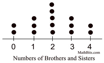
4
200
Which of the following is MOST LIKELY causation?
A) Higher shoe size is associated with higher reading ability in children.
B) Smoking increases the risk of lung cancer.
C) People who drink more coffee tend to have more gray hair.
D) The number of fire trucks at a fire determines with the amount of damage.
B) Smoking increases the risk of lung cancer.
200
If a data set is shown to have a correlation coefficient of -0.8 (r = -0.8). What does this signify about the relationship between the data?
a. Perfect negative correlation
b. Strong negative correlation
c. Weak negative correlation
d. No correlation
b. Strong negative correlation
300
Find the median of the data set
22, 24, 24, 25, 26, 28, 30, 30
25.5
300
If Data Set A has Mean Absolute Deviation of 3.5 and Data Set B has a Mean Absolute Deviation of 6, which set of data has the larger spread?
Data Set B
300
Which set of Data has the largest spread?
Data set b
300
Which statement best describes the difference between correlation and causation?
A) Correlation always means there is also causation.
B) Causation occurs when one variable directly affects another, while correlation only indicates a relationship.
C) Correlation means one variable changes randomly without affecting another
D) Causation occurs only when variables are identical.
B) Causation occurs when one variable directly affects another, while correlation only indicates a relationship.
300
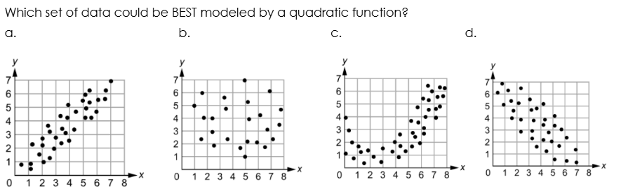
Which set of data points could BEST be modeled by a line of best fit that is an increasing linear function
a. {(0, 0), (1, 8), (2, 15), (3, 22), (4, 30)}
b. {(0, 5), (1, 6), (2, 10), (3, 16), (4, 28)}
c. {(0, 50), (1, 42), (2, 33), (3, 25), (4, 16)}
d. {(0, 64), (1, 60), (2, 52), (3, 39), (4, 22)}
a. {(0, 0), (1, 8), (2, 15), (3, 22), (4, 30)}
400
Calculate the mean of the data set
21, 21, 23, 28, 30, 31, 35
27
400
Which of the following best describes an outlier in a dataset?
A) A value that is very close to the mean
B) A value that appears more than once
C) A value that is significantly different from other values
D) A value that is negative
C) A value that is significantly different from other values
400

What is the shape of the data set?
Skewed Left
400
A study finds that ice cream sales and drowning incidents increase at the same time during summer. Which conclusion is most accurate?
A) Eating ice cream causes drowning.
B) Drowning causes ice cream consumption.
C) Both variables are correlated, likely due to a third factor like hot weather.
D) There is no relationship between the two variables.
C) Both variables are correlated, likely due to a third factor like hot weather.
400
What does linear regression help us do?
A) Draw a line through a set of points to show a trend
B) Count how many data points are in a dataset
C) Find the average of all numbers
D) Make a pie chart
A) Draw a line through a set of points to show a trend
500
If the mean of a data set is 17 and the median is 26, what is the overall shape of the data?
Skewed Left
500
Given Q3 = 40 and IQR = 12, what value would be considered an outlier?
A) 58
B) 42
C) 22
D) 60
D) 60
500
What percent of the data is inside the box on a boxplot?
50%
500
Two variables change together, but one does not cause the other. This is called:
A) Causation
B) Correlation
C) Coincidence
D) Experimentation
B) Correlation
500
A dataset shows a linear trend. Which tool would best summarize this trend?
A) A pie chart
B) A regression line
C) A bar graph
D) A histogram
B) A regression line