Variables
Displaying Distributions
Describing Distributions
Frequency Tables
Vocabulary
Boxplots
100
The person/object described by a set of data.
individual
100
The name of this type of graph. 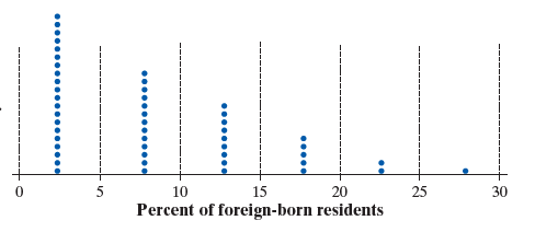
dotplot
100
This is the middle number of an ordered data set
the median
100
These are the 2 types of frequencies
raw and relative
100
This display shows the entire group of cases as a circle.
pie chart
100
The lowest value in a data set
minimum
200
Two types of variables
categorical and quantitative
200
name of this type of graph.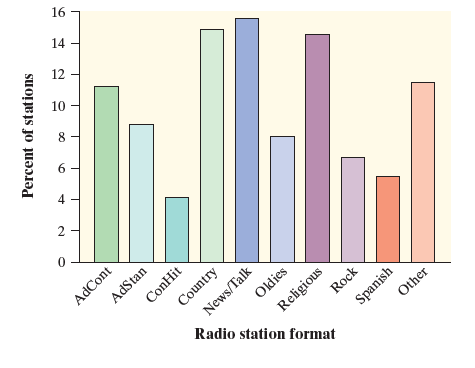
bar chart
200
This is another word for average
mean
200
The proportion of customers who ordered a hot dog (fraction and decimal)

158/400 and 0.395
200
A bar chart displays this kind of variable.
Categorical Variable
200
the 50th percentile in a data set indicated by the line inside the box
median
300
Identify the individuals.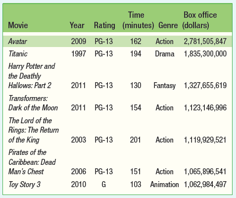
movies
300
This allows you to identify the segments when creating a segmented bar graph.
a key
300
The range for 1.5, 0.25, 3, 2.7, 1.1, 4.85, 2.75
4.6
300

determine the proportion of soda customers who also purchased pizza
120/200 = 0.6
300
This measure of spread is the average distance from an individual value and the mean
standard deviation
300
We subtract these values to determine the interquartile range
Q3 - Q1
400
Classify the variables (categorical vs. quantitative).
Categorical - rating and genre
Quantitative - year, time, box office sales
400
This graphical display looks similar to a bar graph but displays quantitative data.
histogram
400
The shape of this distribution.
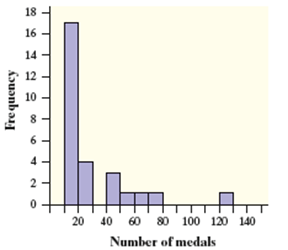
skewed right
400
The proportion of pizza customers who also bought water
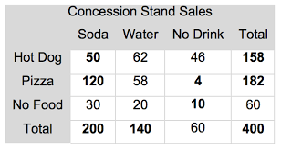
58/182 = 0.319
400
A data value that is far/different from most of the data
outlier
400
the minimum, Q1, the median, Q3 and the maximum collectively are called the:
5 number summary
500
D
500

What percent of males prefer clothing that's flattering?
20%
500
the 3 measures of spread
range, IQR and standard deviation
500
Calculate the MEAN number of siblings for the survey of 25 students.
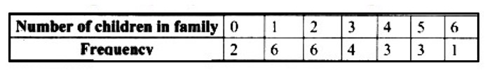
2.52 siblings
500
The 2 different classifications for quantitative variables
continuous and discrete
500
Fill in the blanks: According to the boxplot, the ___________ for 1st period is equivalent to the ___________ for 2nd period

median, Q1