Name that Graph!
Choose that Graph
Parts of Graphs
Definitions
Choose that Graph Pt. 2!
100

Pie Chart/Circle Graph
100
Which graph would be most appropriate to show the percentages of topics?
Circle graph
100

What is being graphed here?
Books sold in each genre
100
A circle graph shows how the parts are related to the ___________
Whole
100
16 students chose which ice cream flavor was their favorite. 3 students voted for chocolate, 5 voted for mint, 2 voted for vanilla, 3 voted for strawberry, 1 voted for pecan, and 2 voted for cookies and cream.
Bar graph.
200
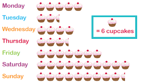
Pictogram
200
A survey was conducted on the length of the names of the students in a class. What type of graph would be most appropriate to show the range of the data?
Line Plot
200
What are the two categories being compared for each bar?
Children's vs Adults
200
A line graph is used when you have ________________ data
Continuous/on-going
200
Paco recorded how long he spent on homework each night for 1 week.
Line graph.
300
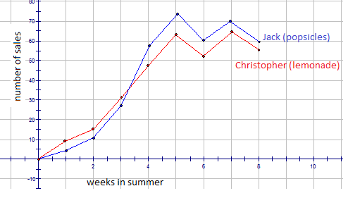
Double Line Graph
300
Choose the graph that shows intervals and frequency the best.
Histogram
300
What is the highest category of books sold?
Children's Fantasy
300
On a pictogram, the _________ tells that number that each picture of symbol represents.
Key/Legend
300
Christina showed the elements and compounds in percentage form that make up soil.
Circle graph.
400
Stem and Leaf Plot
400
 The table shows the yearly average earnings (in thousands of dollars) for men and women. Which type of graph would be most appropriate for the data?
Double Bar Graph
400
What is the left side of the bar graph always called by definition?
The frequency
400
A line plot is an easy way to identify ______________ and ____________
Outliers and clusters
400
The weight change of a puppy over the course of 1 month.
Histogram.
500

Line Plot
500
Identify the graph that is most appropriate to represent a data that denotes the amount of money spent on military over a period of time.
Line Graph
500
The right side of the graph that tells the difference between the Children's and Adult's categories is called?
The key
500
A histogram is a bar graph that shows the frequency of equal __________ of data
Intervals
500
Compare the amount of rain two states received over the course of 6 months.
Double bar graph.