Bar and Circle Graphs
Scatterplots
Data Distribution
Box Plots
100
What percentage of students chose the history museum or the science museum?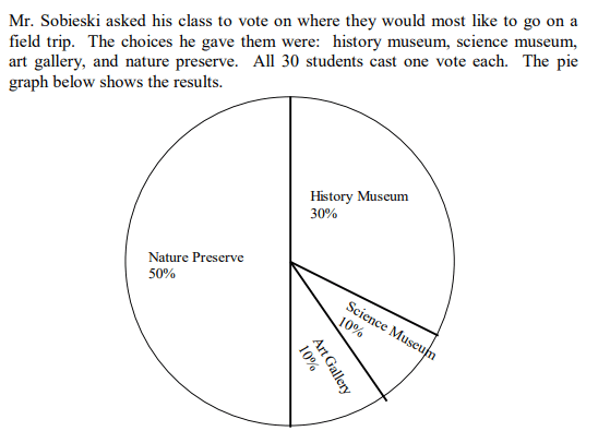
40% of students chose the history museum or the science museum
100
True or False.
A line of best fit, like the one shown below, must pass through at least 2 points on a graph.
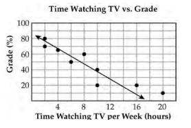
False
100
When creating histograms and using a range of numbers, the data is separated into equal ________.
Intervals
100
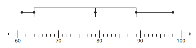
The incubation time (in days) of different types of birds are observed and represented in the box plot below. What is the maximum incubation time?
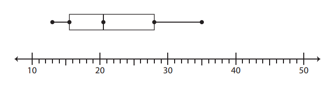
35 days
200
What percentage of George's classmates said winter was their favorite season?
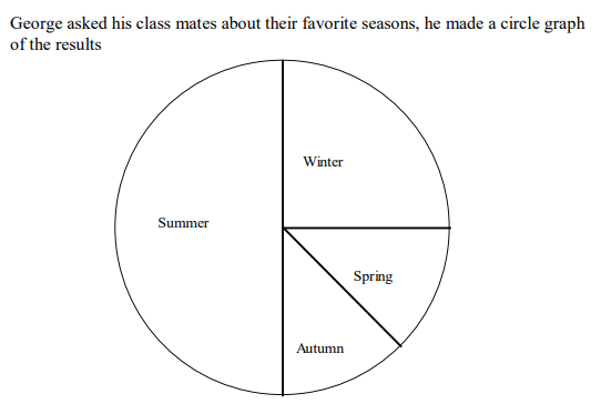
25%
200
Based on the equation, what is the number of new types of plants that will be in the park after 24 years?
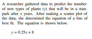
There will be 14 new types of plants after 24 years.
200
The histogram below shows the weights of the players on the Washington Redskins. How many players weigh between 220 and 240 pounds?
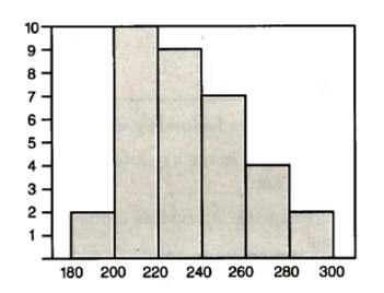
9 players
200
Eleven trays have different colored balls in them. The number of balls in each tray is counted to make a box plot. What is the upper quartile or Q3 of the data?
89
300
If George surveyed 20 classmates, how many of them chose summer?
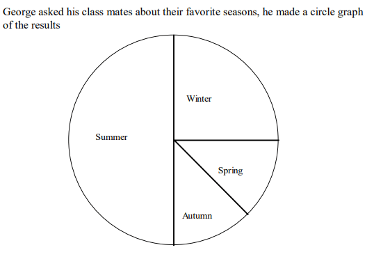
10
300
Using the line of best fit, about how many minutes would it take to complete 9 laps?
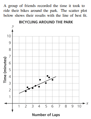
About 5 minutes
300
The histogram below shows the number of people that visited the library last Wednesday. What was the most common age of people at the library?
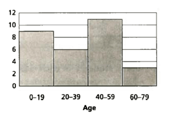
Between the ages of 40-59.
300
What is the median of the following set of data:
40, 42, 46, 48, 51, 55, 58, 66, 67, 68, 69
55
400
What two activities took up half of the time of the day?
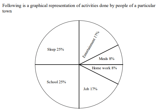
Sleep and school
400
What kind of relationship between class study time and test scores is shown on the scatterplot?
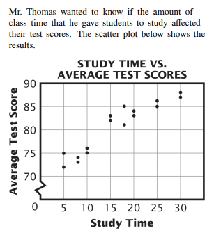
Positive Correlation. As the study time increases, the average test score increases.
400
The histogram below shows the number of people that visited the library last Wednesday. How many people were between the ages of 20 and 59?

17 people are between the ages of 20 and 59.
400
What is the lower quartile of the following set of data:
40, 42, 46, 48, 51, 55, 58, 66, 67, 68, 69
46
500
How many students voted?
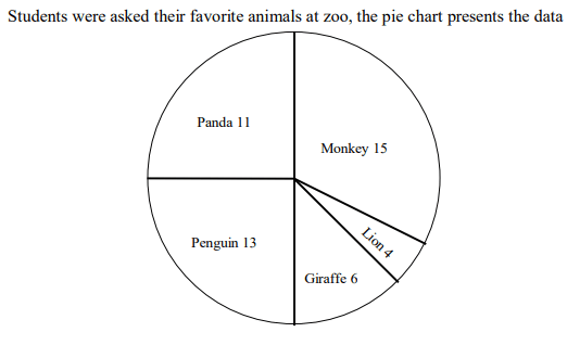
49 students voted
500
Describe the relationship between the average traffic volume and average vehicle speed shown in the scatterplot below.
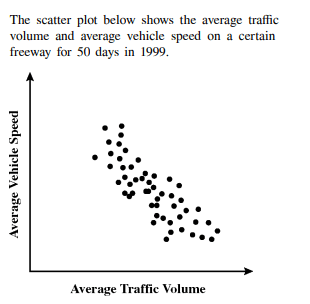
Negative Correlation. As the traffic volume increases, vehicle speed decreases.
500
The speed of cars on a stretch of interstate are clocked by a police officer and have been organized in the frequency table below. How many people were going speeding if the speed limit was 60 mph?
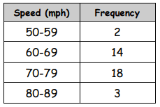
35 people were speeding
500
What is the Interquartile Range of the following set of data?
40, 42, 46, 48, 51, 55, 58, 66, 67, 68, 69
21