Graphs
Measures of Center
Dot Plots
Box Plots
Histograms
100
It is extremely easy to determine the MODE on this simple plot using a number line.
Dot plot
100
Find the mean of the data.
10, 11, 15, 10, 14
12
100
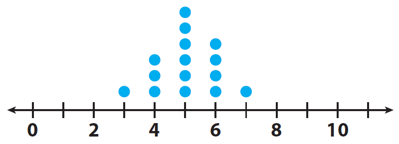 Find the range.
4
100
What is the maximum?
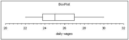
30
100
How many people participated in the survey?
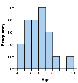
20
200
This graphical display has bars that groups data in intervals or ranges.
histogram
200
Find the median of the data set.
12, 15, 18, 14, 13, 20, 21, 12, 17
15
200
The dot plots represents shoe sizes in a classroom. How many students have a shoe size 5 or greater?
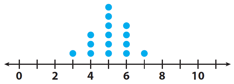
11
200
What is the median?
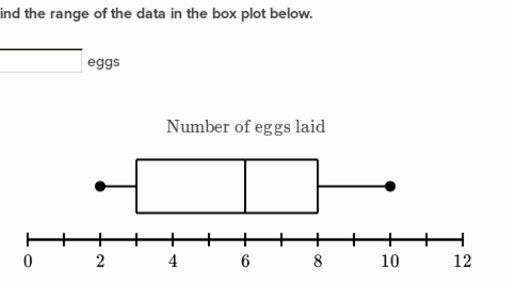
6
200
How many volunteers worked fewer than 11 hours?
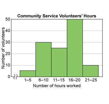
35
300
This data organizer groups data into quartiles
box plot or box and whiskers
300
What is the mode of the data set.
33, 23, 33, 25, 28, 28, 33, 21, 30, 31
33
300
What is the highest and lowest grade on the test?
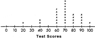
Highest is a 100.
Lowest is a 20.
300
What percent of the data is between 80-86?
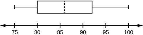
25%
300
How many people are less than 40?
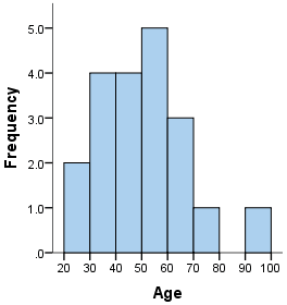
6
400
The first steps in making this this type of graph is to put the data in order and find the median.
box plot or box and whisker
400
What is the range in the data set?
12, 16, 11, 22, 23, 22, 25, 19, 19, 19, 24
14
400
How many total hours did this class spend on homework during the week? 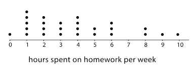
101 hours
400
What does 92 represent in the box plot?
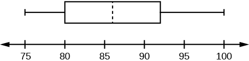
3rd Quartile
Upper Quartile
400
How many volunteers worked at least 16 hours?
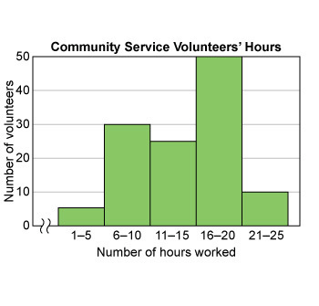
60
500
How do you find the interquartile range?
Q3 - Q1
500
Find the missing data point in the data set.
Mean = 24
22, 18, 24, 25, 28, x
A) 24 B) 28 C) 27 D) 26
C) 27
500
Which is true?
A. Class 1 had more A's. (90 or above)
B. Approximately 62% of class 2 got an A.
C. The range in Class 1 is 98.
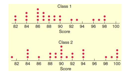
B
500
What percent of the data is 9 or higher
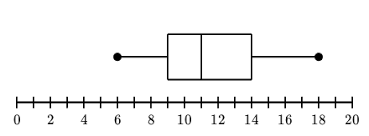
75%
500
What percent of the class scored less than 50%? (round to nearest whole percent) 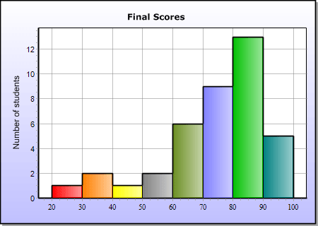
10%