VOCABULARY
ROUTINES
ANALYZING DATA
REPRESENTING DATA
100
Where is the x-axis and what does it show?
On the line and shows/represents the number.
100
What do you do after you collect data?
Organize all of the data (like putting it in a chart).
100
Looking at the line plot, what’s the outlier(s)?
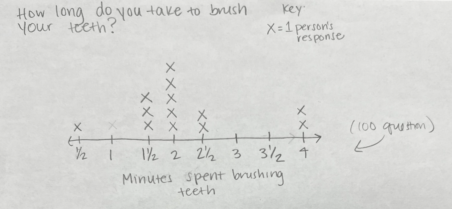
The outlier is 4 minutes. (Also acceptable: 1/2 minute)
100
What makes an effective representation?
An effective representation is easy to understand because it consists of:
- clear labels
- different colors
- different symbols
- evenly spaced values
- uniformed sized data/symbols.
200
What does the “range” mean?
The lowest value and the highest value on a line plot and the difference between the two values.
200
What is the first step when making a line plot?
Make a line!
200
Looking at the line plot, where is the gap in the data?

The gap is between 2.5 minutes and 4 minutes.
300
What is a “cluster” of data?
Data that is clumped/ close together. A cluster is a made up of more than half of the data.
300
How do we check that all the data has been accounted for?
Count all of the data in the set.
300
Looking at the line plot, what is the mode for the 7th grade?
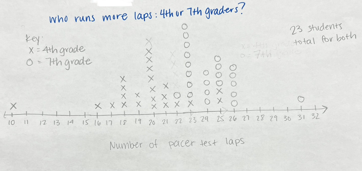
The mode for 7th grade is 23 laps.
400
What does the “mode” represent?
Represents the most frequent/occured value in a data set/line plot.
400
After writing in your lowest and highest values, what should put in between them?
Put ALL of the values.
400
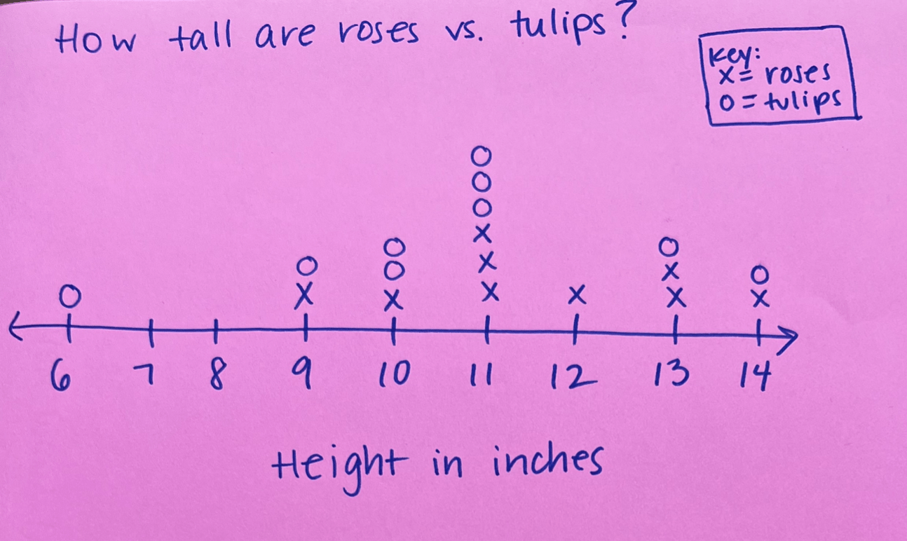
Looking at the line plot, how does the key help you?
The key helps because it represents the symbols for the 4th grade data and the 7th grade data. It makes it easy to compare and see what data belongs to what grade.
400
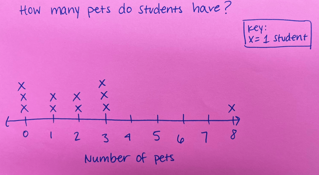
Using this one set of data, create a line plot.
Data:
The number of pets that students have:
0, 2, 1, 3, 3, 3, 1, 0, 0, 2, 4, 8
500
What does an “outlier” mean?
A data/value that is far away from the rest of the data. Think about the word: lies outside of the group.
500
What does the line plot checklist include?
Have a title
Show all values on the line
Label the x-axis
Include a key
BONUS: Have a statement
500
Share something you noticed about the data!
(Share anything!)
500
Use the 2 sets of data to make a line plot.
Data: Height of two types of flowers in inches.
Rose: 9, 11, 13, 13, 14, 10, 11, 12, 11
Tulip: 10, 9, 6, 13, 10, 11, 11, 14, 11