Data Types
Graph That Data
What's wrong with this graph
Mixed
Challenge Round
Reading Graphs
100
What is the difference between qualitative and quantitative data?
Qualitative data describes categories or qualities. Quantitative data deals with numbers and amounts.
100
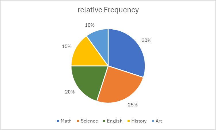
Which qualitative graphs are best for showing parts of a whole?
Pie chart and stacked bar graph
100
What is wrong with this graph?
It's Ugly, but also it is not percentages
100
What is the value of the circled data point?
4.2
100
A student uses a pie chart to show how long people exercise. Why is that a poor graph choice?
Pie charts show parts of a whole. Exercise time is quantitative and best shown with a histogram or dot plot.
100
Which sport is the most popular among students?
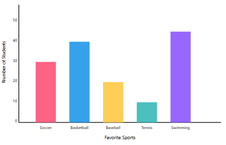
Swimming
200
Is "number of pets" discrete or continuous?
Discrete – you can count pets in whole numbers.
200
What kind of graph would you use for comparing two bar graphs?
Side-by-side bar chart
200
What is wrong with this graph?
Y-axis doesn't start at 0
200
What are the "bins" in a histogram?
Intervals or ranges of values the data is grouped into.
200
Which is better for showing exact values: dot plot or histogram? Why?
Dot plot – you can see each individual value.
200
what was the most common weight of fish caught?
1 Lbs
300
Is Movie ratings (Poor, Fair, Good, Excellent) an example of ordinal data or nominal data.
Ordinal Data
300
If i have a large quantitative data set what graph should i use?
Histogram
300
What is wrong with this graph?
It doesn't start at zero, its also weird and dumb
300
What is the shape of the graph below?
symmetric
300
Explain how a pie chart could be misleading.
You don't know the amount of people surveyed. 100 people and 1000 people look the same on a pie chart
300
Below is the graph of students in 1st period and which class they are taking:
 If there are 300 people in the school how many students are taking math during 1st
90
400
What kind of variable is Zip code, be specific
ZIP codes are nominal qualitative
400
A line graph is best used to show what kind of data?
Data that changes over time.
400
What is wrong with this graph?
Percentages go over 100, also there is no y-axis
400
Why must histogram bars touch?
Because the data is continuous – there are no gaps between intervals.
400
You see a dot plot with most of the data clustered on the left and just a couple dots far to the right. What does this suggest about the data?
It is skewed right
400
How many ice creams were sold on Day 2?
15
500
Which form of variable is represented in the graph below? Be as specific as possible
What is a Continuous quantitative variable
500
Why do bar graphs have spaces between bars, but histograms do not?
Bar graphs show separate categories; histograms show continuous data ranges.
500
What is wrong with this graph?
500
What percent of students slept 8 hours or less?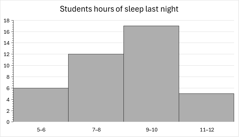
45%
500
Two graphs show the same dataset: one is a dot plot, and one is a Stem-and-leaf. Which one is better for data sets with a wide range of values?
Stem-and-Leaf
500
How much did the cost of gasoline increase from 1975-2005
2.00$