Composition
Light & Cameras
Image Editing
Color
Typography
Design
100
This technique uses a grid to position a subject off-center along a vertical or horizontal line, allowing a photographer to reveal more of the surrounding environment.
rule of thirds (or phi grid)
100
This setting adjusts a camera’s sensitivity to light while also introducing digital noise.
ISO
100
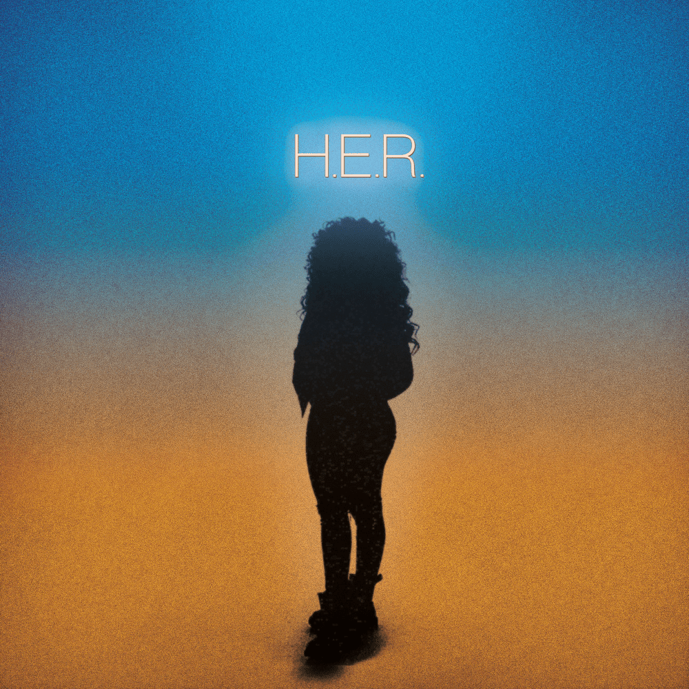
This is the recommended resolution for cover art on streaming platforms.
3000x3000 pixels
100
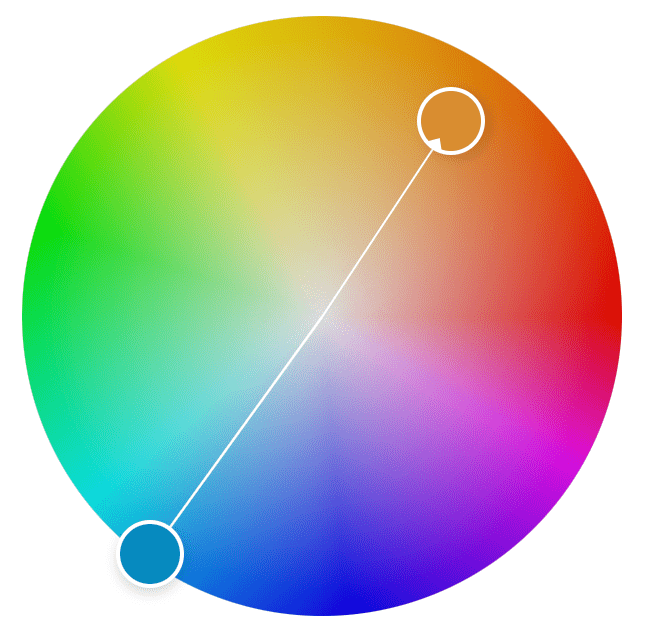
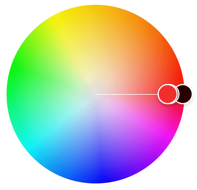
This high-contrast color scheme consists of hues that are opposite of each other on the color wheel.
complementary
100
A type classification defined by small decorative strokes at the ends of letters, often linked to formality or tradition.

serif
100
Unlike JPEG files, this image format allows for transparency, making it ideal for logos and overlays.
PNG (or TIFF or GIF)
200
The space between the top of a subject and the frame edge, important for a balanced portrait composition.
headroom
200
.CR3, .ARW, .RAF, and .DNG are all examples of this type of uncompressed image file for maximum editing flexibility.
RAW files
200
The proportions of an image, such as 1:1 for cover art, 2.33:1 for a Spotify header, and 9:16 for Instagram stories.
aspect ratios
200
This property of color describes its intensity or purity, with high levels appearing vivid and low levels appearing dull or muted.
saturation
200
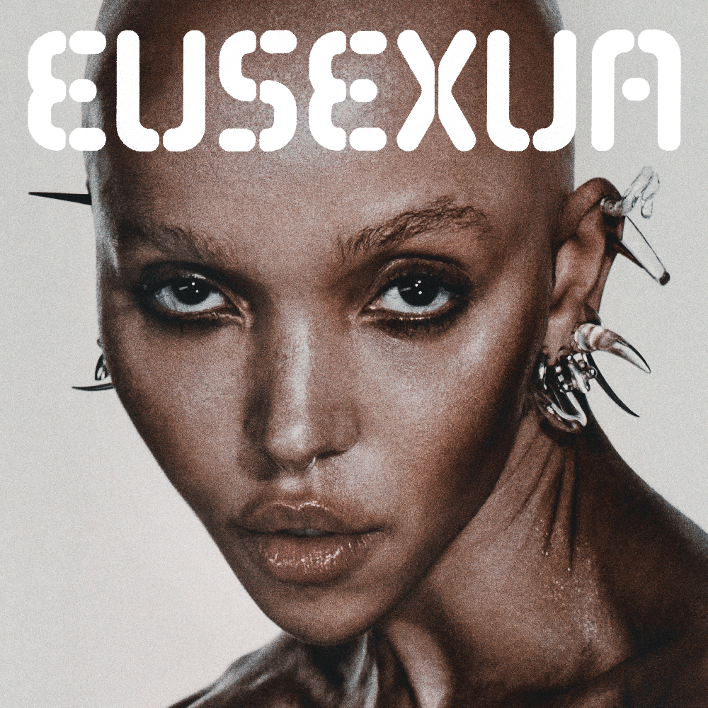
The cover of BRAT by Charli xcx uses this type classification, known for its clean, modern appearance and lack of decorative strokes.
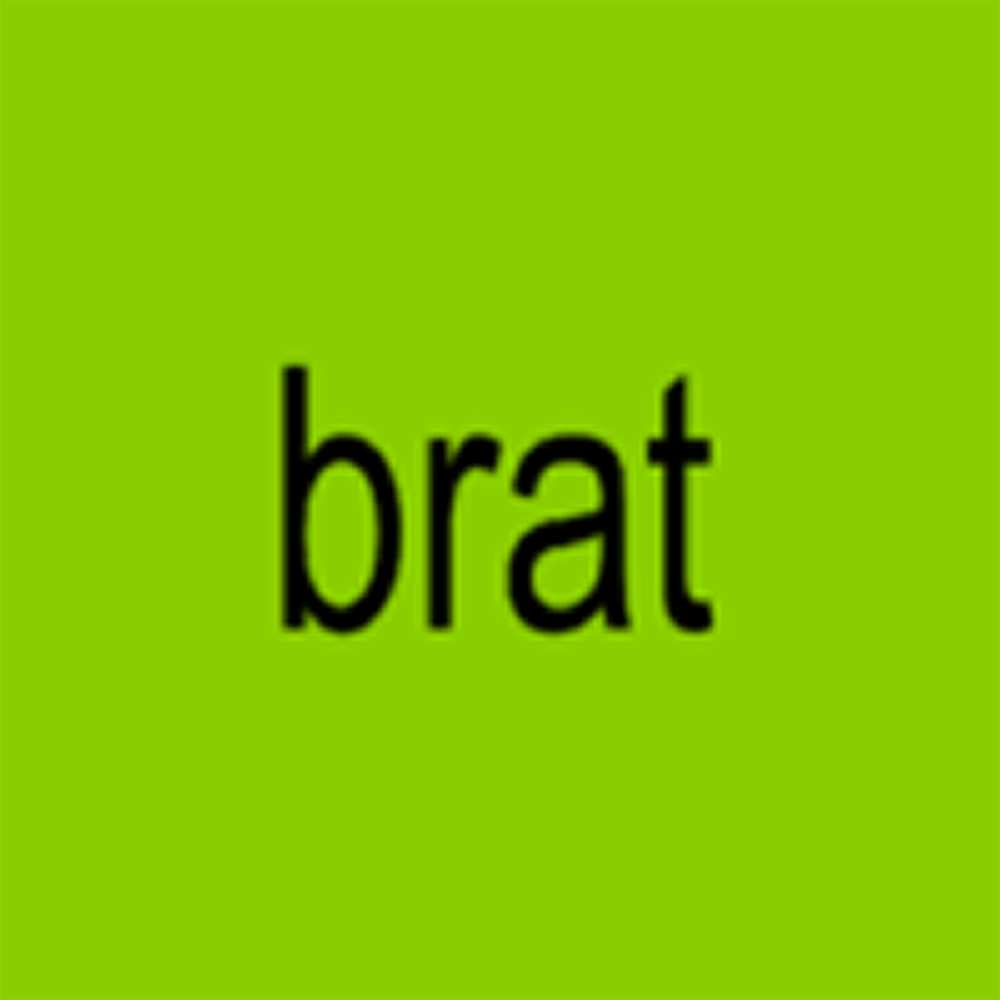
Double points for the exact typeface.
sans serif
Arial
200
Whether it’s posters or cover art, focusing on aesthetic appeal is an example of prioritizing this over function.
form
300
This technique uses borders like doorways, windows, or arches to surround and draw attention to a subject.
framing
300
Characterized by a short focal length, this type of lens provides a broader field of view but often at the cost of increased barrel distortion.
wide-angle (or fisheye)
300
Instead of making changes to the entire photo, these allow you to adjust select areas.
local adjustments (or masks)
300
This color adjustment shifts a color along the spectrum, such as turning blue toward teal or purple.
hue
300
This type classification is highly stylized and designed for short, impactful text like logos, titles, and headlines.
display
300
Unlike raster images, these graphics are defined by mathematical paths, allowing them to scale infinitely without losing quality.
vectors
400
This term describes the area in front of a gazing or moving subject.
Double points: this term describes placing a subject right against the edge of the frame they are facing.
lead room (or nose room or walking room)
short-siding
400
A lighting style, named after a painter, where the key light is placed above and to the side, casting a small triangular patch of light beneath one eye.
100 points for naming each additional lighting direction discussed in class.
Rembrandt
flat, butterfly or Paramount, loop, split
400
In Photoshop, this feature extends an image beyond its original borders.
generative expand (or generative fill)
400
A color scheme that uses only one hue, with variations in brightness and intensity.

monochromatic
400
This adjustment affects the distance between characters.
letter spacing (or tracking or kerning)
400
Designing with this in mind helps arrange elements in order of importance by adjusting size and position to guide the viewer’s eye.
visual hierarchy
500
This term describes how much an element attracts the viewer's eye, influenced primarily by its size and its contrast against the background.
visual weight
500
Controlled by a camera's aperture, this term describes the range of what's in focus.
depth of field
500
These two settings work together to adjust the white balance of an image—one adjusts warmth while the other shifts between green and magenta.
color temperature and tint
500
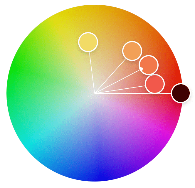
This color scheme consists of hues that sit next to each other on the color wheel, creating a harmonious and visually cohesive look.

analogous
500
While many modern covers omit text entirely, others feature "in-world" text that appears within the scene rather than an overlay—a term also used for music the characters themselves can hear.
diegetic
500
A Gestalt principle stating how elements that share characteristics such as color, shape, or size are related.
similarity
600
The relationship between a subject and its background, determining how clearly it stands out and is recognizable.
figure-ground
600
These are the four main characteristics of light.
quality, quantity, color, direction
600
This Lightroom feature doubles an image’s resolution while preserving detail, particularly useful after an aggressive crop.
super resolution
600
This adjustment increases the intensity of muted colors while preserving skin tones.
vibrance
600
A common guideline for designers, this measurement between text color and background color helps ensure legibility.
Double points for specifics.
contrast ratio
4.5:1
600
A Gestalt principle stating that elements close to each other tend to be seen as belonging together.
proximity