Graphical Representation
Numerical Representation
Describing Data
100
This circular chart represents the classes of a qualitative variable as slices proportional to the size of the class relative frequency.
![]()
Pie Chart
100
This term refers to the number of observations in a data set that fall into a particular class.
Class Frequency
100
A data set is said to be _________ if the mean is equal to the median.
Symmetric
200
This graph partitions numerical values of a quantitative variable into class intervals and represents each class interval using vertical bars.
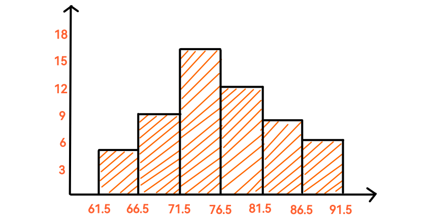
Histogram
200
This term refers to the middle number of a quantitative data set when the terms are arranged in ascending or descending order.
Median
200
This term refers to an observation or measurement that is unusually large or small relative to the other
values in a data set.
Outlier
300
This one-dimensional plot displays data points along a number line.
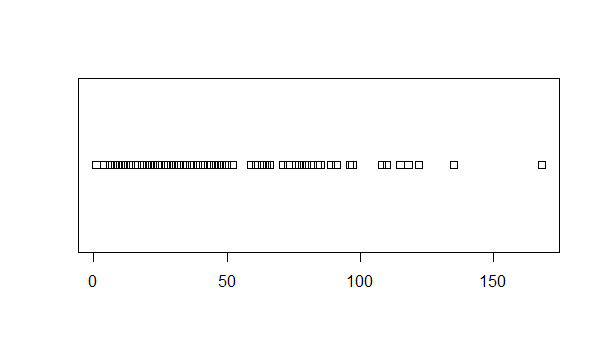
Stripchart
300
This value is calculated by summing all the observations in a data set and dividing by the total number of observations.
Mean
300
For measurements that are arranged in ascending or descending order, the pth __________ is a number such that p% of the values fall below that number
and (100 − p)% fall above it.
Percentile
400
This two-dimensional plot displays the relationship between two quantitative variables on the Cartesian plane.
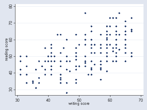
Scatterplot
400
This value is calculated by subtracting smallest measurement in a data set from the largest measurement.
Range
400
This rule, which applies to any data set regardless of the shape of the frequency distribution of the data, tells us how many values will fall within any number of standard deviations from the mean.
Chebyshev's Rule
500
This graph displays the distribution of numerical data using a rectangle between the upper and lower quantiles, with the median in the middle.
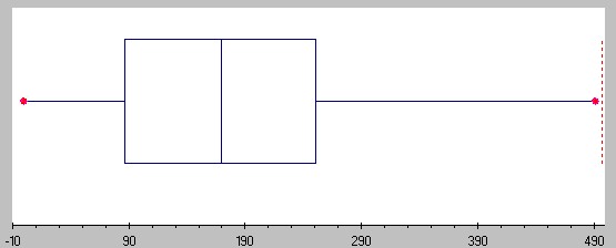
Box Plot
500
This value measures to what degree the observations in a data set are spread out.
Sample Variance
500
This term is a measure of whether the data are
peaked or flat relative to the normal distribution.
Excess Kurtosis