Graphing
Data and Graphing
Data Analysis
Data Analysis Again
Chi-square
100
This type of graph shows discrete, categorical data
bar graph
100
What type of graph would best display data collected by an entomologist studying the frequency of different size ants within a tropical forest?
histogram
100
This statistical term refers to the middle value in a data set
median
100
More data is _____ than less data.
better
100
What is the first thing you need to calculate when solving a chi-square problem?
the expected values
200
This type of graph is generally used to show change in a single variable over time
line graph
200
What type of graph would best show the brightness of a distant star over time?
line graph
200
This statistical term refers to the value that occurs most frequently in a data set
mode
200
This statistical term refers to how precise a data set is compared to the whole population from which it comes
standard error of the mean
200
How do you know how many degrees of freedom to use when determining the critical value in a chi-square problem?
Subtract 1 from the total number of possible outcomes
300
This is the most commonly forgotten part of a good graph in science. It is the first thing that someone else will look at in order to figure out what the graph is showing.
a descriptive title
300
Identify the two main types of data and provide an example of each
Qualitative data: blue shirt, unhealthy plant, new microscope, bright star, or any other term that describes something
Quantitative data: 1 experiment, 4 students, 5 bacterial colonies, 33 orangutans or any other numerical amount of something
300
This statistical term refers to how much variation or spread exists in a data set
standard deviation
300
Error bars that ______ show a statistically significant difference in data, while error bars that ______ show that there is not a statistically significant difference in data.
do not overlap, do overlap
300
For a chi-square genetics problem, how do you calculate the expected values?
use a Punnett square
400
This type of graph shows the correlation or relationship between two measured variables
scatter plot
400
What type of graph would best show average daily attendance of students for each day of the week?
bar graph
400
How do you calculate the rate of change? (Write out the x and y coordinates needed for this calculation.)
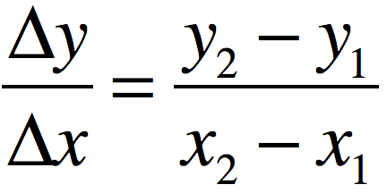
400
A trait that has a standard or normal distribution within a population can be displayed by a histogram that has a bell shaped curve. Briefly describe what this means in terms of the frequency of the different forms of the trait.
The medium forms of the trait are most common in the population, while the extreme forms of the trait are the least common.
400
Once you have solved a chi-square problem, you may be asked to interpret your results. Write the general interpretation of an accepted null hypothesis using the idea of statistical significance.
There is no statistically significant difference between the observed and expected values.
500
This type of graph shows frequency on the y axis and ranges of values on the x axis
histogram
500
Identify the meaning of the following statistical terms:
N =
n =
S =
N = whole population size
n = sample population size
S = standard deviation
500
The arithmetic mean or average of a data set refers to the central tendency in the values of the data set. This is a useful statistical tool, but what type of data can skew its meaning?
outliers = data whose values are far away from the majority of the data
500
Identify the two main ways that a sample population's standard error can be reduced.
1. Decrease the standard deviation
2. Increase the size of the sample population
500
Once you have solved a chi-square problem, you may be asked to interpret your results. Write the general interpretation of a rejected null hypothesis using the idea of statistical significance.
There is a statistically significant difference between the observed and expected values.