Data that falls into groups
What is categorical data?
Using a histogram, box plot, dot plot or a stemplot.
What are ways to graph quantitative variables?
What is Skewed Left?
In the following, diagram, an example of this would be 21/240.
What are joint relative frequencies?
A type of graph that shows categorical data in slices.
What is a pie chart?
A chart used for quantitative data that has bars whose width can be adjusted, but the intervals along its x axis must be consistent.
What is a histogram?
The notation used for the standard deviation of a data set.
What is s?
In the diagram below, an example of this would be 60/240.

What are marginal frequencies?
The notation used for the average of a data set
What is the a bar over the variable?
This is a graphical display of quantitative data in which the area of boxes of the plot are proportional to the frequencies
What is a mosaic plot?
Dots on a boxplot
What are outliers?
The median of the lower half of a set of quantitative data.
What is the first quartile (Q1)?
An example could be the proportion of girls that prefer dogs.

What is conditional relative frequency?
The formal requirement for an outlier
What is a value that is either
Smaller than Q1 - 1.5 x IQR or
Greater Than Q3 + 1.5 x IQR?
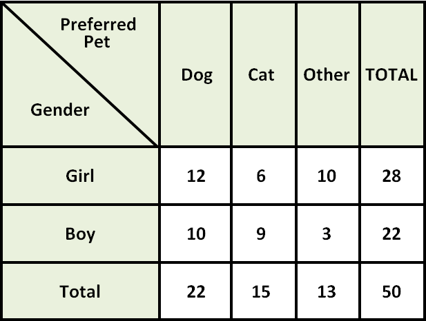
This is a type of table. An example of this type is shown below.

What is a two-way-table?

This type of graph.
What is a segmented bar graph?
The right side of a stemplot
What are the leaves?
The joint relative frequency of girls that like dogs seen in the table below.

What is 12/50?
This is an approximation of the average distance to the mean of a data set.
What is standard deviation?
This is 31 mpg in the dotplot shown below.

What is median and the mode?
This type of graph

What is a side-by-side bar graph?
We use this measurement of the variability when the data is not symmetric.
What is the IQR?
This is the conditional relative frequency distribution of pet preference among girls.

What are Dogs (12/28), Cats (6/28) and Other(10/28)?