Categorial
Quantitative
Misc
100
The most popular colors for cars and light trucks change over time. Silver advanced past green in 2000 to become the most popular color worldwide, then gave way to shades of white in 2007. Here is a relative frequency table that summarizes data on the colors of vehicles sold worldwide in a recent year.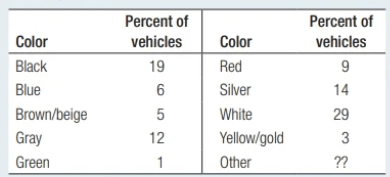
(a) What percent of vehicles would fall in the “Other” category?
(b) Would it be appropriate to make a pie chart of these data? Explain
a: 100% - 19% - 6% - 5% - 12% - 1% - 9% - 14% - 29% - 3% = 2% of cars have some other type of color.
b: It would be appropriate to make a pie chart of these data (including the other category) because the numbers in the table refer to parts of a single whole.
100
In a recent week, data on the age of all homes sold in a particular area were collected and displayed in this histogram. What is the median age?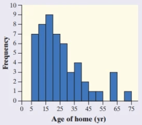
Some number from 20 to <25
100
A car dealer keeps records on car buyers for future marketing purposes. The table gives information on the last 4 buyers. Identify the following Individuals, Categorical Variables, and Quantitative Variables.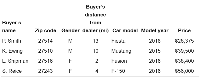
Individuals: The buyers
Categorical: Zip Code, Gender, Car Model, & Model Year
Quantitative: Distance & Price
200
The students in Mr. Tyson’s high school statistics class were recently asked if they would prefer a pasta party, a pizza party, or a donut party. The following bar graph displays the data. This graph is misleading because...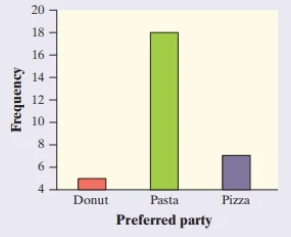
the vertical axis scale should start at 0.
200
The back-to-back stemplot shows the lifetimes of several Brand X and Brand Y batteries.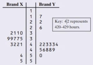
(a) Give a reason someone might prefer a Brand X battery.
(b) Give a reason someone might prefer a Brand Y battery.
(a) Someone might prefer to use Brand X because it has a higher minimum lifetime or because its lifetimes are more consistent (less variable).
(b) Someone might prefer Brand Y because it has a higher median lifetime.
200
Billy surveyed 27 of his friends and asked how long it took for them to get to school each morning. Results of his survey are shown below. What percent of those surveyed said they were able to get to school in under 10 minutes.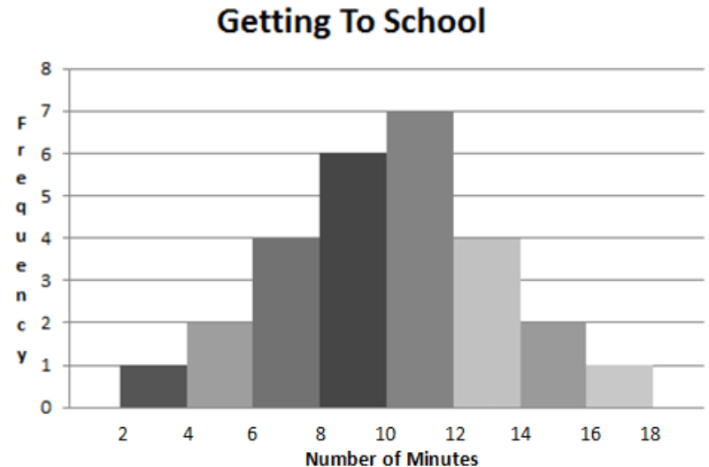
13/27 = 0.48
48% of the students were able to get to school in less than 10 minutes.
300
A study among the Pima Indians of Arizona investigated the relationship between a mother’s diabetic status and the number of birth defects in her children. The results appear in the two-way table.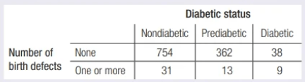
(a) What proportion of the women in this study had a child with one or more birth defects?
(b) What percent of the women in this study were diabetic or prediabetic, and had a child with one or more birth defects?
(a) 53/1207 = 0.044
(b) 22/1207 = 1.8%
300
Looking at this modified Box Plot, what will happen to the range and IQR when the outlier 23 is removed?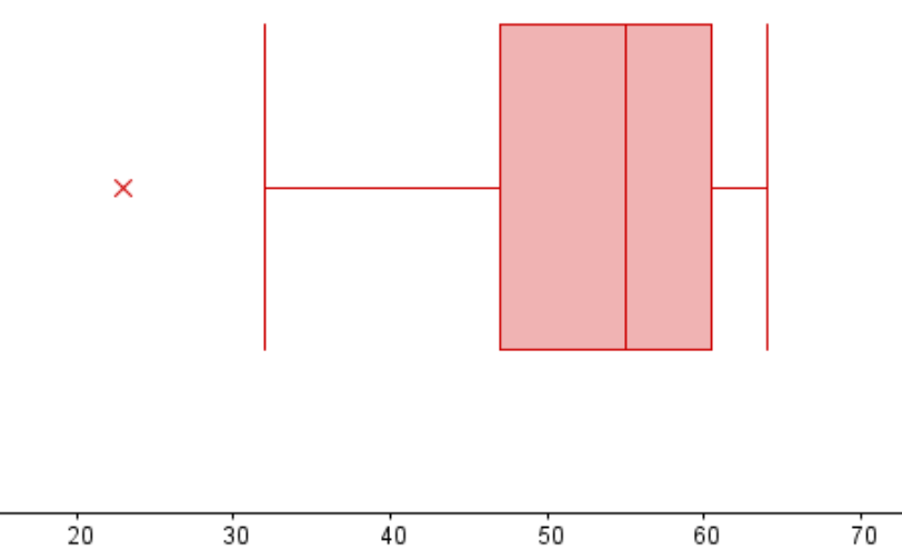
The range will decrease but the IQR should remain about the same
300
Supposed a researcher is measuring the weights of 100 individuals. Which of the following types of graphical displays would best to use to display the weights of all of these 100 individuals?
A. Pie Chart
B. Stem Plot
C. Scatter Plot
D. Box Plot
E. Dot Plot
B. Stem Plot
B is correct because it can better group large amounts of quantitative data to more accurately determine shape.
400
A study among the Pima Indians of Arizona investigated the relationship between a mother’s diabetic status and the number of birth defects in her children. The results appear in the two-way table.
(c) Make a segmented bar graph to display the distribution of number of birth defects for the women with each of the three diabetic statuses.
(d) Describe the nature of the association between mother’s diabetic status and number of birth defects for the women in this study.
c.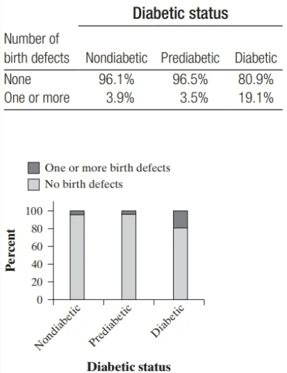
d. There is an association between diabetic status and number of birth defects for the women in this study. Nondiabetics and prediabetics appear to have babies with birth defects at about the same rate. However, those with diabetes have a much higher rate of babies with birth defects.
400
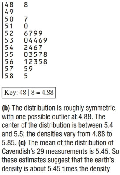
In 1798, the English scientist Henry Cavendish measured the density of the earth several times by careful work with a torsion balance. The variable recorded was the density of the earth as a multiple of the density of water. Here are Cavendish’s 29 measurements.
5.50 5.61 4.88 5.07 5.26 5.55 5.36 5.29 5.58 5.65 5.57 5.53 5.62 5.29 5.44 5.34 5.79 5.10 5.27 5.39 5.42 5.47 5.63 5.34 5.46 5.30 5.75 5.68 5.85
(a) Make a stemplot of the data.
(b) Describe the distribution of density measurements.
(c) The currently accepted value for the density of earth is 5.51 times the density of water. How does this value compare to the mean of the distribution of density measurements?
400
A survey was designed to study how business operations vary by size. Companies were classified as small, medium, or large. Questionnaires were sent to 200 randomly selected businesses of each size. Because not all questionnaires are returned, researchers decided to investigate the relationship between the response rate and the size of the business. The data are given in the following two-way table.
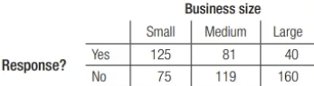
Which of the following conclusions seems to be sup-ported by the data?
(a) There are more small companies than large companies in the survey.
(b) Small companies appear to have a higher response rate than medium or big companies.
(c) Exactly the same number of companies responded as didn’t respond.
(d) Overall, more than half of companies responded to the survey.
(e) If we combined the medium and large companies, then their response rate would be equal to that of the small companies.
(b) Small companies appear to have a higher response rate than medium or big companies.
500
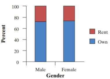
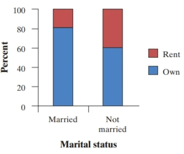
A sample of 348 U.S. residents aged 18 and older was selected. Among the variables recorded were gender (male or female), housing status (rent or own), and marital status (married or not married). One two-way table summarizes the relationship between gender and housing status the other summarizes the relationship between marital status and housing status.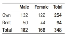
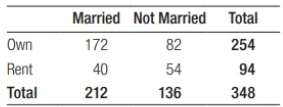
Make two graphs to compare the distributions of housing status for males and females, and housing for married and not married. Is the association between marital status and housing status stronger or weaker than the relationship between gender and housing status? Justify your choice using the data provided in the two-way tables.
A graph of housing status for married and not married respondents is shown below. Because the percent of married respondents who own their home (81.1%) is quite a bit larger than the percent of not married respondents (60.3%), there seems to be an association between mar-ital status and housing status. Also, this association is stronger than the association between gender and housing status because the difference in percents who own a home is greater for marital status (81.1 - 60.3 = 20.8%) than for gender (73.5 - 72.5 = 1%).
500
Catherine and Ana suspect that athletes (i.e., students who have been on at least one varsity team) typically have a faster reaction time than other students. To test this theory, they gave an online reflex test to separate random samples of 33 varsity athletes and 29 other students at their school. Here are parallel boxplots and numerical summaries of the data on reaction times (in milliseconds) for the two groups of students.
(a) Are these numerical summaries statistics or parameters? Explain your answer.
(b) Write a few sentences comparing the distribution of reaction time for the two types of students.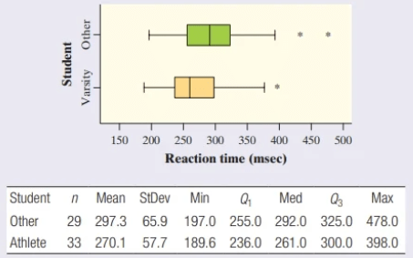
(a) These numerical summaries are statistics because they are numbers that describe the samples.
(b) The distribution of reaction time for the “Athlete” group is slightly skewed to the right. The distribution of reaction time for the “Other” group is roughly symmetric, with two high outliers. It appears that the “Athlete” distribution has one high outlier, while the “Other” distribution has two high outliers. The reaction times for the students who have not been varsity athletes tended to be slower (median 5 292.0 milliseconds) than for the athletes (median 5 261.0 milliseconds). The distribution of reaction time for the “Other” group also has more variability as their reaction times have an IQR of 70 milliseconds and the athletes’ reaction times have an IQR of 64 milliseconds.
500
Mercury in tuna Here are a dotplot and numerical summaries of the data on mercury concentration in the sampled cans (in parts per million, ppm):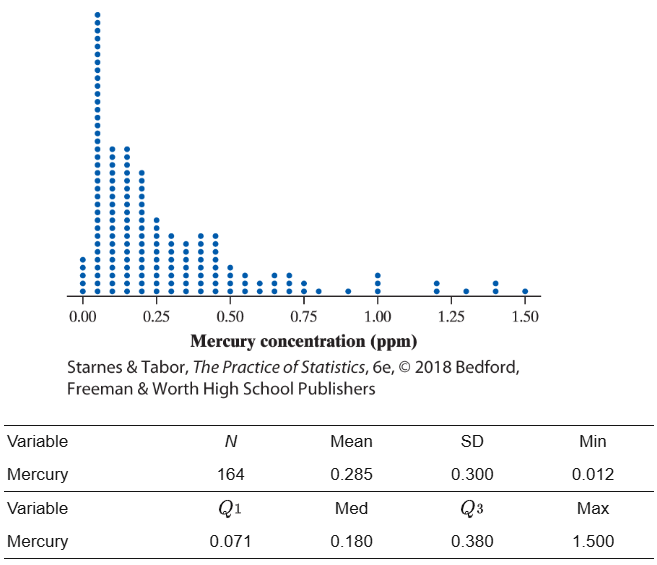
a. Interpret the standard deviation.
b. Determine whether there are any outliers.
c. Explain why the mean is so much larger than the median of the distribution.
(a) The amount of mercury per can of tuna will typically vary by about 0.3 ppm from the mean of 0.285 ppm.
(b) The IQR = 0.380 - 0.071 = 0.309, so any point below 0.071 - 1.5(0.309) = 20.393 or above 0.38 + 1.5(0.309) = 0.8435 would be considered an outlier. Because the smallest value is 0.012, there are no low outliers. According to the histogram, some values fall above 0.8435, so there are several high outliers.
(c) The mean is much larger than the median of the distribution because the distribution is strongly skewed to the right and there are several high outliers.