Mean and Median
Variability
Dot Plots
Histograms
Box Plots
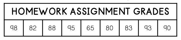
100
Find the median of the following data set.
19, 33, 41, 24, 18, 29, 32
29
100
Find the range of the data below.
33
100
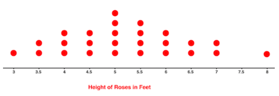
How would you describe the shape of the data shown in the dot plot?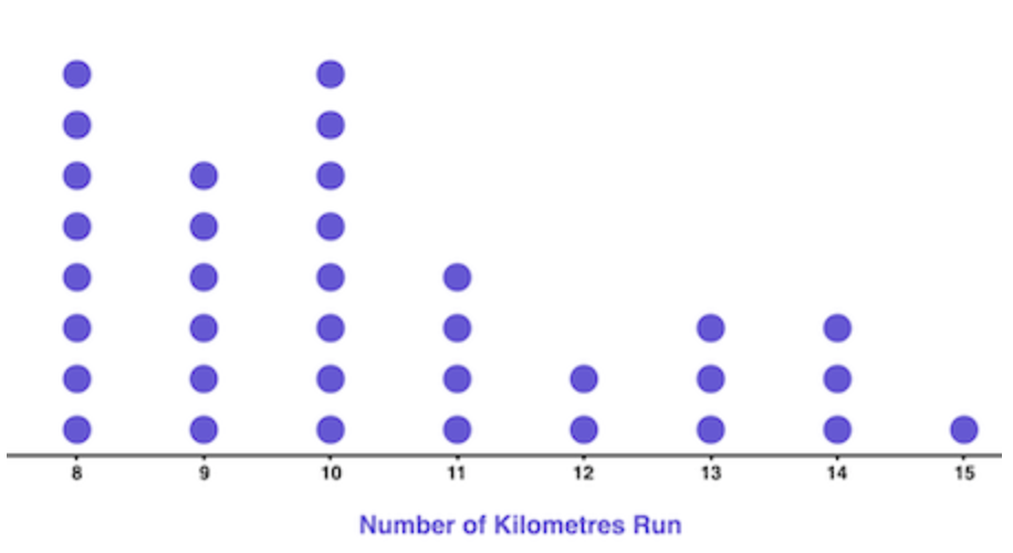
Skewed right
100
In what range of points did most players players score?
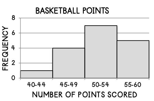
50-54 points
100
What is the median of the box plot below?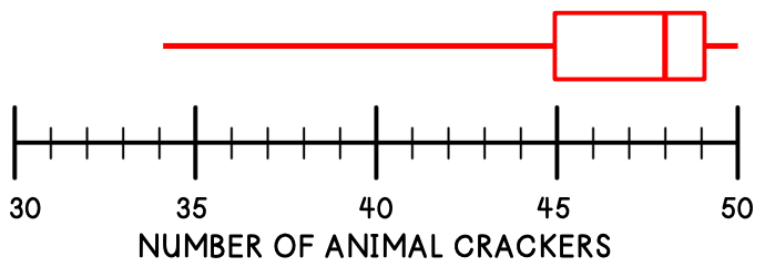
48
200
Find the mean of the following set of data.
10, 13, 16, 16, 14, 10, 12
13
200
Find the range of the data below.
7.5, 4.6, 7.1, 7.8, 2.9, 10, 12.7, 8.3, 7.5, 5.4
9.8
200
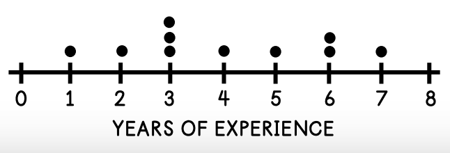
How would you describe the shape of the data in the dot plot shown?
Symmetrical
200
How many players are represented by the histogram below?

17 players
200
What is the interquartile range of the data below?
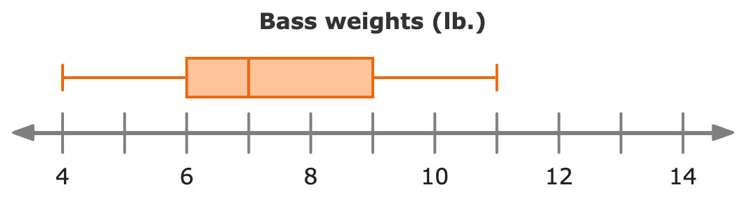
3 lbs.
300
Determine the median of the data below.
87, 95, 101, 79, 92, 108
93.5
300
Find the range of the data below.
6
300
The length of several iguanas were measured and the data is displayed in the dot plot below. How many iguanas were measured?
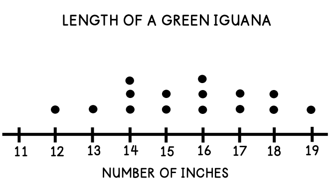
15
300
The graph shows how many minutes Sam read each day in June. How many more days did Sam read 30-39 minutes than 10-19 minutes?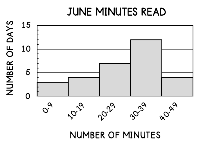
8 days
300
Which quartile represents the greatest spread in data?
the second quartile
400
Determine what the mean would be if 5 was added to the data below.
2.5, 6, 3.1, 4.5, 1.1, 3
3.6
400
Find the interquartile range of the following set of data.
10, 32, 14, 17, 23, 24, 23
10
400
Based on the shape of the data below, what is the best measure of center for the data?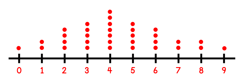
Mean is the best measure of center since the data is symmetrical.
400
According to the histogram below, what percent of the patrons surveyed were between 10-29 years old?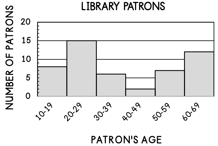
46%
400
Which team has greater variability in shoe sizes?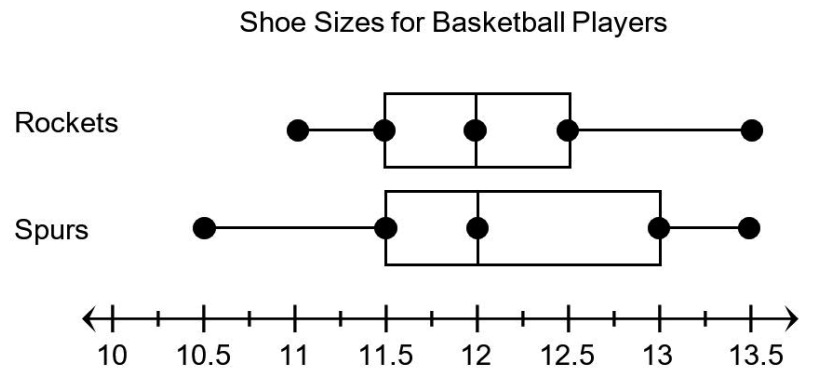
Spurs
500
The mean of the following set of data is 12.
10, 15, 6, 14, 15, 8, ?
What value should replace the question mark to make the statement true?16
500
Find the interquartile range.
3
500
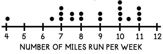
What are the mean and median of the data shown in the dot plot below?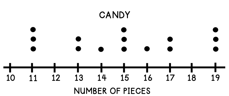
The mean and median are both 15.
500
According to the graph, which two age ranges make up 40% of the data?

10-19 and 60-69
500
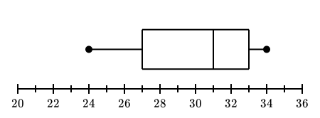
What is the 5 number summary for the box plot below?
min= 24
Q1= 27
med= 31
Q3= 33
max= 34