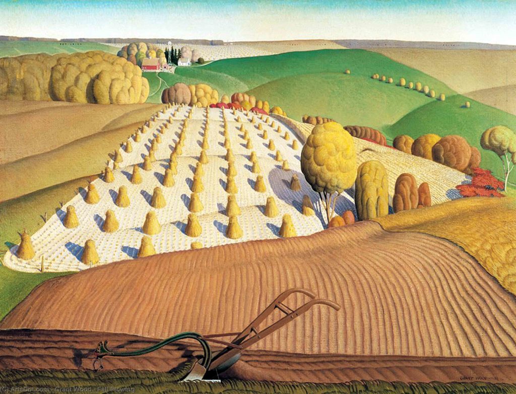
This artwork was created mainly by using the element of _____.

Line
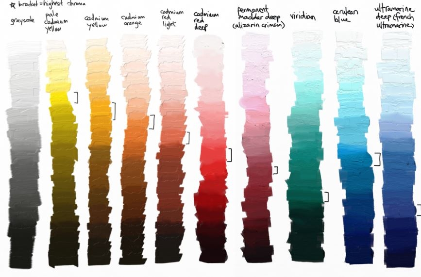
What Principle of Design describes these colors?

Emphasis and contrast
What element of design is a mark from one point to another?
Line
If I made a triangle shaped design and kept copying and pasting the design throughout my whole artwork, what Principle of Design would I be using?
Repetition or Rhythm
How do elements and principles of design relate? Or, how do they work together when designing a space?
The Principles of Design are the ways in which designers use the Elements of Design in the creation of a space.
The Elements of Design are the "what," and the Principles of Design are the "how."
True or false?
This rock can be an example of texture.

BONUS 100 pts: Why?
TRUE!
"Smooth" is also a texture! A texture doesn't have to be something that is rough, bumpy, fuzzy, etc. Texture refers to the visual "feel" of something. In this case, the feeling of the rock would be smooth, therefore it would have a smooth texture.
Which principle of design helps this artwork to show different visual elements, which in turn creates visual interest?

Variety
What element of design is created when lines connect to create a boundary, thus a 2D ______ is created by that enclosed boundary?
Shape
Which 2 principles of design could be used when a designer places a white chair against an orange wall?
Emphasis or contrast
What 1 element of design and 1 principle of design work together in this sculpture shown?
Form and Scale
(Form is the element of art, and scale is the principle of design)
What element of art is dominantly depicted in the entirety of this artwork?

Space
Does this artwork use the Principle of Design balance?

YES
Asymmetrical balance is still considered a type of "balance" in design. It is asymmetrically balanced because the visual weight is heavy on the left with the roaring wave, but the right side has less going on/is more calm.
What word did we study that refers to the visible lightness or darkness of a color?
Value
What principle of design is the distribution of visual weights?
Balance
When forms are not equally placed in a room, we are using which design principle?
Balance and asymmetry
What elements of art is dominantly shown?

Color
Value is how light or dark a color can be
What 2 Principle of Design are most dominantly used in this artwork?

Repetition and Unity
What element of design is the 3D expanse?
Space
What is the size of an artwork in relation to us as humans/the audience? AND
What is the relationship of the size(s) of the objects within an artwork?
Scale
Proportion
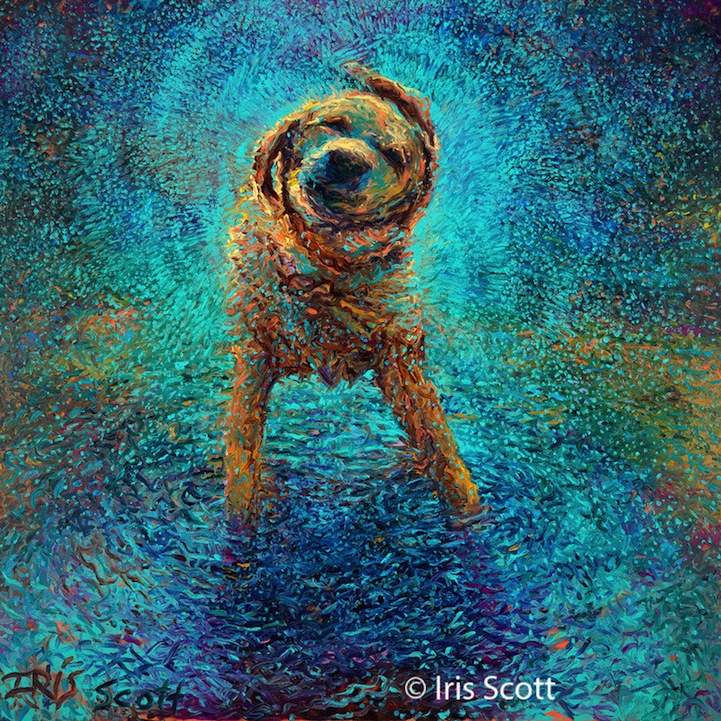
What principle of design pictured below, gives you the idea that the dog is shaking off water?
What element of design was used creatively to demonstrate that there is water/water on the dog?

Movement
Color and/or texture
How many Elements of art did we study and what are they?
SEVEN!
Line, Shape, Form, Space, Texture, Color, Space
What Principle of Design is most dominantly used in this artwork? AND what type of symmetry is occurring?

Balance
Radial
What element of art turns into "form" when you add dimension?
Shape
If I had 2 chairs that were unified in form, but were different colors, what design principles would I be using?
Unity and Variety
What is the word that describes combining Art Deco furniture and Mid-Century Modern furniture?
Eclectic
OR, eclectic design
