Working with Tables
Customizing tables
Charts
Charts 2
More Charts
100
PowerPoint includes several options for customizing tables, including moving and resizing, as well as adding ____ and _______.
rows and columns
100
PowerPoint makes it easy to change the look and feel of your tables. For example, you can quickly apply different table styles and customize the table borders.
True or False
True
100
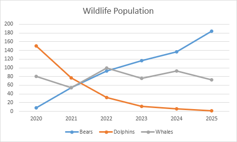
A chart is a tool you can use to communicate data graphically. Including a chart in a presentation allows your audience to see the meaning behind the numbers, which makes it easy to visualize comparisons and trends.
True or False
True
100
These charts are similar to line charts, except the areas under the lines are filled in.

Area Charts
100
You can also click the ______ _____ command in a placeholder to insert a new chart.
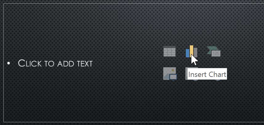
Insert Chart
200
You can also insert a table by clicking the ______ _____ command in a placeholder.

Insert Table
200
To apply a table style:
- Select any cell in your table, then click the ______ tab on the right side of the Ribbon.
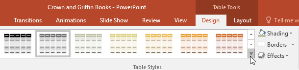
Design
200
These type of charts use vertical bars to represent data. They can work with many different types of data, but they're most frequently used for comparing information.

Column Charts
200
These charts allow you to display data across a 3D landscape. They work best with large data sets, allowing you to see a variety of information at the same time.
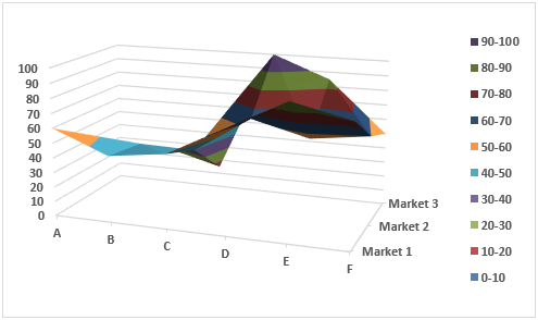
Surface Charts
200
You can also use the chart formatting shortcut buttons to quickly ___ _____ elements, change the chart style, and filter the chart data.
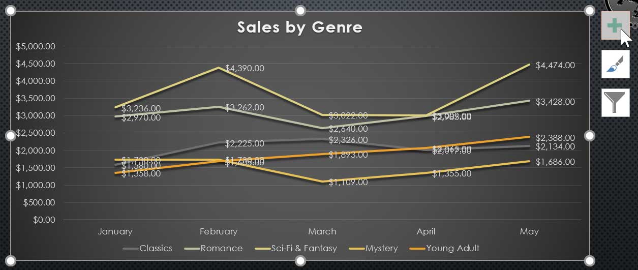
Add Chart
300
- From the Insert tab, click the Table command.
- Hover the mouse over the grid of squares to select the desired number of columns and rows in the table. In this example, how many rows and columns are shown?
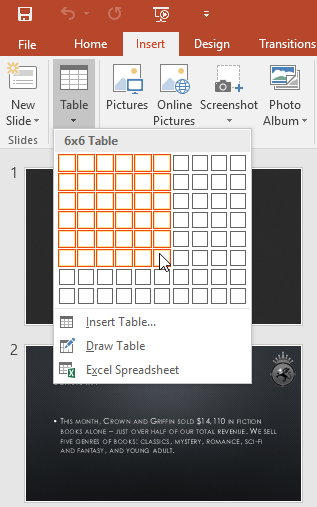
6x6
6 rows and 6 columns
300
Locate the _____ ______ group, then click the More drop-down arrow to see available table styles.
Table Styles
300
These charts are ideal for showing trends. The data points are connected with lines, making it easy to see whether values are increasing or decreasing over time.
Line Charts
300
To insert a chart:
- Select the Insert tab, then click the Chart command in the ______________ group.
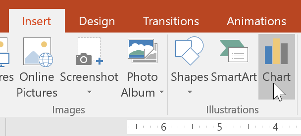
Illustrations
300
From the Design tab, click the More drop-down arrow in the _____ ______ group.
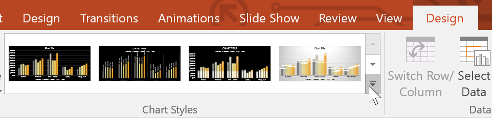
Chart Styles
400
Click the edge of the table you want to delete, then press the _________ or ______ key on your keyboard.
Backspace or Delete
400
To add borders to a table:
You can add borders to help define different sections of a table. Certain table styles may include borders automatically, but it's easy to add them manually or customize them. You can control the border weight, color, and ____ _____ for some or all of a table.
line style
400
These charts make it easy to compare proportions. Each value is shown as a slice of the pie, so it's easy to see which values make up the percentage of a whole.
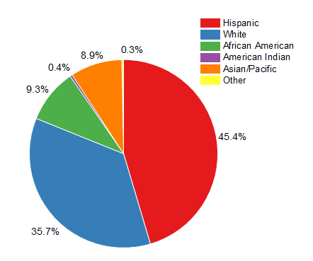
Pie Charts
400
Select the desired chart, then click __.
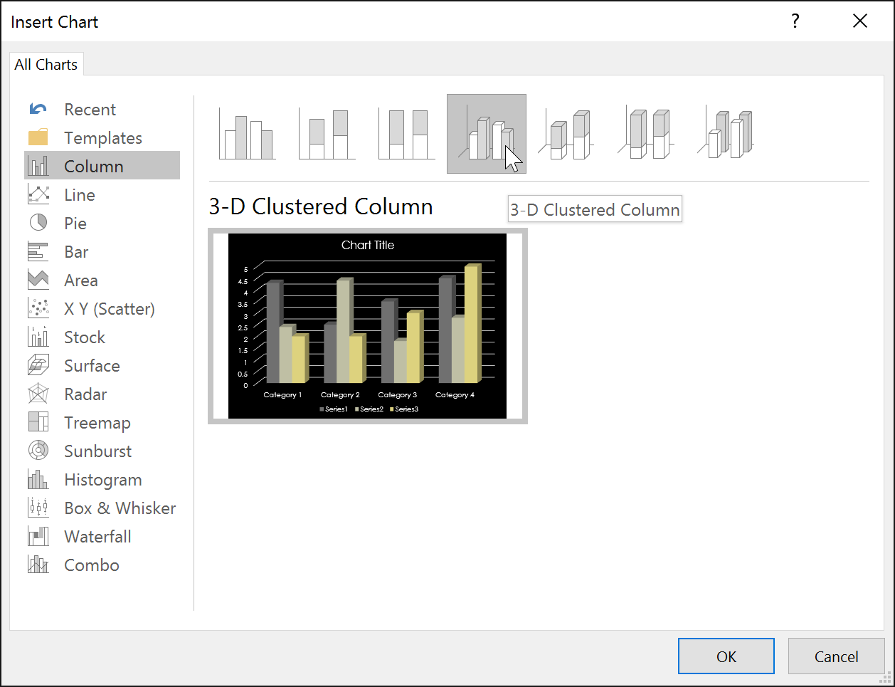
OK
400
From the Design tab, click the _____ ______ command.
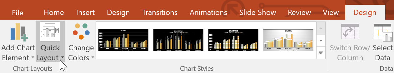
Quick Layout
500
Another tool you can use to display information in PowerPoint.
it's a grid of cells arranged in rows and columns.
They are useful for various tasks, including presenting text information and numerical data. You can even customize tables to fit your presentation.
Tables
500
From the Design tab, select the desired Line Style, Line Weight, and ___ _____.
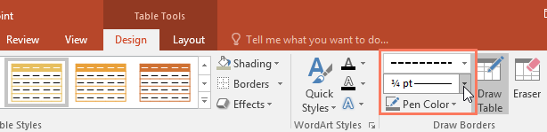
Pen Color
500
These charts work just like column charts, but they use horizontal bars instead of vertical bars.
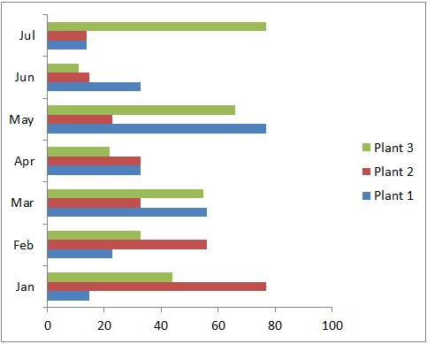
Bar Charts
500
You can edit the chart data at any time by selecting your chart and clicking the Edit Data command on the ______ tab.
Design
500
Click the chart again, then select the ______ ___/______ command in the Data group.
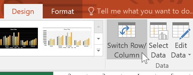
Switch Row/Column