Mixed Bag
Bar Graph
Picture Graph
Step Graph
Pie Graph
Step Graph
Mystery Category
100

Which was the least favorite sport?
Ice Hockey
100
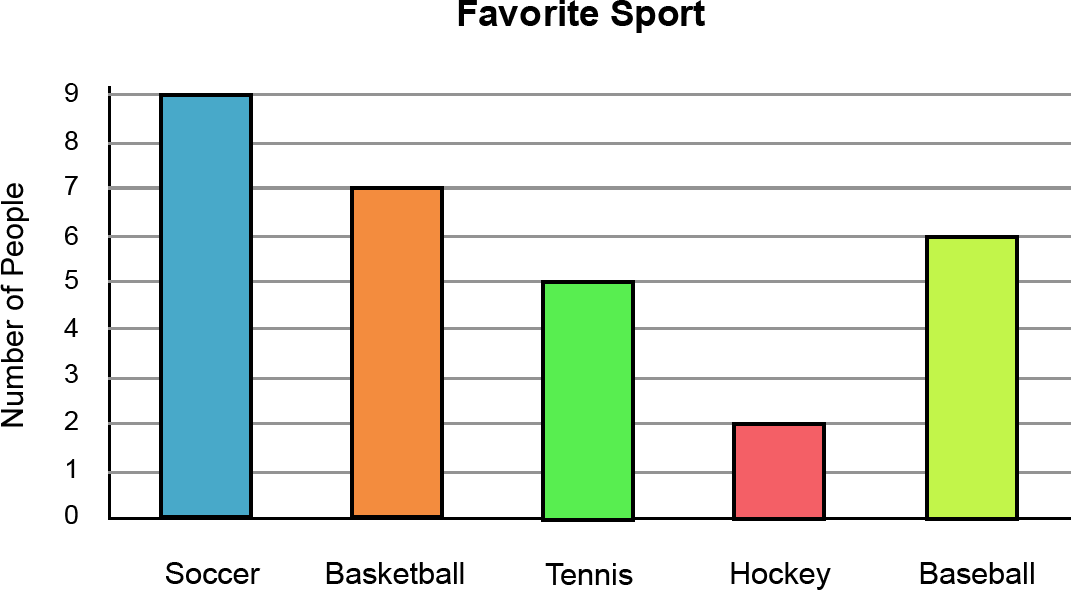
How many students like baseball the best?
6 people
100
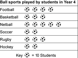
How many students play rugby and soccer?
50
100
What is missing from this graph? Hint: there are two things missing

Title
Percentages or measuring scale
100

What percent of people like PIZZA?
100%
100
What time does the event start?
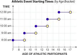
8:00am
100
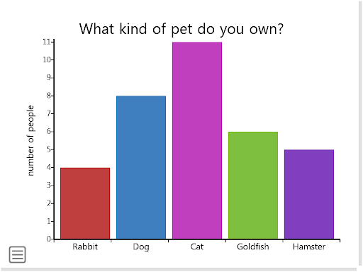
What things must always be on a column graph?
Title
Labels on the Axes
a space between the first column and spaces between the other columns
200
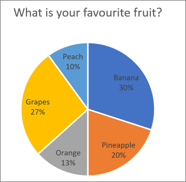
What percentage of people liked grapes and bananas?Clue: add grapes + bananas
57%
200
How many total people completed the survey?
Clue: you must add the totals of all sports 9+7+5+2+6=
29 people
200
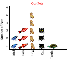
What is missing in this graph?
A key - how much is each picture worth?
200
What percentage of the labour force is services?
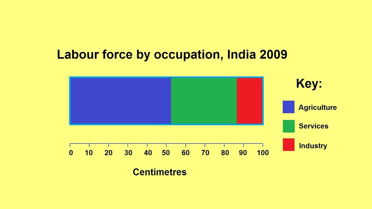
30%
200

This circle graph represents a classroom of 20 students. How many students chose pepperoni pizza?
10 students
200
What time are my events if I am 13 years old?
11:00am
200
List 3 times where you might use a conversion graph
- Exchange money between one currency and another
- temperature
- to see how many kms you can get out of fuel
300
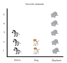
How many students own dogs?
8 students
300
How many more students like Soccer than Basketball?clue soccer minus basketball=answer
9 - 7 = 2 students
300
If each picture is worth 5 pets how many more people own dogs than turtles?
20
300
Which country makes up 4.5% of this divided bar graph?
What could be changed to make this graph clearer?
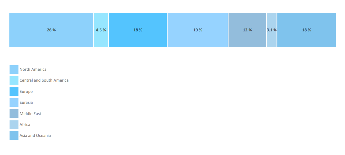
Central and South America
Different colours rather than all blues
300
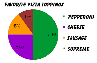
This circle graph represents a class of 20 people. How many people chose CHEESE pizza?
5 people
300
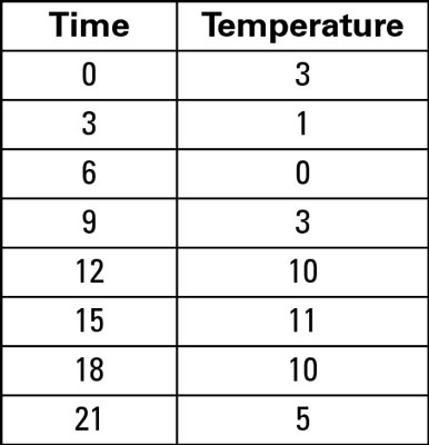
How many children are at the centre on the 10th day of the month?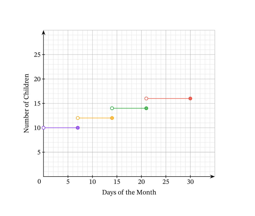
12
300
you usually use me to display data in percentages
I sometimes need to be converted to degrees
What type of graph am I?
Pie Chart
400
 Which method of music sales has increased AND decreased over time?
Downloads
400
What is the most favorite sport?
SOCCER
400
How many people like custard and original doughnuts?
What piece of information is unnecessary on this graph?
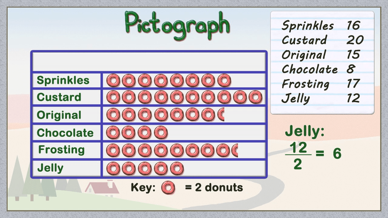
35 people
Jelly 12/2=6
400
Which source of income decreased the most between 1962 to 2013? by how many percent?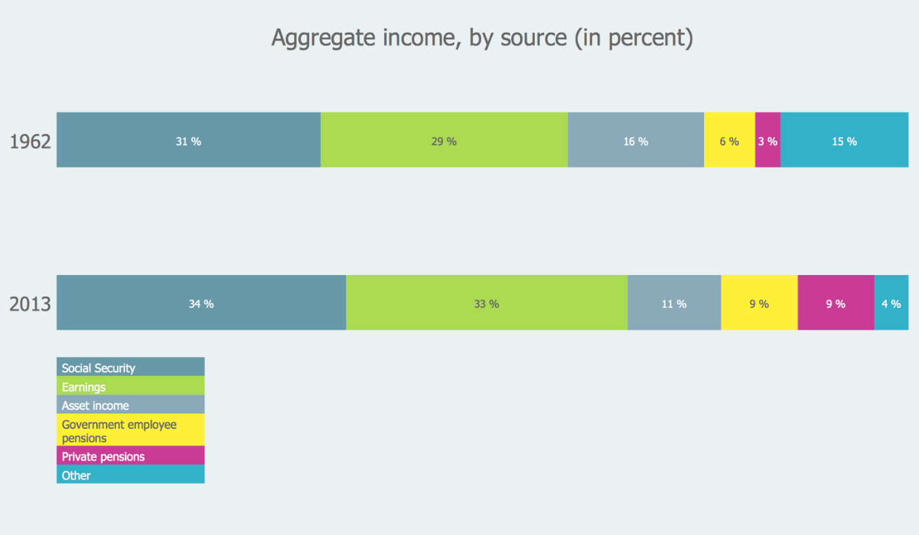
the "other" category
Decreased by 11%
400
 This circle graph represents 20 people. How many more people chose pepperoni compared to cheese?
10-5 = 5 students
400
which days of the month are there 15 children in the centre? why might this be?
Never, there are only ever 14 or 16 children present
400
Draw a line graph with the following information - you have 1 minute... GO!
Miss Millican to Judge
500
Which colour had the biggest increase oveerall?
Which had the smallest increase between pre school and primary?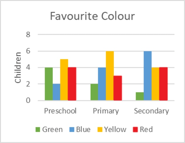
Blue
Yellow
500
How many people picked a favorite sport that is played on a court?
12 people
Basketball and Tennis are played on courts, the others are played on fields or pitches
500
Sneaky Question!
Can you name the 7 main types of graphs we have learnt about?
Picture Graphs
Pie Charts
Line Graphs
Divided Bar Graph
Column Graph
Conversion Graph
Step Graph
500
Which food was consistently highest in all years? What percentage did this food make up each year?
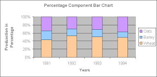
Wheat
1991 - 42%
1992 - 52%
1993 - 50%
1994 - 49%
500
 What percentage of people preferred meat based pizzas?
50 + 15 + 10 = 75%
500
How many children are at the centre on the 21st day of the month?
14
500
Come up with a story about this graph!
Miss Millican to Judge - points for creativity!