Random:)
Bar Graphs
Circle Graphs
100

Which was the least favourite sport?
Ice Hockey
100
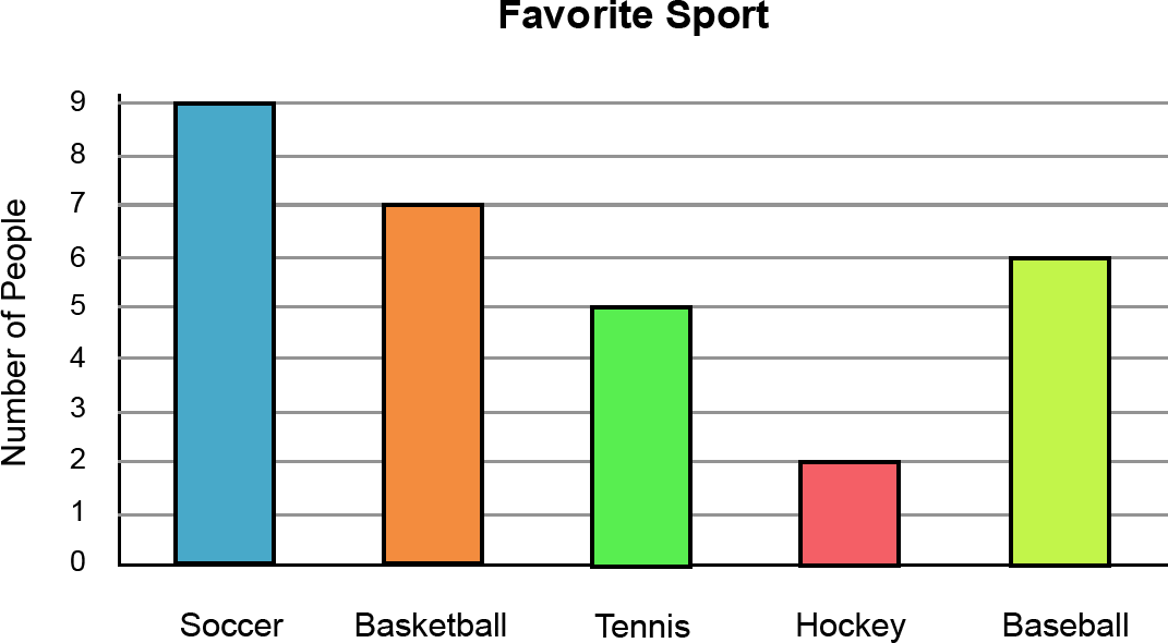
How many students like baseball the best?
6 people
100

What percent of people like PIZZA?
100%
200
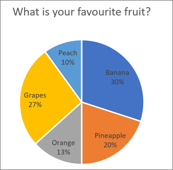
What percentage of people liked grapes and bananas?
57%
200
How many total people completed the survey?
29 people
200
This circle graph represents a classroom of 20 students. How many students chose pepperoni pizza?
10 students
300
What is 7 x 6?
42
300
How many more students like Soccer than Basketball?
9 - 7 = 2 students
300
This circle graph represents a class of 20 people. How many people chose CHEESE pizza?
5 people
400
What type of graph is used to show change over time?
Line Graph
400
What is the most favorite sport?
SOCCER
400
This circle graph represents 20 people. How many more people chose pepperoni compared to cheese?
10-5 = 5 students
500
What type of graphs is used to compare parts to a whole?
Pie graph (pie chart)
500
How many more people voted for basketball and tennis combined than hockey?
10 people
Basketball and Tennis have a total of 12 votes. Hockey has 2 votes.
12-2= 10
500
What percentage of people preferred pepperoni, sausage or supreme pizza?
50 + 15 + 10 = 75%