Device Grips
Thumb Zones
Layout Do’s & Don’ts
Design Evaluation
Real-World Examples
100
What is the most common way people hold mobile devices?
One handed grip - 49%
100
What zone is best for placing primary actions on smartphones?
Green Zone
- Bottom half
- Easy & accurate
100
Name 3 “Do” for smartphone layout design.
Place primary controls at bottom-center
Put core features in the middle to lower screen area
Position content above controls to avoid occlusion
Use bottom navigation like tabs, nav bars, etc.
Place frequent actions within easy thumb reach
Make room for OS features like the Samsung nav bar
For mobile web, avoid fixed navigation that overlaps browser chrome
100
What question should you ask about reachability in mobile UI?
Can the primary actions be reached with the thumb?
100
Real-World ExamplesWhat layout feature makes Duolingo thumb-friendly?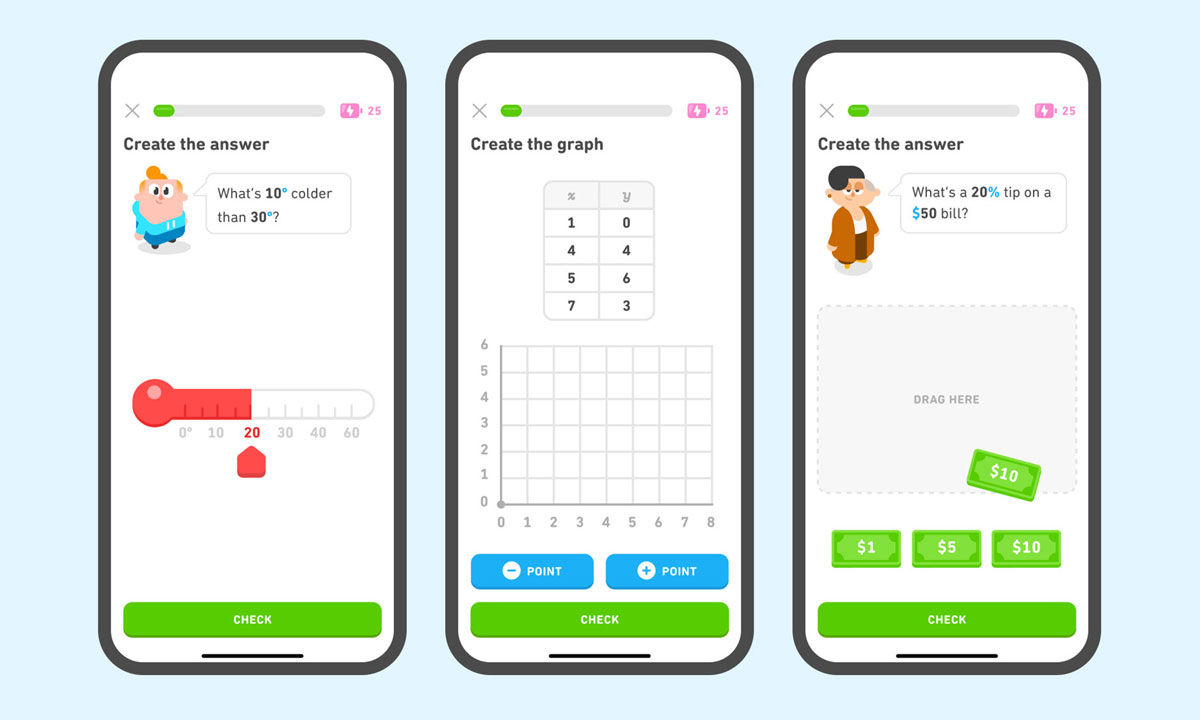
Answer buttons are placed at the bottom, within thumb reach
200
Which grip uses both thumbs for interaction?
Two-handed grip
200
What zone should be avoided for critical controls?
Red Zone
- Top third
- Bottom right and left corners
- Hard to reach
200
Name 3 “Don’t” for tablet layout design.
Don’t place navigation in the top-middle
Don’t place browsing controls above content
Don’t rely on bottom center for primary actions
Don’t ignore the need for edge-based control placement
Don’t assume one-handed usability
200
Why is visibility important in mobile layout design?
So users can see what they’re interacting with and avoid occlusion
200
How does Google Maps balance content and controls?
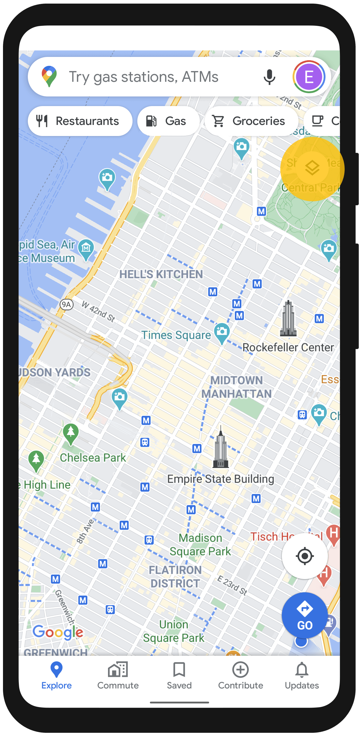
Map fills screen; controls are at bottom, search at top
300
Why is the one-handed grip considered the most constrained?
Because the same hand holds the device and interacts with the thumb, limiting reach.
300
How do thumb zones shift on tablets compared to smartphones?
Easy zones move to lower corners/edges; center becomes harder to reach.
300
Why should navigation be placed at the bottom on smartphones?
It’s within easy thumb reach and avoids occlusion
300
What platform-specific constraint affects mobile web layout?
Browser chrome may interfere with fixed navigation
300
What issue arises from FitBit’s fixed bottom nav?

It overlaps with OS nav bar, causing misclicks
400
How does the 2 handed grip affect thumb zone accessibility?
It allows better reach and precision using the opposite hand’s finger or thumb.
400
Why is the center of a tablet screen considered a Red zone?
It’s difficult to reach with thumbs when holding the tablet with two hands.
400
What layout mistake can lead to accidental taps on FitBit’s app?
Fixed bottom nav overlapping with OS nav bar
400
How should layout adapt to different device sizes?
By adjusting thumb zones and control placement based on form factor
400
What does the Canadian Tire mobile site do well with navigation?
Uses expanding hamburger menu and places controls near screen edges
500
How should UI design accommodate all grip types?
By designing for the most constrained grip (one-handed) to ensure universal usability
500
How does pinky support affect thumb zone layout on tablets?
It shifts the grip and changes the thumb’s reach, altering the green zone location.
500
How can designers avoid occlusion of content by fingers?
Position content above controls and avoid placing labels/icons below controls
500
What makes destructive actions safer in terms of thumb zones?
Placing them outside the easy zone to prevent accidental taps
500
What layout challenges are present in the Realtor.ca app?
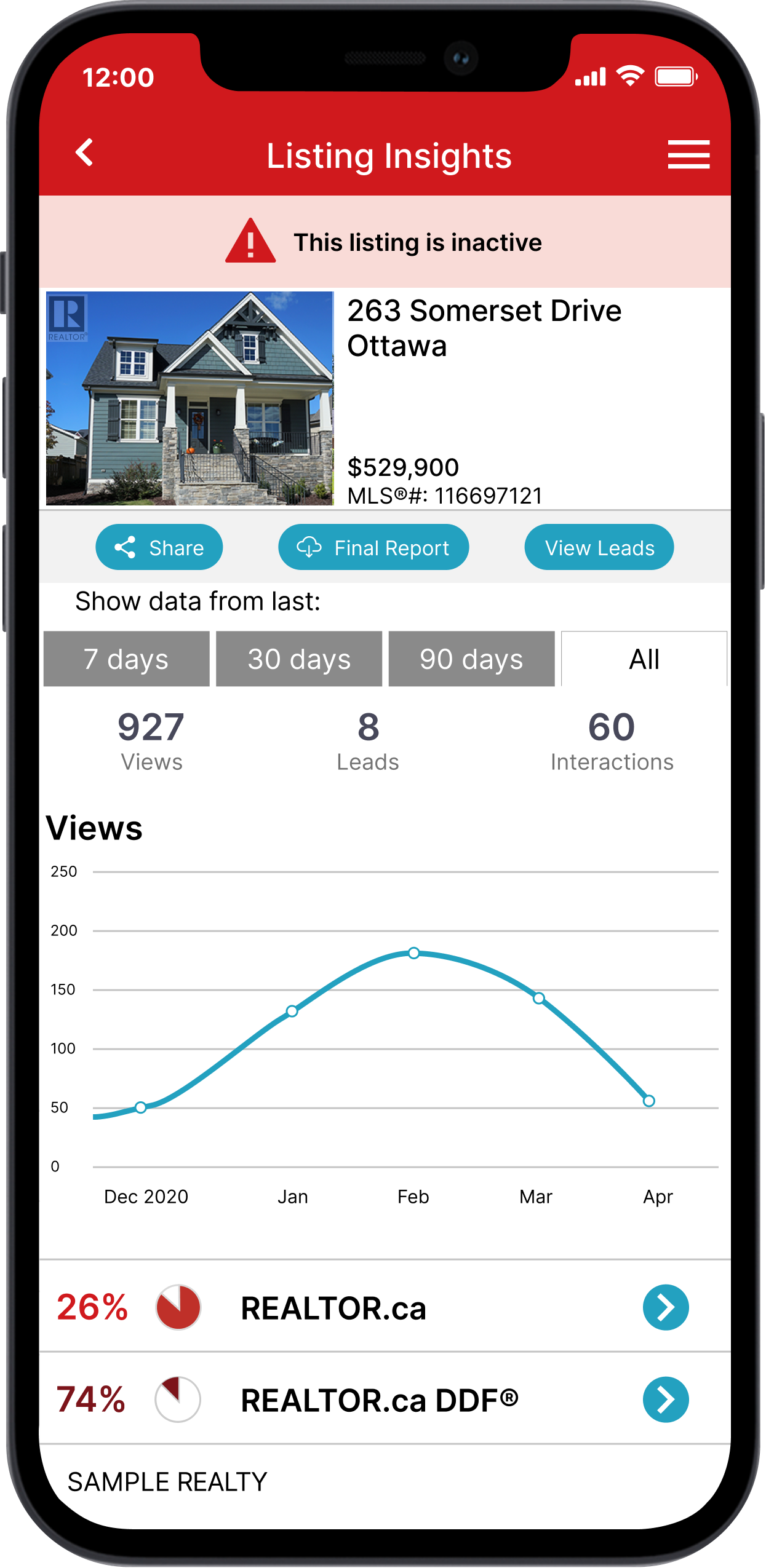
Possibly small touch targets and unclear control placement