Principles of Design
Color Theory
DY's Brand Guide
Accessibility
100
This is an example of _____
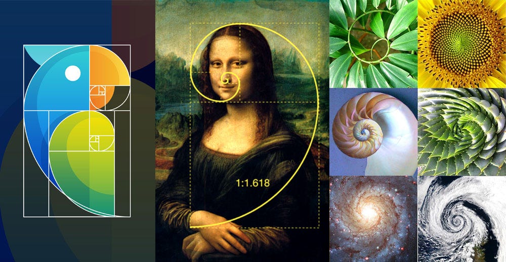
Golden Ratio
100
What feelings and vibe does the color green evoke? List at least two brands that use the color green.
Growth, peacefulness, and freshness are some of the feelings that the color green evokes. Brands that use green are Animal Planet, Wholefood, and Spotify.
100
This is our current DreamYard logo:
True or False?
![]()
False
100
What does accessibility mean?
Accessibility is the ongoing practice of ensuring all people have access to full participation, regardless of disability.
200
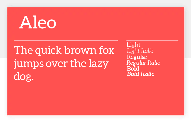
What type of typeface is this? What kind of feeling do these typefaces give off?
Sans serif fonts give off a feeling of being casual, informal, friendly, and very approachable. Companies who want their brands to appear more youthful and relatable tend to use sans-serif fonts.
200
Color Theory refers to _____
The primary rules and guidelines that surround color and its use in creating aesthetically pleasing visuals (color wheel, complementary and analogous colors).
200
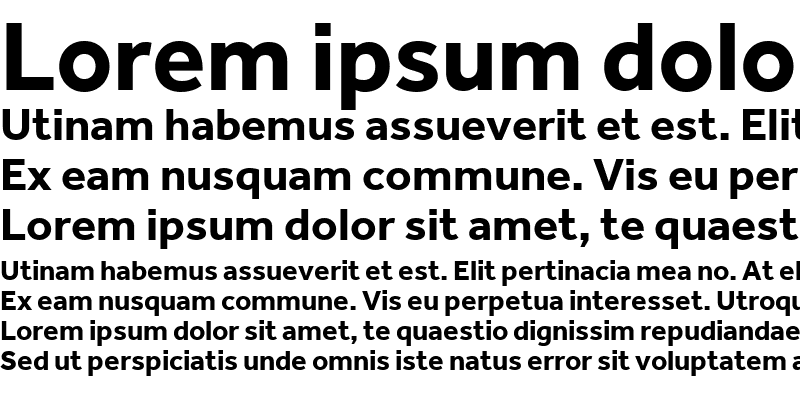
This is DreamYard's main typeface:
True or False?
False. DreamYard's typeface is Effra Regular and/or Effra Bold.
200
High-contrast color combinations are less legible than low-contrast colors.
True or False?
False. High-contrast color combinations make reading easier, and more legible.

300
The following image is an example of ________ principle of design.

Alignment affects how our brain scans the content on a screen, a proper alignment allows our eyes to seamlessly flow through the visual message. Aligning elements with one another so that every item has a visual connection with something else on the page, tightens a design and eliminates the haphazard, messy effect which comes from the random placement of elements.
300
________ refers to how color can influence human behavior, emotions, and change modes of thinking. It can excite or soothe your mood, raise or lower your blood pressure, and even whet your appetite! Different colors, hues, and tones all have meanings and can evoke a particular emotion, vibe, or aesthetic when used correctly.
Color Psychology
300
What is a brand? What is the purpose of a brand guide?
A “brand is your promise to your customer. It tells them what they can expect from your products and services, and it differentiates your offering from that of your competitors."
A brand guide is a set of rules in place not to limit creativity, but to keep your brand identity consistent and recognizable.
300
Accessibility: How should we talk about it?
The words we use to describe individuals with disabilities matters. What are ways to address someone that has low vision?
You should always use a person's first language.
For example:
People with low vision,
400
Which is the correct way to create balance in a design?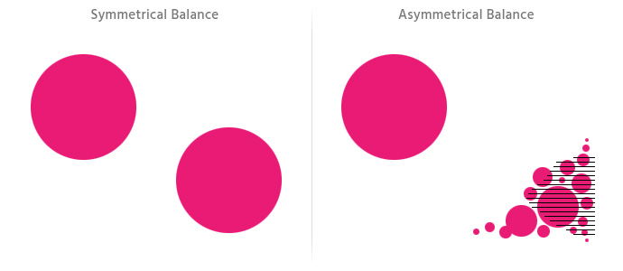
Both. Symmetrical balance is when both sides of a design have equal visual weight, each side is a mirrored image of the other. In Asymmetrical there is an uneven division of elements, yet the layout as a whole looks perfectly balanced.
400
Name a pair of complimentary colors and one pair of harmonious colors.
Blue and Yellow are complimentary
Green and Baby Blue are harmonious colors
400
When should you use DreamYard's tertiary colors in a flyer?
If you need a splash of different colors, only then should you use the Tertiary Colors. Primary and Secondary colors should be used for the majority of your design.
400
Please provide alternative text for the image below:

Black and white panda surrounded by green foliage is resting on a chopped tree trunk.
500
What is visual hierarchy? Why does the design on the right have a good visual hierarchy?
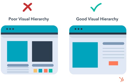
Visual hierarchy creates organization and is used to rank design elements and influence the order in which you want your users to view them.
The visual on the right has a clear beginning and end.
500
What are ways to properly use colors in your presentations & designs?
1. Use complementary colors to create balance and harmony.
2. Use contrasting colors for the text and background to make reading easier on the eye.
3. Use vibrant colors to create emotion and should be used sparingly (e.g. for buttons and call to actions).
500
What are three design principles that are important in a brand guide?
Color Palette
Typeface & Fonts
Hierarchy
500
List at least three typefaces that ensure readability, legibility, and accessibility for all.
Tahoma, Georgia, Calibri, Helvetica, Arial, Verdana, Times New Roman