Correlation/Association
Scatter Plots
Line of Best Fit
Miscellaneous
100

Which graph represents a positive linear association between x and y?
Graph A
Graph B
Graph C
Graph D
Graph A
100

How many outliers does the graph show?
A. 1
B. 2
C. 3
D. 4
C. 3
100

Which graph best shows the line of best fit?
Graph A
Graph B
Graph C
Graph D
Graph B
100
Which statement best describes the relationship between the number of hours spent working and the number of hours spent playing video games?

A. Fewer hours worked, fewer hours spent playing video games.
B. Greater hours worked, greater hours spent playing video games.
C. Greater hours worked, fewer hours spent playing video games.
D. There is no relationship between hours spent working and hours spent playing video games.
C. Greater hours worked, fewer hours spent playing video games.
200
Which graph represents a negative linear association between x and y?
Graph A
Graph B
Graph C
Graph D
Graph B
200
What type of association would a graph showing the age of a tree compared to the number of rings in a tree?
positive (probably linear)
200
Which graph best shows the line of best fit?

Graph A
200

What is the y-intercept of the line of best fit and what does it represent?
A. 10.4 hours; the number of hours students play outdoor sports in a week when they do not watch television
B. 7.2 hours; the number of hours students play outdoor sports in a week when they do not watch television
C. 10.4 hours; the number of hours students watch television in a week when they do not participate in any outdoor sports
D. 7.2 hours; the number of hours students watch television in a week when they do not participate in any outdoor sports
D. 7.2 hours; the number of hours students watch television in a week when they do not participate in any outdoor sports
300
Which graph represents a positive nonlinear association between x and y?
Graph A
Graph B
Graph C
Graph D
Graph D
300

Which two ordered pairs can be joined to draw most accurately the line of best fit on this scatter plot?
A. (4, 9.5) and (10, 5.5)
B. (5, 0) and (10, 10)
C. (0, 6) and (5, 0)
D. (0, 9.5) and (10, 1.5)
D. (0, 9.5) and (10, 1.5)
300
Which line best represents the line of best fit?

A. Line A, because it shows a positive association
B. Line A, because it is closest to most data points
C. Line B, because it is closest to most data points
D. Line B, because it shows a negative association
B. Line A, because it is closest to most data points
300

What would most likely be the approximate height of the plant after 7 weeks?
A. 5.2 cm
B. 7.6 cm
C. 8.7 cm
D. 12.7 cm
A. 5.2 cm
400
For which set of data will the scatter plot represent a negative nonlinear association between x and y?
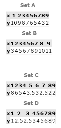
Set C
400
How many outliers does the graph show?

A. 1
B. 2
C. 3
D. 4
D. 4
400

What is a reasonable prediction based on this scatterplot?
A) x=3, y=8
B) x=2, y=2
C) x=0, y=5
D) x = 8, y =2
B) x=2, y=2
400
A small business records the afternoon outdoor temperature each day and the number of frozen treats sold that same day, then graphs those two quantities together.
Would a graph of this data show positive association, negative association, or no association?
probably positive association
500
What will most likely happen to the test scores of students if the number of hours they study increases?

A. Test scores will increase because the graph shows a negative association.
B. Test scores will increase because the graph shows a positive association.
C. Test scores will decrease because the graph shows a positive association.
D. Test scores will decrease because the graph shows a negative association.
B. Test scores will increase because the graph shows a positive association.
500
Which two ordered pairs can be joined to draw most accurately the line of best fit on this scatter plot?

A. (0, 0.5) and (10, 10)
B. (0, 4.5) and (7, 10)
C. (5, 0) and (10, 5)
D. (5, 0) and (9, 4)
A. (0, 0.5) and (10, 10)
500

What is the most reasonable value for x when y = 11?
A. 0
B. -3
C. 11
D. 2
D) x=2
500
Students measure their shoe size and also record how many questions they answered correctly on a recent social studies quiz.
Would this scatterplot give a positive, negative, or no association when graphed?
probably no association