Association
Scatter Plots
Line of Best Fit
Interpreting Scatter Plots OR Surprise!
100

Which graph represents a positive linear association between x and y?
Graph A
Graph B
Graph C
Graph D
Graph A
100

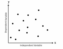
How many outliers does the graph show?
A. 1
B. 2
C. 3
D. 4
C. 3
100

Which graph best shows the line of best fit?
Graph A
Graph B
Graph C
Graph D
Graph B
100
Which statement best describes the relationship between the number of hours spent working and the number of hours spent playing video games?

A. Fewer hours worked, fewer hours spent playing video games.
B. Greater hours worked, greater hours spent playing video games.
C. Greater hours worked, fewer hours spent playing video games.
D. There is no relationship between hours spent working and hours spent playing video games.
C. Greater hours worked, fewer hours spent playing video games.
200
Which graph represents a negative linear association between x and y?
Graph A
Graph B
Graph C
Graph D
Graph B
200
What will most likely happen to the test scores of students if the number of hours they play video games increases?

A. Test scores will increase because the graph shows a positive association.
B. Test scores will increase because the graph shows a negative association.
C. Test scores will decrease because the graph shows a positive association.
D. Test scores will decrease because the graph shows a negative association.
D. Test scores will decrease because the graph shows a negative association.
200
Which graph best shows the line of best fit?

Graph A
200

What is the y-intercept of the line of best fit and what does it represent?
A. 10.4 hours; the number of hours students play outdoor sports in a week when they do not watch television
B. 7.2 hours; the number of hours students play outdoor sports in a week when they do not watch television
C. 10.4 hours; the number of hours students watch television in a week when they do not play outdoor sports.
D. 7.2 hours; the number of hours students watch television in a week when they do not play in any outdoor sports
D. 7.2 hours; the number of hours students watch television in a week when they do not play any outdoor sports.
300
Which graph represents a positive nonlinear association between x and y?
Graph A
Graph B
Graph C
Graph D
Graph D
300

Which correlation coefficient would you chose to describe this scatter plot?
A. 0.8
B. -0.8
C. 1
D. -1
B. -0.8
300
Which line best represents the line of best fit?

A. Line A, because it shows a positive association
B. Line A, because it is closest to most data points
C. Line B, because it is closest to most data points
D. Line B, because it shows a negative association
B. Line A, because it is closest to most data points
300

What would most likely be the approximate height of the plant after 7 weeks?
A. 5.2 cm
B. 7.6 cm
C. 8.7 cm
D. 12.7 cm
A. 5.2 cm
400
This type of association.
No Association.
400
How many outliers does the graph show?

A. 1
B. 2
C. 3
D. 4
D. 4
400
What is the slope of a line of best fit if its equation is y = −2x + 3?
A. -2
B. -1/2
C. 1/3
D. 3
A. -2
400
The amount of sales for 24 degrees Celsius.

What is approximately $600.
500
What will most likely happen to the test scores of students if the number of hours they study increases?

A. Test scores will increase because the graph shows a negative association.
B. Test scores will increase because the graph shows a positive association.
C. Test scores will decrease because the graph shows a positive association.
D. Test scores will decrease because the graph shows a negative association.
B. Test scores will increase because the graph shows a positive association.
500
Which two ordered pairs can be joined to draw most accurately the line of best fit on this scatter plot?

Strength descriptor:
A) Weak Positive Association
B) Moderate Positive Association
C) Strong Positive Association
C) Strong Positive Association
500

What is the approximate equation of this line of best fit in slope-intercept form?
A. y = -4/3x + 14
B. y = -14x + 4/3
C. y = -5/7x + 14
D. y = -14x + 5/7
A. y = -4/3x + 14
500
Amount of sales for 10 degrees Celsius.
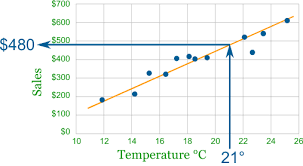
What is approximately $100.