A person, animal, or thing described in a set of data
What is Individual
This type of data consists of attributes, labels, or nonnumerical entries.
What is Categorical Data.

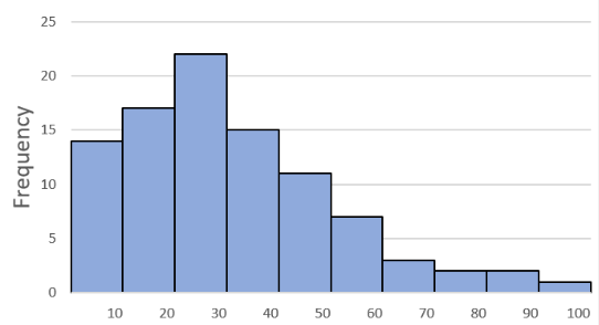
The shape of this histogram.
What is Skewed to the right.
15, 20, 20, 30, 35
The median of this data set.
What is 20
10, 15, 20, 20, 30, 35, 40
The range of this data set.
What is 30
A data point that is distant (far from) the other data.
What is an Outlier
This type of Data consists of numerical entries where it makes sense to find the average.
What is Quantitative Data
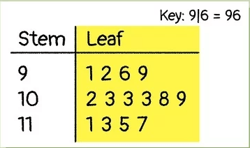
 The median of this stem plot.
What is 103
15, 20, 20, 30, 35
The mean of this data set.
What is 24
The Measure of Variability (spread) that represents the distance of the data points from the mean.
What is Standard Deviation
The science of collecting, analyzing, and drawing conclusions from data.
What is Statistics
The Three Measures of Central Tendency (Center)
What are Mean, Median and Mode

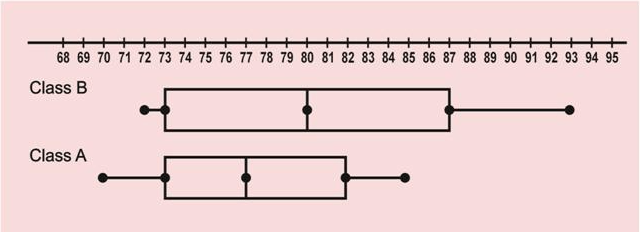
The Class with the greater interquartile range.
What is Class B.
The shape of a distribution where
the mean = the median.
What is symmetrical
The measure of Variability (Spread) that represents the inner 50% of the data.
What is Interquartile Range
This type of table shows the count of individuals having each data value.
What is a Frequency Table
The Three Measures of Variability (Spread)
What are Range, Interquartile Range (IQR) and Standard Deviation
This type of Graph is used to show changes in value over time.
What is a Line Graph.
The shape of a distribution where the mean is less than the median.
What is skewed to the left
10, 15, 20, 20, 30, 35, 40
The interquartile range of this data set.
What is 20
This type of table shows the proportion or percent of individuals having each data value.
What is a Relative Frequency Table
These two types of graphs can be used to show categorical data.
What are pie charts and bar graphs

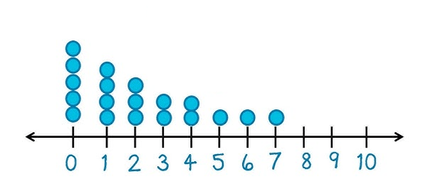
The interquartile range of this dot plot.
What is 4
The shape of a distribution where the mean is greater than the median.
What is skewed to the right
15, 20, 20, 30, 35
The standard deviation of this data set, rounded to the nearest tenth.
What is 7.3