Random Sample vs. Biased Sample
Inferences about a Population
Interpreting Dot Plots
Interpreting Box Plots
100
A group of students was selected randomly from the lunchroom to represent their grade level (assume the entire grade eats lunch together).
Random sample or biased sample?
Random
100
A manager samples the receipts of every fifth person who goes through the line. Out of 50 people, 4 had a mispriced item. If 600 people go to this store each day, how many people would you expect to have a mispriced item?
48
100
True or false? If a number appears more than once in a data set, you only include one dot on a dot plot for that value.
False, you should include the amount of dots for each time a data point appears in your data set
100
There are 5 values needed to create a box plot. Name them
1. min
2. max
3. median
4. upper quartile
5. lower quartile
200
When trying to figure out people's favorite breed of dog, a researcher went to a Facebook group of pit bull owners to select the sample.
Random or biased?
Biased
200
Part of the population of 10,800 hawks at a national park are building a nest. A random sample of 72 hawks shows that 12 of them are building a nest. Estimate the number of hawks building a nest in the population.
1,800
200
Visually compare the spreads of the dot plots of the number of hours a class of students spends on homework to the number of hours they watch television each week.

HW: Between 4 and 18
TV: Between 0 and 20
200
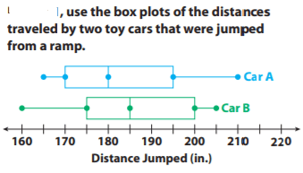
Compare the minimum, maximum, and median of the box plots.
Car A has a minimum of 165 in. and a maximum of 210 in. Car B has a minimum of 160 in. and a maximum of 205 in. Car A has a median of 180 in. Car B has a median of 185 in.
300
For a survey, a company manager assigned a number to each of the company’s 500 employees, and put the numbers in a bag. The manager chose 20 numbers and surveyed the employees with those numbers. Did the manager choose a random sample?
Yes, it was a random sample
300
Multiple answers apply, check with teacher to verify correctness
300
Visually compare the centers of the dot plots of the number of hours a class of students spends on homework to the number of hours they watch television each week.

HW: 12-14
TV: 16-18
300

Compare the ranges and interquartile ranges of the data in box plots.
Both cars have ranges of 45 in. Both cars have interquartile ranges of 25 in
400
Members of a polling organization survey 700 of the 7,453 registered voters in a town by randomly choosing names from a list of all registered voters. Is their sample likely to be representative? Why or why not?
Yes, because it was a random sample taken from all registered voters
400
Linda collects a random sample of 12 of the 98 Wilderness Club members’ ages. She makes an inference that most wilderness club members are between 20 and 40 years old. Describe what a box plot that would confirm Linda’s inference should look like
The box part of the box plot should be between 20 and 40.
400
Visually compare the shapes of the dot plots of the number of hours a class of students spends on homework to the number of hours they watch television each week.
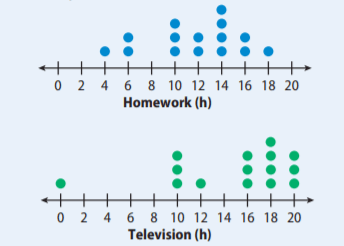
Homework: clustered between 10 and 18, peak at 14
TV: clustered between 10 and 20, evenly spread, highest point at 18
400
What do the box plots tell you about the jump distances of two cars?
Car B has a greater median distance than Car A. The interquartile ranges are the same, so the middle 50% of the jump distances for the two cars have the same variability.
500
To choose a sample for a survey of seventh graders, the student council puts pieces of paper with the names of the 7th graders who volunteered to help with a study in a bag, and selects 20 names.
Would this be a random or biased sample? Why?
Biased, because it was based on volunteers, not all 7th graders
500
Greta collects the number of miles run each week from a random sample of female marathon runners. Her data are shown below. She made the qualitative statement, “25% of female marathoners run 13 or more miles a week.” Is her statement reasonable? Explain. Data: 13, 14, 18, 13, 12, 17, 15, 12, 13, 19, 11, 14, 14, 18, 22, 12
No. The statement should say that 75% of female marathoners run 13 or more miles a week
500
Numerically compare the dot plots (for center, shape and spread) of the number of hours a class of students spends on homework to the number of hours they watch television each week.

Shapes: Homework: Most of the data are 10 hours or greater. Television: Most of the data are 16 hours or greater.
Centers: Homework: The median is 12 hours, with most of the data close to the median. Television: The median is 16 hours, and even though there is an outlier, that value does not affect the median.
Spreads: Homework: The range is 14 hours. Television range with outlier: 20 hours. Television range without outlier: 10 hours. The outlier greatly affects the range.
500
What do the whiskers tell you about the two data sets?
Car A has less variability in the lowest quarter of its data and greater variability in the highest quarter of its data. The variability is reversed for Car B.