Typography
Color
Design Principles
Punctuation
Miscellaneous
Magazine Design
Publication Design
InDesign
Miscellaneous B
100
This alignment has uneven word and letter spacing.
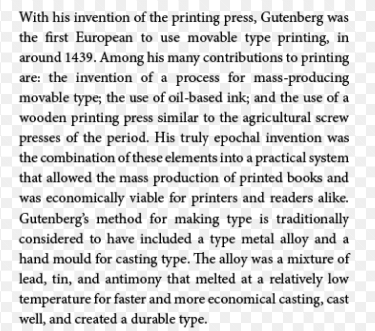
What is justified?
100
Yellow, red, and blue are considered this category on the color wheel.
What are primary colors?
100
The four basic design principles we focused on this semester.
What are Contrast, Repetition, Alignment, and Proximity?
100
The correct format is letter _____.
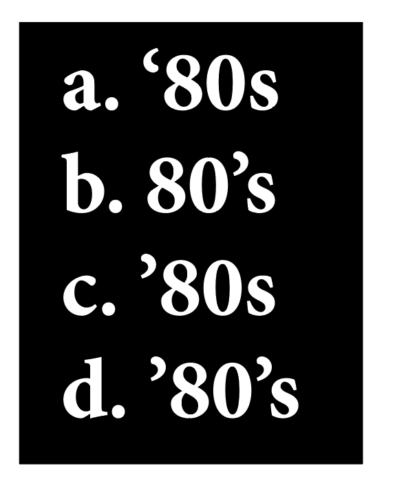
What is C?
100
Add white to a hue to create a _____.
What is a tint?
100
When laying out a magazine, these paragraphs should not be indented.
What is the first paragraph or immediately following a subhead?
100
The C stands for ____ in CMYK.
What is Cyan?
100
The shortcut for the Selection Tool.
What is V?
100
A color combination composed of one hue in any number of tints and shades.
What is monochromatic?
200
This font category can add punch, create a "look," or emphasize content, but overuse can destroy a design.

What is decorative?
200
The pure color is called ______.
What is hue?
200
_________ on a page draws our eyes to it.
What is contrast?
200
Which phrase below uses punctuation correctly?
A. Cookies 'n’ cream (both curved in toward n)
B. Rock ʼnʼ roll (both apostrophes)
What is B?
200
This is an example of employing ____.

What is tracking?
200
For multiple-line headlines in a large type size, you should ________.
What is decrease leading?
200
The M in CMYK stands for ______.
What is magenta?
200
This tool draws a path composed of line segments or curves.
What is the pen tool?
200
The color model used for designs displayed on a screen.
What is RGB?
Hex is OK too.
300
The most readable alignment is____.
What is left aligned?
or
What is flush left/rag right?
300
The color you add to a hue to create a tint.
What is white?
300
Grouping together elements that have a nearness in space, time, or relationship.
What is proximity?
300
This is an example of:
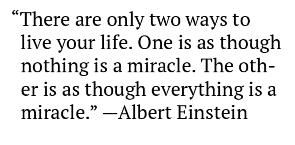
What is hanging punctuation?
300
Use of this typeface makes text more legible at a quick glance and good for skimming.
What is a sans serif?
300
A _____________ is when you take a quote from the article and emphasize it in a graphic way.
What is a pull quote?
300
CMYK is considered a ______ process.
What is four-color? OR
What is printing?
300
This tool can select colors from existing images on a page and copy text/shape attributes.
What is the eyedroper tool?
300
For easier readability, online fonts tend to have a ______ x-height.
What is higher?
400
In typesetting, this is the term for when the last line of a paragraph has one word by itself.
What is a widow?
400
Colors directly across from each other on the color wheel are considered _____.
What are complementary colors?
400
If you use a cluster of squares in several places in your design, you are incorporating this design principal.
What is repetition?
400
This type of dash indicates a period of time.
What is an en dash?
400
If you are adjusting the space between the lines of text, you are adjusting the _________.
What is leading?
400
To visually connect the subheads to the body text it refers to, use more space above than below the subhead. True or False?
What is true?
400
In CMYK, K is usually black, but technically K stands for _____.
What is Key?
400
The Pen Tool creates a _______ drawing.
What is vector?
400
This category of serif type has a moderate stroke contrast and diagonal stress. Serifs are always at an angle. It's easy to read.
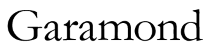
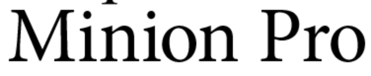
What is Oldstyle?
500
This is an example of a _____ serif typeface.

What is Slab?
[Slab serifs are characterized by thick, block-like serifs.]
500
Colors next to each other on the color wheel are considered _____.
What are analogous colors?
500
The principle of ________________ states, "If two items are not exactly the same, then make them different. Really different."
What is contrast?
500
A special character combining two or more characters into one.
(Ex. fl)
What is a ligature?
500
If you are adjusting the space between individual letters, you are adjusting the __________.
What is kerning?
500
These large or ornate letters at the beginning of first paragraphs add interest to a page.
What are drop or initial caps?
500
The lines at each of the four corners of a page that define the outer edges of the document that printers use to create a full-bleed print.
What are crop marks?
500
The standard bleed measurement in InDesign.
What is 0.125 inches (1p or 3 mm)?
500
Use ________ to make parenthesis and hyphens appear to be in the correct position when using caps or lining numbers. Or when using dingbats as bullets to adjust their position.
What is baseline shift?
600
This is THE most important principle of typography.
What is readability and/or legibility?
600
Add black to a hue to create a _______.
What is shade?
600
An arrangement or classification of things according to relative importance or inclusiveness.
What is hierarchy?
600
In "The Non-Designer’s Type Book," Williams mentions two ways where you can use small caps. Name one of the ways.
What is AM/PM?
or
What are acronyms?
600
A _____________ relationship occurs when you combine typefaces that are similar (but not the same) in style, size, weight, and so on. The visual attractions are neither the same, nor are they different.
What is conflicting?
600
Two pages next to each other that work as one unit.
What is a spread?
600
This is considered a mathematical or architectural framework for organizing a lot of complex information...a framework for design.
What is a grid?
600
InDesign includes these five items in the folder when you package your project.
What are:
InDesign File
IDML File
PDF
Links Folder
Fonts Folder
600
A ____________ relationship occurs when you combine separate typefaces and elements that are clearly distinct from each other.
What is contrasting?