The area in the center of the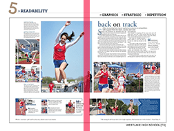 spread, where the yearbook is bound with thread and glue; also the middle of two pages of a spread where the paper
What is the "Gutter?"
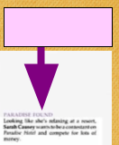 Caption starter technique- like a mini headline for captions
What is an "Overline?"
A good layout, just like a good headline or a good photograph does these three things with the reader's attention (or, you might say, with the viewer's eyes)
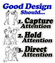 What are "Capture, Hold, and Lead?"
These are used to precisely measure text, rule lines, and leading between lines of text
What are Points?
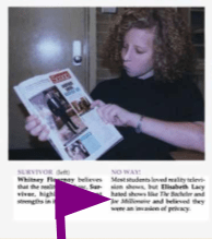 Text blocks accompanying photos that add information. Captions answer reader's questions about the people, the action and/or the reaction in a photograph. Can range from identifying and supplying minimal information for people in photos to serving as mini-stories telling the 5W's and H and including quotes Also called cutlines.
What are "Captions?"
Vertical divisions used as guides for placing content elements. Provide alignment and organization and divide the page vertically.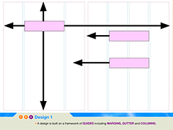
What are "Columns?"
Center of Visual Interest (CVI), noticeably larger than other photos- should be the first one placed on the layout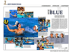
What is the "Dominant Photo?"
Using this, creates order and indicates importance through size and placement. A range of say three different sizes of picture, text, or graphic helps establish this kind of order. Viewer's eyes are let from Large, to Medium, to Small; From Dark to Medium to Light; of from Red to Yellow to Green.
What is "Hierarchy?"
These measure width and height of content elements like photos and text boxes
What are Picas?
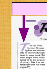 These ornamental first letters of the first word in a sentence in the first sentences in first paragraphs have a "LOWkey" way of serveing as an entry point into the story copy.
What is a "Drop-Cap?"
Serve the same function as column guides, except that they provide horizontal guides
What are Grid Lines?
 A mini-layout within the layout. Often contains pulled quotes or infographics
What is a "Content Module?"
The goal is to keep the reader moving from element to element. A dominant photo can be placed so that its content guides the reader toward the center of the design and perhaps into the headline. Elements should direct the reader toward the center rather than off the page.
What is Eyeflow
The width in inches that multiples are cut at that plant in order to fit into a particular yearbook's specifications. Ours is 8.5
What is the "Trim Size?"
These may be candid (photojournalistic), seriously posed for reference like group pictures or mug shots, or informally posed like a snapshot you'd put in your scrapbook.
What are Photos? (or what are Visual Elements?)
Establish boundaries for the content; they provide a border of white space along all the edges of the spread. As Eminem used to sing, "around the outside."
What are Margins?
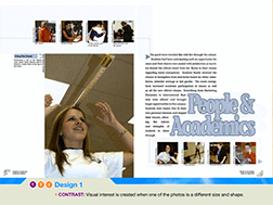 Effective for framing or isolating content- best used either on the outside edges, or as rails and bridges
What is "Planned White Space?"
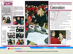 The primary design element that catches readers' attention first. Should be the focal point or dominant element on the page or spread (like a content module), usually a photo. But in another sense, it may be the main subject within any one photograph.
What is the "Center of Visual Interest (CVI)?"
There are 72 of these in an inch.
What is a Point?
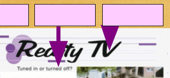
The largest type on a spread. When well written and well designed, these pull in the reader and sparks interest in the content. Spreads often feature these in both "Primary" & "Secondary" or "Sub" forms.
What is a Headline?
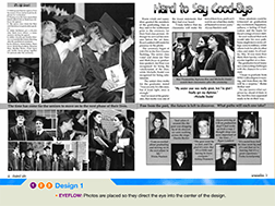 Alignment of elements linking two pages into a single spread. Usually about 2 picas thick and arranged just under or above the Dominant element.
What is an "Eyeline?"
When photos replace the blue boxes and when written captions or headlines replace temporary copy-boxes. It's the stories and memories that fills the layouts. It's what drives the design process.
What is Content?
This principle of design captures the viewer's attention because it brings the drama and keeps the presentation lively by demonstrating that opposites attract and make each other stand out.
What is Contrast?
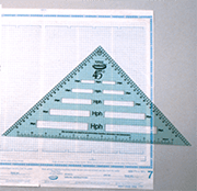 There are 12 points in one of these and six of these in an inch.
What is a Pica?
A Journalism or Publications "Jargon" term that refers to anything written or including words, whether they're headlines, captions, stories, overlines, or even drop-caps and folios
What is "Copy?